Home Decor
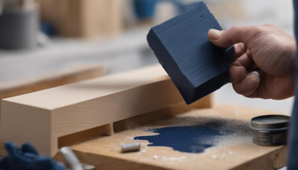
DIY Navy Shiplap Wall: Create Your Own
Discover the secrets to crafting a stunning DIY navy shiplap wall, from locating studs to finishing touches, in this step-by-step guide.
To create a stunning DIY navy shiplap wall, you'll need to tackle a few essential steps, starting with locating and marking wall studs, an important coincidence of 16-inch spacing that will greatly simplify your installation process. Next, cut and level your shiplap planks, ensuring a precise fit along your wall. Then, nail and secure the planks using a pneumatic nail gun and construction adhesive. Sand the wall to smooth out rough edges, apply primer and paint, and finally, install baseboards and trim pieces for a polished finish. As you proceed, you'll uncover the intricacies of bringing your navy shiplap vision to life.
Key Takeaways
• Locate wall studs 16 inches apart to ensure a sturdy installation and prevent unnecessary nail holes.
• Cut and level shiplap planks according to wall measurements, smoothing out cut edges with sandpaper.
• Nail planks onto studs using a pneumatic nail gun and construction adhesive for added strength.
• Sand the wall to smooth out rough edges, then apply primer and multiple coats of navy paint for a bold look.
• Reinstall or add baseboards, trim pieces, and proper lighting to conceal gaps and highlight the finished wall.
Locating and Marking Wall Studs
To guarantee a secure attachment of your shiplap planks, start by locating the wall studs, which are typically spaced 16 inches apart in most walls. This is important, as studs serve as the anchor points for nailing the shiplap planks in place, ensuring a sturdy and durable installation.
To locate these studs, use a stud finder, a handy tool that makes it easy to detect the studs behind your wall. Once you've found the studs, mark them with tall vertical lines from floor to ceiling for reference. This will give you a clear visual guide as you begin installing your shiplap planks.
When nailing the planks, make sure to hit the studs to avoid creating unnecessary nail holes in your wall. By taking the time to locate and mark your wall studs, you'll ensure a professional-looking finish and prevent potential problems down the line.
Cutting and Leveling Shiplap Planks
Now that you've marked the wall studs, you're ready to start cutting and leveling your shiplap planks to fit your wall's unique dimensions. To guarantee a seamless look, measure the entire wall to avoid ending up with small cuts at the ceiling. Cut and level the first piece of shiplap according to the wall measurements to ensure precise fitting.
Here's a breakdown of the cutting and leveling process:
Step | Tool | Action |
---|---|---|
1 | Tape measure | Measure wall dimensions |
2 | Jigsaw | Cut shiplap planks to fit wall dimensions |
3 | Level | Level shiplap planks for a straight fit |
4 | Pencil | Mark cut lines on shiplap planks |
5 | Sandpaper | Smooth out cut edges |
Remember to maintain consistent spacing between shiplap planks to achieve a uniform and professional appearance on the wall. You'll be using a nail gun to secure the planks in the next step, so make sure they're properly aligned and fitted.
Nailing and Securing Planks
With your shiplap planks cut and leveled, you're ready to secure them to the wall using a pneumatic nail gun, which provides the necessary holding power to keep your DIY navy shiplap wall looking great for years to come.
As you start nailing, remember to use nails specifically designed for fastening planks onto studs, guaranteeing stability and preventing the planks from shifting over time. For added strength and durability, apply construction adhesive along with the nails. It's crucial to maintain proper spacing between nails to prevent splitting or damage to the planks.
Here are some key tips to keep in mind:
- Use a pneumatic nail gun to securely attach shiplap planks to the wall.
- Apply construction adhesive along with nails for added strength and durability.
- Ensure proper spacing between nails to prevent splitting or damage to the planks.
- Utilize spacers to maintain consistent gap width between rows for a professional finish.
- When adding a trim piece, choose a neutral tone that complements your shiplap feature wall, creating a cohesive look.
Sanding and Painting the Wall
After securing your shiplap planks, you'll want to smooth out any rough edges or imperfections by sanding the wall, guaranteeing a professional finish. Use fine-grit sandpaper to achieve a smooth surface that's ready for painting.
Sanding is an important step, as it removes any imperfections, creating a surface that's ideal for painting.
Next, apply a primer to the wall, which is essential for proper adhesion and coverage of the paint. A good primer will help make sure that your navy paint adheres evenly and lasts longer.
Once the primer is dry, you can start painting. For a bold and dramatic look, apply multiple coats of navy paint to your accent wall. Consider using a satin or semi-gloss finish, which not only looks great but is also easy to maintain.
With these steps, you'll be well on your way to creating a stunning navy shiplap wall that adds depth and character to any room.
Installing Baseboards and Finishing Touches
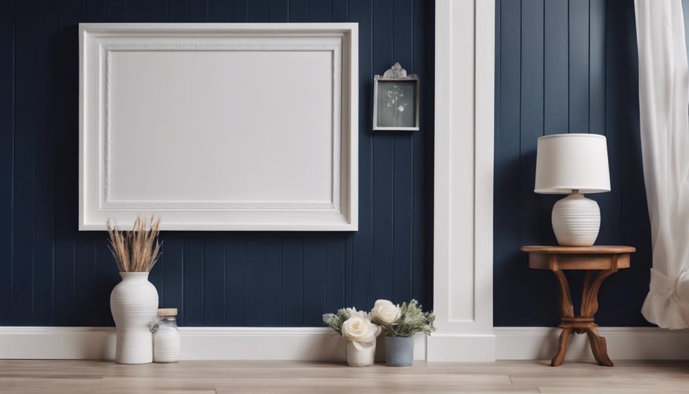
You'll complete the look of your navy shiplap wall by reinstalling or adding baseboards to conceal any gaps between the planks and the floor. This step is important in achieving a polished, professional finish in your living room or any other room where you've installed the shiplap wall.
To guarantee a seamless look, use a finishing nail gun and construction adhesive to secure the baseboards to the wall. Consider painting the baseboards the same color as the shiplap wall for a cohesive finish.
Here are some additional tips to keep in mind:
- Trim pieces can be added to the top of the shiplap wall for a more finished and structured appearance.
- Pay attention to detail when finishing the edges of the shiplap wall to ensure a professional and complete look.
- Add decorative trim or molding to cover any gaps or seams for a flawless finish.
- Make sure the entire wall is well-lit to highlight the beauty of your DIY project.
- Don't forget to add those final finishing touches to complete the transformation of your room.
Frequently Asked Questions
Is It Cheaper to Make Your Own Shiplap?
When considering shiplap, you might wonder: is it cheaper to make your own?
The answer is yes, making your own shiplap can be more cost-effective, especially if you already have the necessary tools and materials. By cutting and installing the shiplap yourself, you can save on customization fees and guarantee a unique look that suits your preferences.
Additionally, you'll have control over the quality of materials used, which can lead to a more affordable and personalized result.
Can I Make My Own Shiplap?
As you envision the rustic charm of shiplap adorning your walls, you wonder: can I make my own shiplap? Absolutely!
With a table saw and compound miter saw, you can precision-cut plywood into planks tailored to your desired width. By doing so, you'll not only save money but also enjoy the satisfaction of customizing your space to your unique taste.
What Is the New Trend Instead of Shiplap?
As you move on from shiplap, you'll notice alternative design trends emerging. Vertical paneling, like board and batten or beadboard, is gaining popularity.
For a sleeker look, tongue and groove wall paneling is a modern alternative. If you're feeling bold, chevron or herringbone wood patterns offer a unique twist.
If you're looking for something entirely different, textured wall coverings or faux wood/brick wallpaper can provide a fresh, contemporary vibe.
Is There Faux Shiplap?
You're wondering if there's a more affordable and easier-to-install alternative to traditional shiplap.
The answer is yes, there's faux shiplap!
For instance, consider a homeowner who wants to add a rustic touch to their living room without breaking the bank.
Faux shiplap, made from materials like MDF or PVC, offers a cost-effective solution.
It's lightweight, easy to install, and comes in various finishes, mimicking the look of real wood shiplap at a fraction of the cost.
Conclusion
You've managed to create a stunning DIY navy shiplap wall, and it's a far cry from the bland, white walls you once had.
Ironically, the most tedious part – locating and marking wall studs – was the key to a successful project.
But now, as you step back to admire your handiwork, you realize that the real challenge lies ahead: resisting the urge to shiplap every wall in your house.

Vivienne – Your Content Companion Vivienne is your content companion, curating valuable tips, advice, and inspiration to guide you on your home decor journey. From insightful blog posts to informative product descriptions, she’s here to empower you with the knowledge you need to create your dream space.
Home Decor
Color Psychology in Home Design: Room-by-Room Guide
Beyond aesthetics, color psychology influences emotions in your home—discover how each hue can transform your space and enhance your well-being.
Understanding color psychology helps you create a harmonious home. In your living room, use warm tones like terracotta to invite comfort and conversation. For bedrooms, soft blues promote relaxation, while deeper colors add coziness. In kitchens, warm yellows stimulate appetite, whereas muted greens create a rejuvenating vibe. Your home office can benefit from cool colors like blue for focus and productivity. Finally, choose warm shades in dining areas to spark interaction, while light colors brighten hallways. Each room has a unique emotional impact. Explore these tips to transform your home's atmosphere effectively.
Key Takeaways
- Warm colors in living rooms create inviting atmospheres, fostering social interaction and comfort.
- Soft blues and lavenders in bedrooms promote relaxation and peaceful environments.
- Kitchens benefit from warm colors like yellow and red to boost appetite and energy levels.
- Cool colors in home offices enhance productivity and focus while reducing stress.
- Dining rooms and hallways should use stimulating warm colors to encourage conversation and light colors for brightness.
Understanding Color Psychology
Have you ever noticed how a room's color can instantly change your mood? That's the essence of color psychology, which connects hues to emotional responses. For instance, warm colors like red and orange can evoke energy and passion, making you feel lively and enthusiastic.
In contrast, cool colors such as blue and green promote calmness and relaxation, perfect for unwinding after a long day.
When you choose a color palette, think about the specific feelings you want to inspire. Yellow often represents happiness and optimism, while purple can evoke creativity and a sense of luxury.
However, remember that individual reactions to colors can vary considerably. What calms one person may energize another, so consider your own preferences and those of the people who'll use the space.
Light colors can make a room feel larger and airier, enhancing functionality, especially in smaller areas.
On the flip side, darker colors can create a cozy, intimate atmosphere, influencing how a room is perceived.
Living Room Color Choices
When choosing colors for your living room, consider warm palettes like oranges and reds to create a cozy, inviting atmosphere that encourages conversation.
Adding accent colors can energize the space, making it more dynamic and engaging.
Balancing these choices with neutral tones allows you to maintain flexibility while enhancing the overall ambiance.
Warm Palettes for Comfort
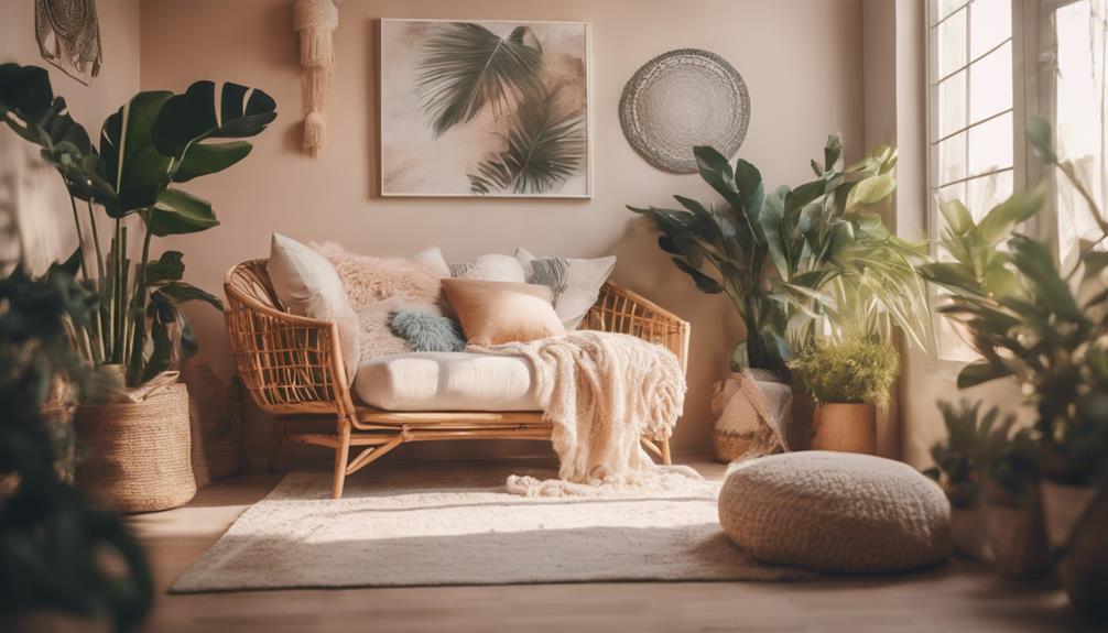
Creating a warm and inviting living room starts with choosing the right color palette. Warm palettes featuring shades of red, orange, and yellow evoke feelings of warmth and comfort, making them perfect for fostering social interaction. Soft terracotta or warm beige can help create an inviting atmosphere that encourages connection among family and guests.
Incorporating warm accent colors, like deep reds or vibrant oranges, adds visual interest without overwhelming the space. Meanwhile, warm neutrals such as cream or light brown balance these bold colors, ensuring a cozy environment.
Optimal lighting—especially natural light—enhances the emotional impact of your chosen colors, making the room feel both spacious and intimate. Here's a quick reference to guide you in selecting your living room colors:
Color Type | Examples |
---|---|
Warm Palettes | Red, Orange, Yellow |
Warm Neutrals | Cream, Light Brown |
Accent Colors | Deep Red, Vibrant Orange |
Accent Colors for Energy
Incorporating vibrant accent colors in your living room can energize the space and spark lively conversations. Warm tones like red and orange are excellent choices, as they stimulate energy and create a vibrant social atmosphere.
To keep your design balanced, use accent colors strategically, ideally comprising about 10% of your overall color scheme. This way, they stand out without overwhelming the space. Additionally, consider integrating natural materials, such as wood and metal, which are common in modern farmhouse design, to complement your vibrant accents and enhance the rustic charm.
Consider pairing complementary colors, such as blue accents against an orange backdrop, to create visual interest while maintaining harmony. This interplay enhances the psychology of color, making your living room feel dynamic yet cohesive.
To further boost the inviting atmosphere, incorporate textured fabrics and bold-colored accessories that add depth and liveliness.
Don't forget about lighting! Natural light can greatly enhance the vibrancy of warm accent colors, making them appear more engaging throughout the day. Position your furniture and decor to take advantage of the light, ensuring that your living room remains bright and inviting.
Bedroom Color Selections
Choosing the right colors for your bedroom can greatly impact your mood and sleep quality. For a tranquil environment, consider soft blue or lavender hues. These colors foster a serene ambiance, promoting restful sleep. Warm tones like peach and soft pink can create a nurturing atmosphere, ideal for personal spaces, evoking feelings of comfort and love.
To achieve a cohesive look, think about using a monochromatic color scheme with varying shades of a single color. This approach can enhance the overall feel of the room. Incorporating neutral tones, such as light grays or beiges, can also foster peace and spaciousness, making the room feel more open and inviting.
If you're looking to add depth, consider using accent walls in deep shades like navy or forest green. These rich colors create a cozy, cocoon-like feel, perfect for a restful retreat.
Here's a quick reference table for your bedroom color selections:
Color Type | Recommended Colors | Mood Created |
---|---|---|
Tranquil Hues | Soft blue, Lavender | Calmness |
Warm Tones | Peach, Soft pink | Comfort |
Neutral Tones | Light gray, Beige | Peacefulness |
Deep Shades | Navy, Forest green | Coziness |
Kitchen Color Recommendations
When it comes to choosing colors for your kitchen, warm tones like yellow and red can really boost your appetite and energy.
Additionally, incorporating natural elements, such as the creamy textures and rich colors of butter varieties, can enhance the overall aesthetic and make the space feel more inviting.
On the flip side, cool colors such as green can create a revitalizing and calming cooking space.
Balancing these color choices can help you cultivate the perfect atmosphere for meal prep and enjoyment.
Warm Color Choices
Since warm colors like yellow and orange stimulate appetite and create an inviting atmosphere, they're perfect for kitchens. These hues not only encourage social interaction but also evoke a cozy feel that makes mealtime enjoyable.
Consider incorporating soft warm tones, such as buttery yellows and light oranges, which enhance the sense of spaciousness in smaller kitchens while maintaining that inviting vibe. Additionally, incorporating elements from nature, such as wooden utensils or eco-friendly materials, can further enhance the warmth of the space and promote a sense of sustainability in your kitchen design, aligning with eco-friendly toy choices.
To add energy and passion, you can introduce red accents, which will energize the space and encourage lively conversations. However, it's essential to balance these warm colors with neutral shades, providing visual relief to prevent the room from feeling overwhelming. This harmonious blend allows you to enjoy the warmth without it becoming too intense.
Also, pay attention to your kitchen's natural light. It can greatly enhance the vibrancy of warm colors, making them appear cheerful and uplifting throughout the day.
Cool Color Benefits
Incorporating cool colors like soft greens and blues into your kitchen design can evoke a sense of renewal and cleanliness, creating a calming cooking environment perfect for cooking. These shades promote relaxation and can lower blood pressure, making meal preparation more enjoyable.
Soft greens, associated with energy and balance, emphasize health-conscious cooking, while muted blues enhance the overall atmosphere.
Using cool colors in your kitchen can also create the illusion of a larger space, which is especially beneficial in compact areas. This sense of openness contributes to a harmonious atmosphere, allowing you to feel more at ease while cooking.
When you choose muted tones, you balance out the warmth generated by cooking, ensuring your kitchen remains inviting and serene.
Opting for soft greens and blues can turn your kitchen into a sanctuary, where you can focus on your culinary creations without feeling overwhelmed.
By embracing these cool colors, you not only enhance the aesthetic appeal of your kitchen but also foster an environment that supports relaxation and creativity.
Home Office Color Tips
Creating a productive home office often hinges on your choice of colors. To enhance focus and calmness, consider cool colors like green and blue. These hues lower blood pressure and boost productivity during work hours.
If your tasks require creativity, incorporating shades of yellow as bold accents can stimulate enthusiasm and innovative thinking.
To create a balanced and stimulating environment, apply the 60/30/10 rule:
- Neutral Color: Use a neutral color for your walls to create a serene backdrop.
- Medium Tone: Select a medium tone for your ergonomic furniture, ensuring comfort and aesthetics align.
- Bold Accents: Add vibrant accents through accessories or artwork to energize the space.
- Natural Light: Maximize natural light to enhance color perception, making your chosen colors appear more vibrant throughout the day.
Dining Room and Hallway Hues
Transforming your dining room and hallway with the right colors can greatly enhance the overall atmosphere of your home.
In the dining room, consider warm colors like red and orange; they stimulate appetite and spark conversation, creating an inviting atmosphere for gatherings. Yellow can also add cheerfulness, promoting happiness and optimism, but use it sparingly to avoid overstimulation.
For hallways, which often serve as narrow passage spaces, light colors such as soft beige or pale blue can brighten the area, enhancing openness and making it feel more spacious. Adding accents of green in hallways evokes feelings of growth and safety, providing a welcoming passage between rooms.
To establish a cohesive flow throughout your home, use complementary color schemes that tie the dining room and hallway together. This not only enhances visual interest but also creates harmony in your design.
Frequently Asked Questions
What Is the 3 Color Rule in Interior Design?
The 3 Color Rule in interior design suggests using three colors: 60% dominant, 30% secondary, and 10% accent. This balance creates visually appealing spaces that enhance mood and atmosphere, making your home feel cohesive and inviting.
What Is the Psychology of Color for Rooms?
The psychology of color for rooms affects your mood and emotions. Warm colors energize social spaces, cool colors promote relaxation in bedrooms, and neutral tones create a clean, spacious feel in kitchens and bathrooms. Choose wisely!
How Do I Choose Colors That Flow From a Room to a Room?
To choose colors that flow from room to room, select a cohesive palette. Use the 60/30/10 rule, test colors in different lights, and guarantee adjoining spaces complement each other for a seamless shift.
What Is the Color Theory in House Design?
Color theory in house design explores how hues impact emotions and perceptions. By understanding primary and secondary colors, you can create harmonious spaces that evoke desired feelings, enhancing the overall ambiance of your home.
Conclusion
Incorporating color psychology into your home design can transform your space and mood. Remember, "a picture is worth a thousand words," and the colors you choose speak volumes about your personality and intentions. By carefully selecting hues for each room, you create an environment that enhances relaxation, productivity, and social interaction. So, take a moment to reflect on the colors that resonate with you, and let them guide your home's ambiance toward a harmonious balance.
Xavier – Your Operations Partner Xavier is your operations partner, working tirelessly behind the scenes to ensure that everything runs smoothly so you can enjoy a seamless experience with Perfect Fit Living. From managing inventory to coordinating logistics, he’s committed to making your experience with us hassle-free.
Home Decor
Wall Art Arrangement: Professional Tips and Tricks
Breathe new life into your space with expert wall art arrangement tips that will leave your guests in awe—discover the secrets to stunning displays!
To master wall art arrangement, start by creating focal points with oversized pieces—they'll draw the eye! Consider using pairs or trios for a polished look; keep spacing between 2-6 inches for breathing room. For more visual interest, mix styles and mediums, and introduce textures. Don't shy away from gallery walls; they offer an organic vibe when arranged thoughtfully. Make sure artwork is hung 6-8 inches above furniture for best viewing. Incorporate lighting to highlight your favorite pieces. Follow these tips, and you'll transform your space effortlessly. There's even more to explore on how to elevate your art displays!
Key Takeaways
- Use oversized art pieces as focal points to transform spaces and enhance visual interest above key furniture like sofas and beds.
- For dynamic arrangements, mix symmetrical and asymmetrical pairings, allowing for 2-6 inches of spacing between pieces for a balanced look.
- Create gallery walls by using a key piece as a centerpiece, surrounded by smaller works for a cohesive and visually appealing display.
- Incorporate varying heights and textures in displays to enrich the aesthetic and maintain engagement in your wall arrangements.
- Utilize accent lighting to highlight artwork, enhancing its impact and creating a captivating atmosphere in any space.
Creating Focal Points With Art
Creating an enchanting focal point with art can transform your space. Oversized art pieces can establish a unique style and mood, enhancing your room's atmosphere. When you place large artwork strategically, it draws the eye and adds visual interest, making it perfect for locations like above sofas, mantles, or beds.
Consider your wall space carefully; these pieces should anchor your decor and guide the arrangement of other elements in the room.
To achieve balance, think about the scale of the oversized art relative to your surrounding furniture and architectural features. A well-placed piece can create harmony, ensuring it doesn't overwhelm or underwhelm the space. Leaning art over a fireplace, for instance, adds a casual yet stylish touch while reflecting your unique style.
If you're considering a gallery wall, oversized art can act as a centerpiece, with smaller pieces surrounding it to create a cohesive arrangement. This approach helps maintain balance while showcasing your individual taste.
Ultimately, using oversized art as a focal point can greatly enhance your room, making it inviting and impactful.
Arranging Art in Pairs and Trios
Arranging art in pairs and trios can elevate your decor by adding balance and interest to your walls. When you think about it, creating a cohesive look with your wall art isn't just about aesthetics; it's about the visual flow and interaction between pieces.
- Aim for symmetry with matching frames for a polished look.
- Explore asymmetrical pairings to keep things dynamic and engaging.
- Center the middle piece of a trio at eye level for maximum impact.
- Adjust spacing to 2-6 inches to give each piece room to breathe.
Whether you're working with pairs or trios, consider the wall space and how the art interacts. For wider spaces, arrange pieces horizontally to create a balanced feel.
In contrast, vertical stacking works wonders for narrower walls. This strategy not only enhances the visual flow but also draws the eye across the arrangement.
Gallery Walls and Organic Arrangements
Transforming your space with a gallery wall can instantly boost its visual appeal and showcase your unique style. A well-curated display of art pieces allows for personal expression and enhances visual interest. Start by taping off the area on the floor to visualize your layout, ensuring about 3 inches of spacing between pieces for a cohesive look.
An organic arrangement strikes a balance between structure and spontaneity. Begin with a few key pieces as your focal point, then gradually add more art pieces in different sizes and orientations. This approach creates a dynamic effect and embraces asymmetry, steering clear of a strictly symmetrical gallery wall.
Here's a quick reference to help you plan your gallery wall:
Element | Description |
---|---|
Layout Strategy | Tape off the area and visualize the arrangement |
Framing Consistency | Use similar frames to enhance the cohesive look |
Size Variation | Combine different sizes to add depth and visual interest |
Mixing Art Styles and Mediums
Mixing art styles can transform your wall into a dynamic focal point, so don't hesitate to combine abstract paintings with rustic sculptures.
By incorporating various textures and a cohesive color palette, you can unify different pieces while showcasing your unique taste.
Adding diverse art types, like photographs and mixed media, will enrich the overall aesthetic and keep your display visually engaging.
Art Style Combinations
Exploring various art style combinations can elevate your gallery wall from ordinary to extraordinary. Mixing different types of art—like pairing abstract paintings with rustic photographs—creates visual depth and intrigue.
You might also consider incorporating elements from modern farmhouse designs, such as exposed beams, to enhance the overall aesthetic of your space.
To achieve a cohesive and enchanting display, consider these tips:
- Use contrasting textures: Glossy prints alongside rough textiles or ceramics can unify diverse pieces while enhancing aesthetics.
- Incorporate various mediums: Include charcoal sketches, framed prints, and three-dimensional sculptures to add dynamic layers.
- Maintain a consistent color palette: Repeating a specific hue three times across your arrangement can tie everything together beautifully.
- Embrace asymmetry: Mixing different frame styles and sizes lends a personalized, dynamic look, steering clear of a rigid feel.
Textures and Color Themes
Combining different textures and color themes can take your art arrangement to the next level. Mixing different art styles, like abstract paintings with rustic photographs or sculptures, creates visual depth and interest on your walls.
To achieve a cohesive look, consider utilizing contrasting textures—pair smooth paintings with textured textiles or three-dimensional art. This approach unifies diverse pieces and enhances the overall aesthetic.
When working on your arrangement, repeat colors or themes across pieces two to three times to guarantee a harmonious flow. This repetition ties your art collection together, making it visually appealing.
Incorporating various mediums, such as charcoal drawings, prints, and mixed media, adds a dynamic visual experience that captivates the viewer.
Don't forget to fill any gaps in your arrangement with natural elements like dried flowers or feathers. These organic touches enrich your display of mixed art styles and introduce an inviting, earthy feel.
Diverse Art Types
Creating an engaging art arrangement involves incorporating diverse art types that resonate with your style. Mixing different styles and mediums not only adds depth but also creates a cohesive look for your wall decor.
Here are some ideas to contemplate:
- Pair abstract paintings with traditional landscapes.
- Incorporate photographs and charcoal drawings.
- Use textiles to enhance texture and visual appeal.
- Fill gaps with natural elements like dried flowers or feathers.
When you arrange art, think about how contrasting textures—like smooth frames alongside rough canvases—can unify diverse art types while keeping things dynamic.
This approach allows you to highlight each statement piece and evoke different emotions within your space. Bright, colorful prints can energize, whereas softer tones can promote relaxation.
Incorporating Art Into Functional Spaces
Incorporating art into functional spaces can really elevate the aesthetics of your home.
Hang pieces above furniture at a height of 6-8 inches for ideal viewing and to enhance the room's purpose.
Enhance Functional Aesthetics
While you might think of art as something reserved for galleries or living rooms, placing it in functional spaces can elevate both style and utility.
Incorporating art into areas like kitchens, home offices, or even bedrooms not only enhances aesthetics but also contributes to the overall vibe of the space.
- Use bright colors to energize functional areas.
- Lean art pieces near eye level on bookcases for depth.
- Mix horizontal and vertical arrangements to create visual interest.
- Utilize accent lighting to highlight your favorite pieces.
Optimize Viewing Heights
Finding the right height for your artwork can make all the difference in how it's perceived within a space. When you hang artwork, aim for a viewing height of 57 to 60 inches from the floor to the center of the piece, which is generally ideal for most people. If you're displaying art above furniture, like sofas or beds, maintain a distance of 6 to 8 inches between the top of the furniture and the bottom of the artwork for a balanced look.
Type of Space | Ideal Height |
---|---|
Functional Spaces (like kitchens) | Slightly lower than eye level |
Above Furniture | 6 to 8 inches above furniture |
Larger Pieces | 2/3 to 3/4 of wall space |
For larger pieces, make sure they occupy about two-thirds to three-quarters of the available wall space to create a cohesive visual impact. In functional spaces, placing art at varying heights adds visual interest, making each piece easily visible and enhancing your overall arrangement. Remember to adjust your display art strategy according to the space, maximizing both aesthetics and functionality.
Utilizing Shelving and Lighting
When you set up your wall art, combining shelving and lighting can really elevate the overall look. Using shelves allows you to display both art and decorative items, creating layers that enhance depth and interest. Consider placing art pieces behind or beside objects for a dynamic arrangement.
To add warmth and coziness, you might also integrate elements from cozy fall decorating ideas such as textured throws or seasonal accents.
- Vary the heights of items on shelves to avoid monotony.
- Integrate plants and natural elements for a fresh, inviting look.
- Use accent lighting, like picture lights or track lighting, to highlight key art pieces.
- Incorporate dimmers in your lighting setups for adjustable ambiance.
Floating shelves are a modern option that allows for easy rearrangement of art pieces, giving you flexibility without extensive wall alterations.
By varying the heights and incorporating different elements, you create a visually appealing display that draws the eye. Accent lighting can create dramatic effects, making your artwork pop and enhancing the overall atmosphere.
With these techniques, you can transform your wall art into a stunning focal point that reflects your style and creativity.
Frequently Asked Questions
What Is the Best Way to Arrange Art on a Wall?
To arrange art on a wall, start with a large piece as your focal point. Maintain 2-3 inches between artworks, and consider asymmetry for a dynamic look that feels effortlessly curated and visually appealing.
What Is the Rule for Wall Art?
When it comes to wall art, think of it as a dance; it should flow gracefully. Hang pieces at eye level, with 2-3 inches between them, creating harmony without overwhelming your space.
How Do Professionals Hang Artwork?
Professionals hang artwork by measuring the wall space, marking layouts, and starting with the largest piece as a focal point. They guarantee it's at eye level and maintain consistent spacing for a cohesive look.
How Do You Make Wall Art Look Expensive?
To make wall art look expensive, choose high-quality frames, incorporate large pieces, and use a cohesive color palette. Mix styles and add accent lighting to enhance the overall presentation and create a luxurious atmosphere.
Conclusion
Your walls are like a blank canvas, waiting for your personal touch. By employing these tips, you can transform mere spaces into enchanting stories filled with color and emotion. Whether you're creating a striking focal point or a cozy gallery wall, remember that art is a reflection of you. So let your creativity flow, and watch as your home blossoms into a vibrant tapestry of inspiration and warmth that invites everyone to pause and admire.
Xavier – Your Operations Partner Xavier is your operations partner, working tirelessly behind the scenes to ensure that everything runs smoothly so you can enjoy a seamless experience with Perfect Fit Living. From managing inventory to coordinating logistics, he’s committed to making your experience with us hassle-free.
Home Decor
Seasonal Decor Storage Solutions
Improve your seasonal decor storage with smart solutions that keep your decorations safe and organized—discover strategies that will transform your decorating experience!
When it comes to storing your seasonal decor, organization is key. Start by investing in durable, stackable clear bins to keep everything visible and accessible. Designate separate containers for each holiday and sort items chronologically. For fragile ornaments, use padded boxes or bubble wrap. Don't forget to label everything! Regularly evaluate your decor and purge any unwanted items. This proactive strategy not only protects your decorations but also makes future decorating stress-free. Want to discover more effective storage ideas and creative display solutions? There's plenty more to explore that can simplify your seasonal decorating process.
Key Takeaways
- Invest in durable, stackable 45 qt clear totes for efficient storage and easy identification of decorations by holiday.
- Use compartmentalized organizers and padded boxes to protect fragile items during storage.
- Designate separate bins for each holiday and sort items chronologically for quick access.
- Implement a master inventory list to track items in each bin and schedule annual reviews for damage assessment.
- Embrace mindful decluttering by purging unwanted decorations immediately after the holiday season.
Importance of Seasonal Decor Storage
As the holiday season wraps up, the importance of seasonal decor storage becomes clear. After spending over $230 annually on holiday decorations, you want to guarantee these valuable items are protected.
Proper storage not only prevents damage to fragile holiday items but also helps you organize your seasonal decorations efficiently. Using clear bins can make it easier to identify what's inside, streamlining your home organization efforts.
Prioritizing holiday decor storage right after the festivities allows you to reduce stress during changes. Instead of scrambling to find items next year, everything will be neatly packed and easily accessible.
Regularly evaluating your decorations to decide what to keep or discard fosters a proactive approach to home organization, which can extend beyond just seasonal items.
Effective Storage Strategies
Once you've sorted through your seasonal decor, it's time to implement effective storage strategies that keep your items protected and organized.
Start by purging unwanted decorations right after the holiday season. This streamlines your storage and guarantees you only keep items that spark joy, making future setups easier.
Invest in durable, stackable storage containers, like 45 qt clear totes, to store larger holiday items while maximizing your storage space.
When packing fragile holiday decorations, use bubble wrap or padded boxes to prevent damage. Carefully packing items will guarantee your ornaments stay intact for next year.
Consider a reverse-organize strategy by storing items in the order you set them up. This way, accessing your seasonal decorations becomes a breeze when the next holiday season rolls around.
Recommended Storage Solutions
Effective organization elevates your seasonal decor storage experience, making certain items remain safe and accessible. To streamline your storage, consider using 45 qt clear totes for bulkier items like stockings and ornaments. These bins keep everything organized and visible, making it easy to find what you need during the holiday season.
For outdoor decorations, invest in weatherproof totes, such as clear weathertight options, to protect your holiday decor items from moisture and damage, especially in garages or sheds.
Additionally, compartmentalized organizers, like Sterilite 20 compartment packs, are perfect for fragile ornaments. They provide a safe, neat arrangement that prevents breakage. If you have wreaths to store, opt for specially designed 24 red wreath boxes; they'll shield your wreaths from damage during off-season storage.
To maximize vertical space in your storage room, stackable storage bins are a must-have. They facilitate easy access to your seasonal decorations and keep your space tidy.
With these recommended storage solutions, you'll enjoy a stress-free experience when it's time to decorate for the holidays, knowing everything is organized and protected.
Organizing by Holiday
Organizing your seasonal decor by holiday can greatly simplify your decorating process. When you designate separate bins for each holiday, like Christmas and Halloween, you maximize space and guarantee easy access to your items.
Here are some steps to help you get started:
- Sort items in chronological order of use, so you know what to pull out first.
- Use color coding for different holidays to make sorting quick and easy.
- Keep a master list of items in each bin, so you're able to see what you have at a glance.
- Schedule an annual review of your holiday storage to check for damage and update your inventory.
Creative Display Ideas
After you've sorted and stored your seasonal decor by holiday, think about how you can creatively display these items throughout your home.
One way to showcase your decor is by incorporating decorative boxes. These stylish storage options can help keep your items organized while enhancing your home's aesthetic. You can also repurpose old furniture, like chests or bookshelves, to create unique display solutions that store large items and showcase your seasonal treasures.
Utilizing vertical space is another effective strategy. Hang seasonal wreaths or garlands on walls to save floor space and create a visually appealing display. This not only adds charm to your home but also keeps items accessible.
Consider establishing a seasonal rotation system to easily switch out items based on the time of year. This approach allows you to enjoy your decorations without cluttering your space.
Don't forget to engage with your community for feedback and ideas. Sharing experiences can inspire you to discover new and creative ways to display seasonal decorations, making your home feel festive and inviting all year round.
Tips for Maintaining Organization
Maintaining your seasonal decor organization is essential for a stress-free decorating experience. To keep everything in order, follow these simple tips:
- Invest in durable, stackable storage containers to store seasonal decorations, making sure they're labeled by holiday or season. This practice not only maximizes space but also promotes a clutter-free environment, allowing you to embrace mindful decluttering strategies throughout your home.
- Sort decorations by category—like lights, ornaments, and holiday tablecloths—using clear bins for easy visibility.
- Wrap fragile items in bubble wrap or tissue paper to protect them, saving you time and effort during the next setup.
- Schedule an annual review of your decoration inventory to check for damage and discard unusable items.
Frequently Asked Questions
How to Store Seasonal Signs?
To store seasonal signs, you'll want to use protective containers and clear bins for organization. Label everything, keep fragile items separate, and maintain a master list to track what you have for easy retrieval.
Where to Store Seasonal Items?
You can store seasonal items in your attic or basement, depending on your climate. If you have extra closet space, use that too. Just make certain the conditions are suitable to protect your belongings.
How to Store Seasonal Wall Art?
To store seasonal wall art, use acid-free tissue paper or bubble wrap for protection. Organize pieces in labeled flat containers or hang larger items on hooks, ensuring they're visible and safe from damage. Regularly check for wear.
Where Do People Store Holiday Decorations?
When the festive spirit dims, you often tuck away holiday decorations in attics, basements, or closets. Each space becomes a treasure chest, holding memories until the next celebration beckons you to unearth them again.
Conclusion
In summary, mastering seasonal decor storage can feel like revealing the secret to a perfectly organized life. By implementing effective strategies and utilizing the right storage solutions, you'll transform your space into a clutter-free haven. Remember to sort by holiday and think creatively about displays to keep your decor fresh and exciting. With these tips in hand, you'll not only maintain organization but also make every season feel like a joyous celebration bursting with possibilities!
Xavier – Your Operations Partner Xavier is your operations partner, working tirelessly behind the scenes to ensure that everything runs smoothly so you can enjoy a seamless experience with Perfect Fit Living. From managing inventory to coordinating logistics, he’s committed to making your experience with us hassle-free.
-
Vetted6 months ago
14 Best Personalized Father's Day Gifts for Your Husband – Show Him You Care
-
Alfresco5 months ago
Alfresco Stacker Doors: Seamless Indoor-Outdoor Living!
-
Vetted6 months ago
15 Best EMS Foot Massagers for Neuropathy to Soothe Your Feet
-
Craft and Textiles7 months ago
15 Best Places to Buy Appliances for Your Home – Top Retailers Reviewed
-
Vetted5 months ago
Battle Born Batteries Review: Reliable Power Solution
-
Vetted5 months ago
D-Link Switch Review: Lite Layer 3 Managed Networking
-
Tableware and Dining Accessories7 months ago
What Is the Meaning of the Word Tableware
-
Tableware and Dining Accessories7 months ago
When Is Tableware on Sale at Hobby Lobby