Connect with us

Home Decor

Chalk Paint Looks Like Wood: Achieving Wood-Like Effects

Harness the power of chalk paint to deceive the eye with remarkably realistic wood-like finishes that will leave you wondering what's real and what's not.

Published

on

faux wood with chalk

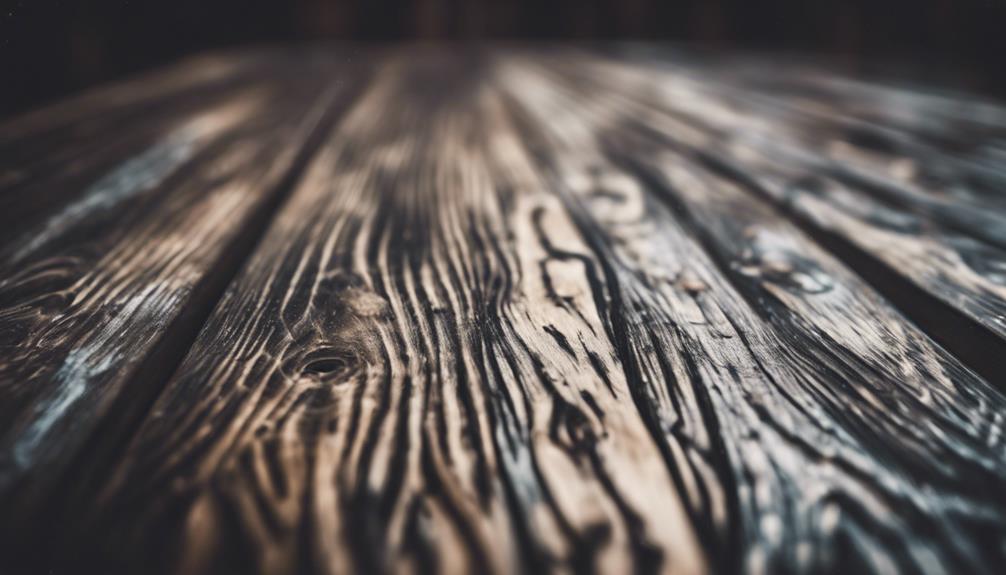
To achieve a wood-like finish with chalk paint, you'll need to select the right wood type, such as pine or plywood, and prepare the surface by sanding and wiping off dust. Choose warm, earthy tones and experiment with layering colors for depth and texture. Dry brushing and blending techniques can mimic the natural appearance of wood grain. To add realism, try painting knots and grains, and experiment with brush strokes and texture techniques. Finally, seal your work with clear wax and consider adding a distressed look. With these techniques, you're one step closer to creating a stunning, wood-like masterpiece – and there's still more to discover.

Key Takeaways

• Choose the right wood: Opt for pine or plywood, and avoid wood with heavy grain patterns for a realistic wood-like finish.

• Prepare the surface: Sand the wood thoroughly for smoothness and paint adhesion, and wipe off dust before applying the base coat of paint.

• Select earthy tones: Experiment with warm brown tones, earthy hues, and nature-inspired colors to create a convincing wood grain look.

• Master dry brushing: Use a nearly dry brush with light pressure to mimic the natural appearance of wood grain with long strokes.

Advertisement

• Add texture and details: Vary brushstrokes, add knots and grains, and experiment with blending chalk paint colors to achieve a realistic wood-like effect.

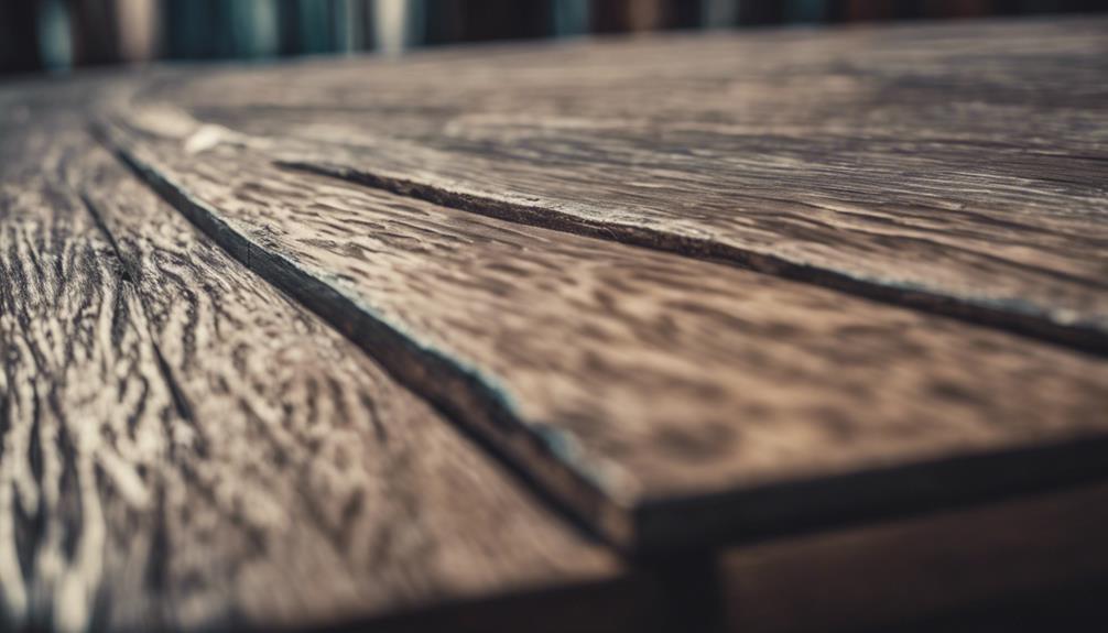
Selecting the Right Wood Type

When selecting the right wood for a realistic wood-like finish, opt for pine or plywood, as these types of wood will guarantee the best results with chalk paint.

Specifically, Annie Sloan Chalk Paint, a popular brand, works beautifully with these wood types.

Avoid using wood with heavy grain patterns, as they may disrupt the faux wood finish. Instead, choose wood planks that are approximately ¾ inch thick for a sturdy and realistic appearance.

Additionally, consider the size of your project and cut the wood planks to your desired lengths before applying chalk paint. This will guarantee a seamless finish and a more realistic wood-like effect.

Advertisement

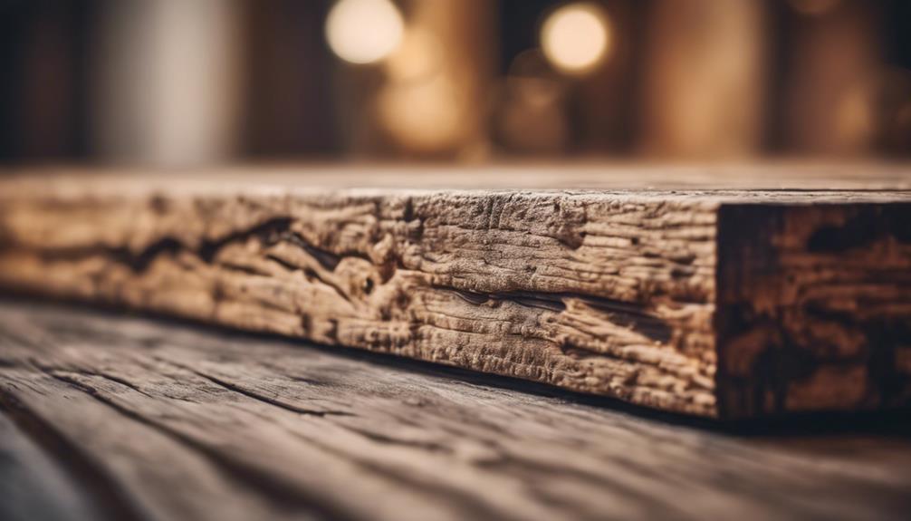
Preparing the Wood Surface

wood surface preparation steps

You'll achieve the best results by sanding the wood surface thoroughly to guarantee smoothness and enhance paint adhesion. This important step lays the foundation for a realistic wood-like finish with chalk paint.

As you sand, remember to wipe off any dust or debris from the surface before applying the base coat of paint. This secures a strong bond between the wood and the paint, reducing the likelihood of peeling or flaking.

Once you've applied the base coat, allow it to dry completely before proceeding with the next steps in the process. This patience will pay off when you're rewarded with a smooth, even finish.

For an added distressed look that mimics natural wood textures, lightly sand the dried base coat.

By following these steps, you'll be well on your way to achieving a wood-like finish that's both beautiful and convincing. Properly preparing the wood surface is essential, so take your time and don't rush through this critical step.

With a little patience and attention to detail, you'll be amazed at the results you can achieve with chalk paint.

Advertisement

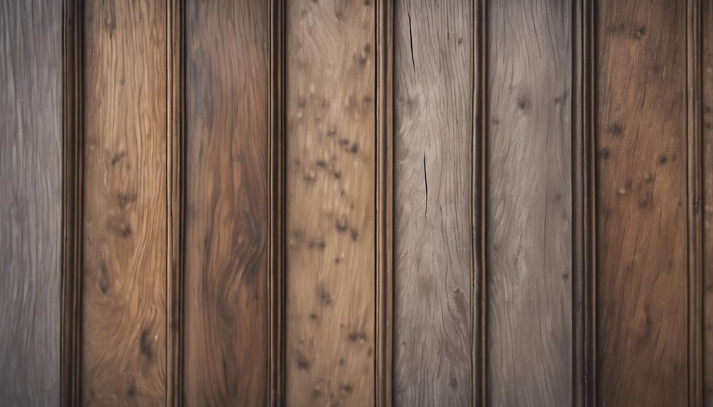
Choosing the Perfect Colors

selecting the ideal color palette

Now that you've prepared your surface, it's time to contemplate the colors you'll use to create a realistic wood effect. You'll want to ponder a range of options, from earthy tones like brown and tan to grayer hues, as well as how to combine them to achieve the perfect wood grain look.

As you start exploring your color palette, you'll also want to reflect on finding inspiration in nature and testing out different combinations to get the look just right.

Color Palette Options

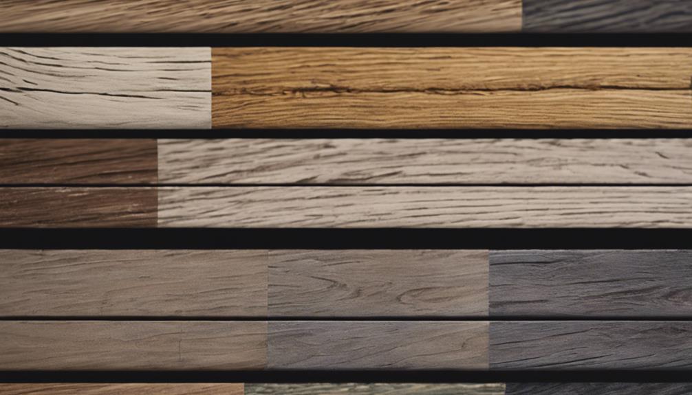
Your color palette options are essential in achieving a realistic wood look with Chalk Paint, and the right hues can make all the difference in mimicking the warmth and character of natural wood. Choosing the perfect colors can elevate your project from mediocre to magnificent.

Here are some color palette options to explore:

Color Palette Description
Warm Brown Tones Use 'Coco' or 'Arles' for a natural wood look
Rich Wood Grain Experiment with 'Graphite' or 'Graphite mixed with Florence' for a deep wood grain effect
Weathered Wood Layer 'Country Grey' and 'Paris Grey' with a touch of 'Old White' for a rustic finish
Classic Oak Finish Combine 'Chateau Grey' with 'Coco' and 'Provence' to mimic the warm tones of real wood

Wood Grain Inspiration

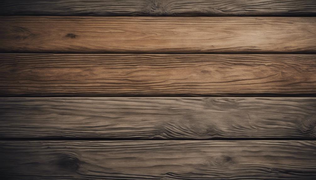
When it comes to capturing the essence of wood grain, earthy tones like browns, grays, and tans are your best friends, as they effortlessly mimic the natural warmth and character of real wood. These colors will help you achieve a wood-like effect that's both authentic and enchanting.

To add depth and variation to your wood grain design, mix different shades of paint to create a unique blend. Take inspiration from real wood textures like oak, pine, or walnut to get a realistic effect. Experiment with layering colors and blending techniques to achieve a lifelike wood appearance. Don't forget to use a fine brush to add intricate details like knots and grains for a more authentic look.

Advertisement

Nature-Inspired Hues

As you set out to capture the essence of wood grain, earthy tones become your trusted allies, guiding you towards a palette that echoes the natural world.

To achieve a realistic wood-like effect, you'll want to focus on hues that evoke the great outdoors. This means opting for warm, earthy tones like browns, grays, and beiges, which will help you create a convincing wood grain pattern.

When selecting your colors, keep the following tips in mind:

  • Warm undertones will help create a realistic wood grain effect
  • Mixing multiple shades of the same color can add depth and dimension to your design
  • Hints of green or blue can give your wood-like finish a weathered or aged appearance

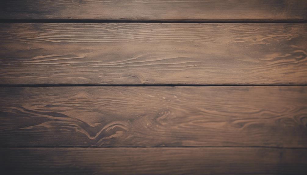
Dry Brushing Techniques Explained

dry brushing skin benefits

To achieve a realistic wood-like finish, you'll use a nearly dry brush to apply paint in a controlled, gentle manner. This technique, known as dry brushing, creates a textured, wood-like effect by leaving some areas unpainted.

By using light pressure and long strokes, you can mimic the natural appearance of wood grain, adding depth and character to your surface. Experiment with different shades and layering to enhance the realism of your faux wood finish.

As you work, remember to maintain a gentle touch, as excessive pressure can result in an uneven, unnatural appearance. By mastering the art of dry brushing, you'll be able to create a wood-like finish that's both convincing and beautiful.

Advertisement

With practice, you'll develop a keen sense of how to manipulate the paint and brush to achieve the desired effect. So, take your time, be patient, and get ready to express your creativity.

Blending Colors for Realism

creating realistic artwork techniques

As you explore the world of blending colors for realism, you'll want to focus on mastering natural wood tones. Experimenting with color gradation techniques and layering for depth are essential techniques. By doing so, you'll be able to create a wood-like effect that's incredibly convincing.

Natural Wood Tones

You can create a wide range of natural wood tones by blending different shades of chalk paint, allowing you to achieve a realistic look that's both convincing and visually appealing.

By experimenting with various color combinations, you can replicate the warmth and depth of real wood, adding authenticity to your faux wood planks.

To get started, try blending the following colors to achieve a natural wood tone:

  • Warm beige and golden brown for a light oak effect
  • Rich walnut and deep brown for a darker, more rustic look
  • Soft gray and beige for a weathered wood appearance.

Color Gradation Techniques

By layering chalk paint colors in a specific order, you can create a wood grain effect that's remarkably realistic. To achieve this, blend browns and grays to mimic the natural variations in wood grain.

Start with a base color and gradually layer darker or lighter shades for depth and dimension. Use a feathering technique with a dry brush to seamlessly blend different colors together, creating a smooth shift between shades.

Advertisement

Experiment with different paint application methods to mimic the natural variations in wood grain. For instance, you can use a dragging technique to create a wood grain pattern or a stippling technique to create a more textured look.

Before applying the color gradation technique to your entire project, practice on a small test surface to confirm the desired effect. By mastering this technique, you'll be able to create a wood-like finish that's both realistic and stunning.

Layering for Depth

To build depth and realism in your wood grain effect, layering different shades of chalk paint is key, allowing you to create a dimensional, textured look that mimics the natural variations found in real wood. By combining multiple shades, you can achieve a rich, multi-tonal appearance that captures the complexity of real wood.

To get started, select a base color that represents the dominant tone of the wood you're trying to replicate. Then, add darker and lighter shades to create contrast and visual interest. Finally, blend the colors together using a dry brush technique to create a seamless shift between shades.

Some key considerations to keep in mind as you layer your chalk paint include:

Advertisement

Focus on creating knots, grains, and patterns typical of wood for a realistic appearance.

Experiment with different color combinations and blending techniques to achieve the desired wood-like effect.

Don't be afraid to try new things and adjust your approach as needed to achieve the look you want.

Adding Knots and Grains

tying woodwork showcasing details

With a fine brush in hand, carefully craft knots and grains that convincingly mimic the natural textures found in wood. To add authenticity to your faux wood planks, focus on creating realistic wood textures.

Technique Description
Painting Knots Use a darker shade of paint to create small circular shapes, blending them into the surrounding area.
Painting Grains Apply long, thin lines using a lighter shade of paint to mimic natural wood patterns.
Varying Grains Change the direction and thickness of the grains to achieve an authentic wood-like appearance.
Brush Strokes Experiment with different brush strokes to achieve a realistic and textured finish.
Patience Take your time, as achieving a realistic wood-like effect requires patience and practice.

Texture and Dimension Techniques

exploring artistic texture techniques

You can create a remarkably realistic wood texture by using a dry brush technique with chalk paint, which helps to mimic the natural grain patterns found in wood. This technique is essential in achieving a wood-like effect, as it adds depth and dimension to your painted surface.

By using a dry brush, you can create a textured, layered look that resembles the natural grain of wood.

To take your wood-like effect to the next level, try these techniques:

Advertisement
  • Apply paint in long strokes, varying shades to create a natural, multi-tonal look.
  • Use a fine brush to add knots and grains, enhancing the wood-like effect.
  • Blend different colors to achieve depth and realism in the faux wood grain.

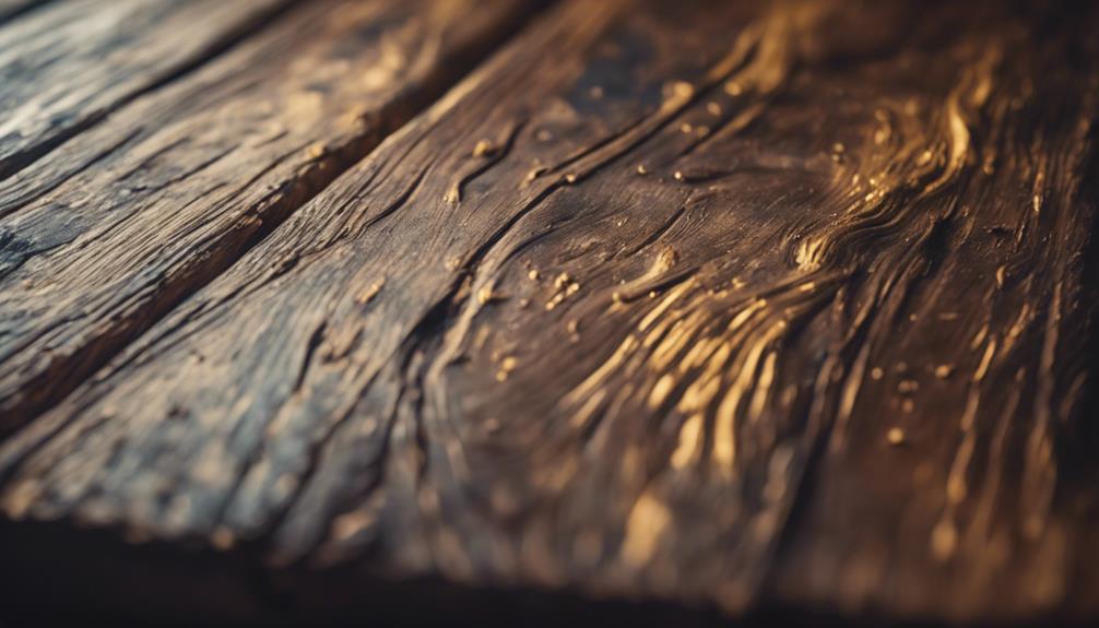
Clear Wax Finishing Touches

polished waxing for furniture

Your faux wood planks are now ready for a clear wax finish that seals and protects the chalk paint, giving your project a polished, professional look. This final step is essential in ensuring your hard work lasts for years to come.

By applying clear wax, you're not only sealing the paint but also making it more durable and resistant to wear and tear. After applying the wax, use a clean cloth to buff the surface, and you'll be left with a smooth, polished finish.

The clear wax will enhance the natural look of the wood grain effect you've created with chalk paint, making it almost indistinguishable from real wood. By adding this final layer of protection, you're guaranteeing a long-lasting, professional finish that will withstand the test of time.

With clear wax, you can be confident that your faux wood planks will remain vibrant and beautiful for years to come.

Creating a Distressed Look

distressed denim fashion trend

As you work on creating a distressed look, you're aiming to achieve a weathered wood appearance, where the paint layers appear faded and worn.

To get this effect, you'll focus on sanding specific areas, such as edges and corners, to reveal the underlying base coat and create a sense of age.

Weathered Wood Appearance

Achieving a weathered wood appearance with chalk paint requires a combination of subtle layering and deliberate distressing techniques. To create a realistic weathered wood look, you'll need to focus on building up layers of paint and strategically distressing the surface.

Advertisement

Here are some techniques to try:

  • Sand the base coat lightly to reveal the wood underneath and create a weathered appearance.
  • Apply additional layers of paint in different shades to mimic natural wood variations and imperfections.
  • Use a dark wax to enhance the distressed look and add depth to the faux wood grain.

When applying these techniques, focus on the edges and corners of your piece to create a more realistic weathered wood effect. Don't be afraid to experiment with different techniques like dry brushing and sanding to achieve a customized distressed look.

Faded Paint Layers

By strategically layering multiple coats of chalk paint in different shades, you can create a distressed look that captures the worn, weathered essence of aged wood. To achieve this faded, layered effect, allow each coat to dry completely before applying the next, gradually building up the color and texture.

As you work, use a sanding block or sandpaper to lightly distress the paint, revealing the underlying colors and creating a sense of depth and history. Focus on areas that would naturally wear over time, such as edges, corners, and high-traffic areas, to create a realistic, aged appearance.

Experiment with varying pressure and sanding techniques to achieve a truly unique, distressed look. By doing so, you'll add character and visual interest to your project, making it look like a genuine, weathered wood finish.

With a little patience and practice, you can master the art of creating faded paint layers that convincingly mimic the beauty of aged wood.

Advertisement

Tips for a Realistic Finish

realistic painting finish techniques

To achieve a realistic finish, you can employ a combination of techniques that mimic the natural patterns and colors of wood. By mastering these techniques, you'll be able to create a wood-like effect that's incredibly convincing.

Here are some essential tips to help you achieve a realistic finish:

  • Vary your brushstrokes: Apply paint in long, smooth strokes to mimic the natural look of wood grain, and use a dry brush technique with Annie Sloan Chalk Paint to create realistic wood grain on wood planks.
  • Play with colors: Vary shades of paint to imitate different wood tones and textures for a more authentic appearance. Blend colors together to achieve depth and dimension, enhancing the overall realism of the faux wood planks.
  • Add finer details: Use a fine brush to add knots and grains to enhance the wood-like effect, creating a more realistic finish.

Frequently Asked Questions

How to Get Chalk Paint to Look Like Wood?

To achieve a wood-like appearance with chalk paint, start by selecting the appropriate surface, such as pine or plywood, with a smooth finish.

Next, use a dry brush to simulate a wood-grain effect by applying different shades of chalk paint in long strokes.

For added authenticity, use a fine brush to incorporate knots and grains.

How Do You Make Painted Wood Look Like Real Wood?

To make painted wood look like real wood, you'll want to master a few techniques.

First, use a dry brush to apply paint in long, sweeping strokes, mimicking the natural grain of wood. Vary your strokes and shades to achieve depth and realism.

Advertisement

Add knots and grains with a fine brush, blending colors to create a textured appearance.

Finish with a clear wax coat for protection and a smooth finish, distressing as desired for an authentic look.

How Do You Paint Wood Like Effects?

You're looking to paint wood-like effects, and you're wondering how to achieve that realistic look.

To start, grab a dry brush and apply chalk paint in long strokes, varying shades to mimic wood grain.

Add knots and grains with a fine brush, blending colors for depth.

Advertisement

Finish with clear wax and buff for a smooth finish.

What Paint Makes Things Look Like Wood?

When it comes to painting surfaces to resemble wood, you're likely wondering what paint makes things look like wood. The answer lies in Annie Sloan Chalk Paint, a popular choice for achieving wood-like effects.

This paint allows for easy application and manipulation to create realistic wood grain patterns. By using a dry brush technique and varying shades of paint, you can mimic the natural look of wood, making it an ideal choice for your project.

Conclusion

As you step back to admire your handiwork, the grain of the wood seems to jump out at you, and the subtle nuances of the colors blend together in harmony.

The dry brushing and blending techniques have conspired to create an illusion so convincing, you can almost smell the wood.

Advertisement

You've managed to tame the chalk paint, bending it to your will to create a wooden masterpiece that's more than just a pretty facade – it's a work of art that whispers 'wood' to all who lay eyes on it.

Continue Reading
Advertisement

Home Decor

How to Style Open Shelving the Country Way Without Clutter

Find out how to achieve a clutter-free, country-style open shelving look that showcases your unique charm and warmth—discover the secrets inside!

Published

on

By

country style open shelving tips

To style your open shelving the country way without clutter, start by choosing a cohesive color palette of warm, muted tones. Use natural materials like wood and wicker for a rustic charm. Incorporate varied textures to enhance visual interest, and display intentional decorative elements like ceramic vases or vintage pitchers in cohesive groupings. Use sturdy wooden shelves and vintage metal brackets for support, and consider warm lighting to create an inviting atmosphere. By focusing on these details, you'll maintain a clean look while showcasing your personal style. There's more to explore that can help you refine your approach even further.

Key Elements

essential components overview

When styling your open shelving, the key elements to contemplate are color scheme, materials, and textures.

These aspects not only define the overall aesthetic but also influence how inviting your space feels.

Color Scheme

A cohesive color palette is essential for styling open shelving in a country aesthetic, often featuring warm, muted tones like soft whites, earthy browns, and gentle greens. This color scheme evokes a rustic feel that enhances the overall charm of your space.

To keep things visually appealing, limit your palette to two or three complementary shades. This approach maintains a clean and uncluttered appearance, preventing any overwhelming sensations when you look at your shelves.

You can also add accents of brighter colors, such as deep reds or soft blues, to create focal points without cluttering the design. These accents can be incorporated through dishware or decorative pieces, adding interest while keeping with the overall color scheme.

Advertisement

Consistency is key; guarantee that all items on your shelves reflect this chosen palette. Whether it's your dishware, décor, or storage solutions, a uniform color scheme fosters a harmonious display.

This not only contributes to an inviting atmosphere but also showcases your personal style in a way that feels effortlessly country. By thoughtfully selecting your colors, you'll create a lovely and organized open shelving display that resonates with warmth and charm.

Materials

Natural materials like wood and wicker are essential for creating a rustic charm that complements the country aesthetic of your open shelving. Choose sturdy wooden shelves with a natural finish to showcase your favorite items while adding warmth to your space. Wicker baskets can serve both decorative and practical purposes, perfect for storing smaller items and keeping clutter at bay.

Incorporating metal accents, like galvanized containers or wrought iron hooks, adds a vintage touch that contrasts beautifully with the wooden shelves. This combination enhances the overall look while maintaining functionality. Select decorative ceramics and earthenware that reflect handcrafted details, showcasing items that resonate with country living.

Additionally, a cohesive color palette featuring muted tones—soft whites, greens, and browns—will enhance the calm atmosphere of your shelves. Layer in textiles like plaid or gingham through table runners or small decorative baskets to introduce a hint of pattern and softness without overpowering your shelves.

Advertisement

This thoughtful approach to materials not only elevates the aesthetic but also guarantees your open shelving remains organized and inviting.

Textures

Incorporating various textures like rustic wood, woven baskets, and metal accents can create a warm and inviting country aesthetic on your open shelves. Start by using natural materials such as ceramic or stone pottery. These elements add an organic touch and provide visual interest, enhancing the overall country vibe.

Next, layer different textiles, like linen or burlap, in decorative trays or baskets. This introduces softness and contrast against harder surfaces, making your display feel balanced.

Don't forget to introduce greenery through potted plants or dried herbs. They not only add texture but also enhance the rustic charm of your shelves.

Mixing and matching smooth and rough textures creates depth, ensuring your display isn't cluttered. Each item can have its own space to shine, creating a cohesive look.

Advertisement

Essential Fixtures and Furniture

key furnishings and installations

When styling your open shelving, consider incorporating rustic wooden shelves that not only provide a sturdy display but also set a warm tone.

Pair them with vintage metal brackets to add a touch of character and guarantee everything stays secure.

Don't forget to include antique glass jars for a charming storage solution that enhances the overall aesthetic.

Rustic Wooden Shelves

Rustic wooden shelves bring warmth and character to your space, making them essential fixtures in any country-style kitchen or living area. Often crafted from reclaimed or distressed wood, these shelves add a unique charm that enhances your decor. The natural grain and texture serve as a stunning backdrop for your favorite decorative items, allowing you to showcase both functional kitchenware and personal treasures.

To keep your rustic wooden shelves looking tidy, focus on a few key pieces that reflect your style. Limiting the number of displayed items helps prevent clutter and maintains visual harmony. Consider incorporating adjustable wooden shelves for flexibility, so you can easily rearrange or update your displays as your tastes evolve.

Pairing these rustic wooden shelves with metal brackets can create an appealing contrast, balancing rustic charm with modern design elements. This combination not only enhances the aesthetic but also provides sturdy support for your items.

Advertisement

With careful selection and styling, rustic wooden shelves can transform your space into a cozy, inviting environment that showcases your personality while staying organized.

Vintage Metal Brackets

Vintage metal brackets serve as essential fixtures that not only provide sturdy support for your open shelving but also add a charming decorative element to your space. These brackets often feature intricate designs or unique patinas that enhance the vintage aesthetic, making them a focal point in your shelving arrangement.

Available in materials like wrought iron, brass, or galvanized steel, vintage metal brackets can complement various color palettes and styles within your country-themed decor. When you install them properly, they guarantee stability and safety for your shelves, allowing you to display heavier items like books or decorative pieces without worry.

Incorporating vintage metal brackets into your open shelving not only elevates the visual appeal but also reflects a commitment to sustainable design by repurposing historical materials. Choosing the right vintage metal brackets can tie your whole design together, seamlessly blending functionality with style.

Antique Glass Jars

Antique glass jars offer a charming way to store and display a variety of items while enhancing the aesthetic of your open shelving. These versatile storage solutions can help organize pantry items, showcase preserved homemade goods, or even display dried flowers. With various sizes and shapes, antique glass jars often come adorned with delightful details like embossed designs or metal clasps, contributing a rustic touch to your kitchen or living space.

Advertisement

By incorporating antique glass jars into your open shelving, you create a visually appealing display that minimizes clutter. Use them to hold spices, grains, or crafting supplies, making it easy to find what you need while keeping your space tidy. The transparency of glass allows for easy visibility of contents, encouraging organization and helping to avoid overcrowding—showcasing only your essentials.

You can find antique glass jars at thrift stores, flea markets, and online marketplaces, often at affordable prices. This accessibility makes it easy to add a touch of country charm to your decor while maintaining a clean, curated look.

Lighting Ideas

creative illumination solutions

When it comes to lighting your open shelves, you've got some fantastic options to enhance both style and functionality.

Consider warm pendant lights for a welcoming glow, or soft LED strip lighting to showcase your favorite items.

Rustic lanterns and hanging mason jar lights can add charming accents while setting the perfect ambiance.

Warm Pendant Lights

Warm pendant lights can transform your open shelving into a cozy focal point, providing both practical illumination and style that complements country decor.

Advertisement

Opt for designs that feature vintage or rustic elements, as these will enhance the inviting ambiance of your space. Materials like wrought iron, wood, or glass paired with warm-toned bulbs work beautifully with the natural textures typical of country style.

When installing warm pendant lights, aim for a height that allows the light to illuminate your shelves without obstructing the view of your displayed items. This creates a welcoming atmosphere in your kitchen or living area. Dimmable warm pendant lights are also a great option, letting you adjust the brightness depending on the time of day or occasion.

For an added touch of whimsy, consider grouping pendant lights in clusters or varying their heights. This not only emphasizes the charm of open shelving but also makes your space feel more dynamic and visually appealing.

With the right warm pendant lights, you'll create a functional yet stylish focal point that enhances the overall country aesthetic of your home.

Soft LED Strip Lighting

Soft LED strip lighting instantly elevates your open shelving by creating a warm ambiance that beautifully showcases your favorite items. You can easily install these lights under shelves or along edges, adding a gentle glow that highlights decorative elements without overwhelming your space. The energy efficiency and longevity of soft LED strip lighting—lasting up to 50,000 hours—make it a cost-effective choice for enhancing your decor.

Advertisement

With an adjustable color temperature around 2700K, these lights emit a soft, warm glow that complements the rustic charm of country-style decor. If you want to set the mood for entertaining or casual family gatherings, consider using dimmable LED strips to customize the brightness and reduce glare on displayed objects.

Incorporating soft LED strip lighting into your open shelving design draws attention to vintage dishware, plants, or other cherished items, adding depth and character to your overall aesthetic. This way, you can create a cozy atmosphere while maintaining a clutter-free look that enhances your home's style.

Embrace the beauty of soft LED strip lighting and transform your open shelving into a stunning focal point.

Hanging Mason Jar Lights

Hanging mason jar lights offer a unique way to enhance your open shelving with rustic charm while providing gentle illumination. You can easily transform mason jars into stunning light fixtures using string lights, battery-operated LED lights, or small Edison bulbs for that vintage vibe.

To create visual interest in your space, consider hanging these lights in clusters or at staggered heights. This arrangement not only adds dimension but also complements the country aesthetic you're aiming for. Incorporating twine or burlap accents when suspending the mason jars can further emphasize a farmhouse style, tying in beautifully with other country-themed decor elements.

Advertisement

When selecting jars, opt for clear or frosted varieties to allow for light diffusion. This choice creates a warm and inviting atmosphere while ensuring your shelving remains practical and stylish.

Rustic Lanterns for Ambient Light

Rustic lanterns bring a cozy, inviting glow to your open shelving, enhancing the country charm of your space while serving as functional lighting. These versatile pieces can act as both decorative accents and practical light sources in your kitchen or living room. You can find rustic lanterns made from various materials like wrought iron, wood, and glass, allowing you to complement the natural textures common in country decor.

For added flexibility, consider using battery-operated or solar-powered rustic lanterns. This way, you won't need to worry about electrical outlets, making them perfect for open shelving. To create visual interest, arrange lanterns in varying heights. This tactic prevents overcrowding while ensuring your shelves make a statement.

Don't forget to pair rustic lanterns with seasonal elements like dried flowers or pinecones. This keeps your display fresh and aligned with the changing seasons, enhancing the overall aesthetic. By thoughtfully incorporating rustic lanterns into your open shelving, you can achieve a warm ambiance that reflects the cozy, inviting spirit of country living.

Decorative Elements

artistic design features

When styling your open shelves, consider incorporating a wildflower-filled ceramic vase for a pop of color and charm.

A vintage enamel pitcher can add a rustic touch, while a handcrafted wooden figurine brings warmth and character.

Advertisement

These decorative elements not only enhance your display but also reflect your personal style.

Wildflower-Filled Ceramic Vase

A wildflower-filled ceramic vase brings a touch of nature indoors, instantly enhancing the warmth and charm of your open shelving. This rustic element not only adds beauty but also serves as a focal point, drawing the eye and creating a welcoming atmosphere typical of country decor.

When selecting your vase, choose one with earthy tones or intricate patterns that complements the wildflowers' natural beauty. You can use fresh or dried wildflowers, allowing for seasonal updates that keep your display dynamic and reflective of the changing environment.

To avoid clutter, group your wildflower vase with complementary items like wooden accents or vintage books, creating a cohesive vignette that feels intentional and organized. Regularly changing the wildflowers is key to maintaining freshness and visual interest.

This simple act keeps your decor lively and guarantees the vase remains the focal point of the arrangement. By incorporating a wildflower-filled ceramic vase into your open shelving, you'll not only enhance the aesthetic but also bring a bit of the outdoors inside, making your space feel more inviting and alive.

Advertisement

Vintage Enamel Pitcher

Incorporating a vintage enamel pitcher on your open shelving instantly adds charm and character, making it a standout decorative element that enhances your space. These pitchers come in various colors and designs, allowing you to select one that complements your existing color palette while introducing a pop of visual interest.

To create an inviting and cohesive vignette, consider styling your vintage enamel pitcher alongside other vintage items, like mismatched teacups or rustic wooden bowls. This arrangement not only showcases the pitcher but also emphasizes a country-style aesthetic. For added appeal, fill the pitcher with dried flowers or branches—this brings an organic feel to your shelves without overwhelming the overall look.

To maintain a clutter-free environment, limit the surrounding decorative items to three or four pieces. This guarantees your vintage enamel pitcher remains the focal point, standing out against a carefully curated backdrop.

Handcrafted Wooden Figurine

Adding handcrafted wooden figurines to your open shelving introduces a rustic charm that beautifully complements the vintage enamel pitcher and enhances your country-style decor.

These unique pieces not only reflect the warmth and character of country aesthetics but also serve as focal points that draw the eye and create visual interest.

Advertisement

When selecting a handcrafted wooden figurine, look for designs that represent nature, animals, or traditional country themes. This choice reinforces your overall aesthetic while adding a personal touch.

To achieve a cohesive and inviting look, group your figurines with other natural elements like greenery or woven baskets. This combination creates a harmonious display that feels well-thought-out and curated.

Consider the scale of your figurines as well. Larger handcrafted wooden figurines can anchor a shelf, while smaller ones can fill in gaps, ensuring your arrangement remains uncluttered.

Flooring

quality flooring installation services

When you're considering flooring options for a space with open shelving, think about how the floor can complement your overall aesthetic.

Reclaimed barn wood planks, distressed whitewashed oak boards, and weathered gray ash flooring all bring unique textures and tones that enhance the rustic charm.

Choosing the right flooring not only supports your decor but also creates a cohesive look throughout the room.

Advertisement

Reclaimed Barn Wood Planks

Reclaimed barn wood planks bring a unique rustic charm to your open shelving, showcasing distinctive textures and colors that new wood simply can't match. When you choose this eco-friendly option, you're not just enhancing your decor; you're repurposing materials that would otherwise go to waste. This choice reduces the demand for new timber and lessens your environmental impact.

The natural durability of reclaimed wood makes it an ideal choice, especially for high-traffic areas or homes with children and pets. With varying widths and lengths, these planks allow for versatile installation patterns that elevate the aesthetic appeal of your space. You can create beautiful displays on your open shelving without feeling cluttered.

When finished correctly, reclaimed barn wood planks reveal stunning grain patterns, adding character and warmth to your shelves. This unique wood not only enhances your decor but also maintains a clean and organized look. So, if you're aiming for a country-themed style, incorporating reclaimed barn wood planks will guarantee your open shelving stands out as a focal point, blending functionality with rustic beauty effortlessly.

Distressed Whitewashed Oak Boards

Distressed whitewashed oak boards offer a perfect blend of rustic charm and modern elegance for your open shelving, creating a bright and airy feel in any space. You'll love how the whitewashing process enhances the natural grain of the oak, giving your home a fresh, inviting look. These boards not only brighten your area but also provide the durability needed in high-traffic spots like kitchens and living rooms.

When you choose distressed whitewashed oak, you're embracing a design that thrives on a relaxed, lived-in aesthetic. The distressed finish helps mask scratches and wear, ensuring your flooring maintains its beauty even amidst daily use. You can easily pair these boards with various color palettes, from soft pastels to bold, earthy tones, making it simple to achieve the country style you love.

Advertisement

Incorporating open shelving with distressed whitewashed oak flooring creates a cohesive look that ties your décor together. As you display your favorite kitchenware or charming decor, the flooring underneath will enhance the overall ambiance, allowing you to enjoy the perfect mix of functionality and style in your home.

Weathered Gray Ash Flooring

Weathered gray ash flooring brings a blend of durability and rustic charm, making it a perfect choice for high-traffic areas in your country-style home. Its natural variations in grain and color add character to your space, enhancing the overall aesthetic. This resilient flooring features a matte finish that not only hides scratches and dirt but also promotes low maintenance, perfect for busy households.

As you style your open shelves, consider how the neutral tones of weathered gray ash can beautifully coordinate with your décor. Whether you're displaying vintage kitchenware or rustic décor items, the flooring acts as a subtle backdrop that draws attention to your curated pieces. The warmth of the wood complements the inviting atmosphere typical in country interiors, creating a cohesive look that feels both homey and stylish.

Additionally, sourcing this flooring from sustainable forests aligns with eco-conscious design principles, giving you peace of mind. By choosing weathered gray ash, you're not just investing in a flooring option; you're enhancing the charm of your home while maintaining a commitment to the environment. Enjoy the blend of beauty and practicality in your living space!

Conclusion

By incorporating these key elements into your open shelving, you can achieve a charming country-style look without the clutter.

Advertisement

Choose essential fixtures and furniture that complement your space, and don't forget to add warm lighting to create an inviting atmosphere.

Use decorative elements sparingly to maintain an organized feel, and consider your flooring to enhance the overall aesthetic.

With these tips, you'll transform your open shelves into a stylish focal point that reflects the beauty of country living.

Continue Reading

Home Decor

August Color Palettes That Will Transform Your Home – Try Them Today!

Discover vibrant August color palettes that can transform your home, but wait until you see the unexpected accents that will elevate your space!

Published

on

By

transform your home colors

Looking to transform your home this August? Embrace vibrant color palettes to ignite your space. Start with Pink Dawn as your bold centerpiece, complemented by Symphony Blue and Jamaican Aqua for a lively mix. Adding white brings balance, while gold accents and natural elements enhance the bohemian vibes. Don't shy away from incorporating hot pink accents in unexpected places—like kitchens and bathrooms. This combination energizes your decor without overwhelming it. With these ideas, you're well on your way to creating a fresh atmosphere. Stick around, and you'll discover even more tips to elevate your home's style!

Key Takeaways

  • Embrace vibrant hues like Pink Dawn, Symphony Blue, and Jamaican Aqua to energize your living spaces this August.
  • Incorporate white accents for visual balance, enhancing the overall aesthetic of your decor.
  • Use gold accents and natural elements to add a bohemian flair to your interior design.
  • Experiment with layering colorful rugs and throw pillows for a cozy, inviting atmosphere.

Embracing Color Trends

Embracing color trends means welcoming vibrant hues like pink into your home, transforming spaces with a fresh and expressive flair. As you explore the emerging dominance of pink, consider how it can redefine your design aesthetic. This isn't just any pink—Millennial Pink is leading the charge, reflecting a cultural shift towards embracing bold colors in home decor.

To create a harmonious environment, start by developing a mood board that features August's color palette. Incorporate Pink Dawn as your main shade, pairing it with Symphony Blue and Jamaican Aqua. This combination will breathe life into your rooms, moving away from traditional neutrals and adding a lively touch.

Don't forget to enhance your design with gold accents and natural elements. These additions can elevate the overall aesthetic, making your space feel more inviting and textured.

August's Signature Color Palette

august color palette selection

August's signature color palette showcases Pink Dawn as the vibrant centerpiece, offering versatility for walls or ceilings. This striking shade isn't just a trend; it's a reflection of how colors have evolved over the years. You can easily transform a space by incorporating this bold pink into your decor.

Complementing Pink Dawn, Symphony Blue and Jamaican Aqua provide invigorating tones that breathe life into your rooms. These colors create a soothing contrast while remaining in harmony with the energetic pink. Adding white enhances visual balance, allowing the vibrant Pink Dawn to shine even more.

To elevate the overall look, consider incorporating gold accents and natural elements like orchids and hibiscus. These touches bring a bohemian flair, making your home feel both stylish and inviting.

Advertisement

This color palette not only embraces current trends but also encourages you to think outside the box when it comes to color choices.

Personal Reflections on Pink

introspective thoughts on pink

You might find your feelings about pink have changed over time, especially as life events influence your color preferences.

Once seen as just a childish hue, pink can now represent a bold choice in your home decor.

As you embrace brighter shades, consider how these shifts reflect your personal journey and evolving taste.

Journey to Embrace Pink

The journey to appreciate pink unfolded unexpectedly after welcoming a daughter, transforming my initial resistance into a vibrant acceptance of the color. You might find that your own experiences color your perspective, just as mine did.

While I once shied away from pink, especially pastel shades, I embraced hot pink with enthusiasm. It became a bold statement in my wardrobe and home decor.

Advertisement

Incorporating pink hasn't only brightened my space but also reflected a broader cultural shift towards more dynamic colors. You may notice this trend too, where blush tones are predicted to dominate upcoming fall palettes. This evolution in taste showcases how personal experiences can reshape our preferences.

Consider these aspects of your journey with pink:

  • The emotional connections tied to specific colors
  • The influence of personal milestones, like having children
  • The shift in societal color trends
  • The contrast between pastel and vibrant shades

Embracing pink, particularly in its bolder forms, can reinvigorate your surroundings and enrich your experiences. So why not take a chance on this lively hue?

Personal Color Preferences Shift

As life experiences unfolded, personal color preferences shifted dramatically, illustrating how our journeys can reshape our views on hues like pink. You might remember a time when pastel pink felt like a color to avoid, steeped in negative memories. However, welcoming a daughter into your life can change everything. Suddenly, the softness of pink transforms from something you resist to a color that carries warmth and joy.

Though pastel shades still don't resonate with you, vibrant hues like hot pink have found a place in your heart. This shift isn't just about embracing a new color; it represents a deeper evolution in your taste. You've slowly woven pink into your wardrobe and home, reflecting your changing perspective.

In this broader context, it's fascinating to see how cultural trends, like the rise of Millennial Pink, resonate with your own transformation. Your journey with pink showcases the power of personal experiences in shaping color preferences and design choices. By allowing yourself to explore the spectrum of pink, you reveal a vibrant part of your identity, demonstrating that even our color preferences can grow and evolve over time.

Advertisement

Pink in Home Decor

Embracing pink in home decor has transformed my living space into a vibrant reflection of my evolving taste, blending warmth and joy in unexpected ways. Initially, I resisted pastel shades due to their associations, but after welcoming a daughter, my perspective shifted. Now, I lean towards bold, vibrant shades like hot pink that energize my space while steering clear of softer pastels.

Integrating pink into my decor has revealed its versatility, allowing me to create a dynamic atmosphere. As pink gains popularity, especially Millennial Pink, it signifies a cultural shift towards bolder choices in home design. Engaging in conversations with others, I've discovered diverse opinions on how striking pink can be, particularly when paired with other colors like gray.

Here are some ways to incorporate pink into your home decor:

  • Use hot pink throw pillows to add a pop of color to neutral sofas.
  • Paint an accent wall in a bold pink to create a focal point.
  • Accessorize with pink artwork that complements your existing decor.
  • Choose vibrant pink rugs to enliven your floors.

Explore the transformative power of pink and see where it takes you!

Bohemian Decor Essentials

bohemian style home essentials

How can you transform your space into a vibrant bohemian haven filled with personality and warmth? Start by embracing a lively mix of colors, patterns, and textures that reflect your unique style.

Layer colorful rugs and throw pillows to create a cozy atmosphere. These textiles not only add depth but also enhance the eclectic feel that defines bohemian decor.

Incorporate plants like orchids and hibiscus to breathe life into your home. These natural elements connect your space to the outdoors, making it feel fresh and inviting.

Advertisement

Don't forget to include diverse materials such as wood, metal, and woven elements; they contribute to the layered look that's essential in bohemian design.

Curate your space with unique art pieces and decor items collected from travels or local markets. These treasures tell your story and showcase your individuality.

The key to a successful bohemian vibe is personalization, so let your creativity shine through every aspect of your decor. Mix and match until you find the perfect balance that reflects your personality, and you'll create a warm, vibrant sanctuary that feels truly like home.

Community Color Conversations

engaging local dialogue sessions

Let's talk about your color journey!

Share your favorite combinations and how you've used pink in your home decor.

Your experiences can spark inspiration for others in our vibrant community!

Advertisement

Share Your Color Journey

Sharing your color journey not only sparks inspiration but also builds a vibrant community where everyone can explore their unique tastes and preferences in home decor. Engaging with others about color choices fosters a rich dialogue and allows you to learn from diverse opinions. You might discover why pink resonates with some while gray appeals to others.

The comments section is a fantastic platform for exchanging insights and suggestions. You can share how you incorporated trending colors into your space or ask for advice on your current project. Plus, participating in monthly color challenges on social media lets you showcase your creativity and inspire others.

Here are some ways to enhance your color journey:

  • Share photos of your color transformations.
  • Discuss your favorite color palettes and why they speak to you.
  • Offer tips on blending colors effectively in your home.
  • Invite friends to join in on color challenges.

Favorite Color Combinations

Immerse yourself in the vibrant world of favorite color combinations, where each pairing tells a story and reflects personal style. In this community, you'll discover a treasure trove of color palettes that resonate with diverse preferences and experiences. Many members find joy in combining pink with complementary hues like Symphony Blue and Jamaican Aqua, creating lively atmospheres that are both modern and inviting.

As you explore these combinations, you'll notice the emotional connections people have with their chosen colors. Each story shared can inspire you to think differently about your own color choices. The ongoing dialogue encourages you to experiment with new palettes, fostering creativity in your home decor.

Don't shy away from expressing your own favorites! The community thrives on feedback and shared experiences, making it a welcoming space for everyone. Whether you're drawn to soft pastels or bold contrasts, there's a combination waiting for you to investigate.

Advertisement

Plunge into these conversations, and you might just find the perfect palette that transforms your living space into a reflection of your unique style. Embrace the journey and let your home shine with colors that speak to you!

Pink in Home Decor

As you explore favorite color combinations, you'll find that pink is making a bold statement in home decor, capturing attention with its versatility and warmth. This year, Blush is set to dominate fall color palettes, reflecting a cultural shift towards vibrant choices. You'll notice Pink Dawn as a key player in August's palette, beautifully complemented by Symphony Blue and Jamaican Aqua.

Homeowners are increasingly embracing pink, moving from a dislike of pastels to celebrating bolder shades like hot pink. This transformation is especially evident in bohemian aesthetics, where pink is integrated with textiles, plants, and natural materials to create an inviting atmosphere.

Consider these ideas to incorporate pink into your decor:

  • Pair pink with neutral tones like gray for a sophisticated look.
  • Use hot pink accents to energize a room without overwhelming it.
  • Incorporate pink textiles, like throw pillows or rugs, to add warmth.
  • Combine pink with vibrant greens to enhance a natural feel.

Embrace the versatility of pink, and watch your space transform into a vibrant haven!

Seasonal Decorating Tips

creative seasonal decor ideas

Transform your space with seasonal colors that reflect the vibrant energy of August, using shades like Pink Dawn, Symphony Blue, and Jamaican Aqua. These hues not only create a rejuvenating ambiance but also energize your home decor during the summer months.

To enhance this look, consider adding white accents alongside pink, as they provide visual balance and highlight the vibrant tones in your decor. Incorporate gold accents and natural elements like greenery to add texture and interest, contributing to a bohemian aesthetic that flourishes in warm weather.

Advertisement

Rotating seasonal colors in textiles, such as throw pillows and blankets, can effortlessly revitalize your home while creating a cozy atmosphere that resonates with August's spirit. Don't overlook the impact of small changes; introducing plants like orchids and hibiscus can greatly enhance the vibrancy of your living spaces.

These elements bring life and a touch of nature indoors, making your home feel more inviting. By embracing these seasonal decorating tips, you'll capture the essence of August and transform your home into a stylish, lively retreat. Get ready to enjoy the beauty of summer right inside your own space!

Resources for Color Inspiration

color inspiration resource guide

To find the perfect color inspiration for your home, explore a variety of resources that cater to your unique style and preferences. With the right tools and communities at your fingertips, you'll discover palettes that resonate with you and elevate your space.

  • Color analysis tools: Use free quizzes to determine your personal color types, helping you enhance your style.
  • Pinterest: Browse for downloadable resources like color palettes and wheels to aid in planning your color combinations.
  • Social media challenges: Participate in weekly color challenges on platforms like Instagram and Facebook to engage with fellow color enthusiasts and share your journey.
  • Blogs: Access insightful blog posts that offer tips on choosing paint colors, considering color psychology, and exploring trending hues for home decor inspiration.

Frequently Asked Questions

What Are the Colors for the Month of August?

For August, you've got Pink Dawn as the main color, paired with Symphony Blue and Jamaican Aqua for cool accents. Adding white creates balance, while gold accents and greenery enhance the overall vibe beautifully.

What Color Goes Best With August?

Did you know that 60% of people feel more relaxed in pink environments? For August, consider pairing Pink Dawn with Symphony Blue and Jamaican Aqua. They create a vibrant yet calming atmosphere in your space.

How Do I Choose a Color Palette for My New Home?

To choose a color palette for your new home, start with a main color you love. Then, select complementary shades and neutrals, adding accents to enhance the overall look while ensuring harmony throughout your space.

What Colors Are Associated With Months?

Colors associated with months reflect seasonal changes. For example, January features white, February has cherry red and pink, March boasts emerald green and purple, while August embraces burnt red and orange, signaling summer's shift into autumn.

Advertisement

Conclusion

As you stand in your living room, imagine the vibrant hues of August washing over your walls.

Picture how a bold pink can breathe life into your space, while soft neutrals create a serene backdrop.

The warmth of bohemian accents draws you in, inviting you to explore every corner.

So, are you ready to transform your home and embrace these enchanting color palettes?

The perfect shade awaits you—just step into your vision and let the magic unfold.

Advertisement

Continue Reading

Alfresco

What Is Alfresco Painting? Artistic Techniques Explained!

An exploration of alfresco painting, a historical technique rooted in the Renaissance, revealing artistic secrets that elevate outdoor artistry.

Published

on

By

outdoor painting technique overview

Explore the historical artistry of alfresco painting, stemming from the Renaissance in Italy. Artists like Giotto and Michelangelo led the way, painting on wet plaster to craft vivid frescoes. For this technique, you'll need outdoor-grade paints such as oil paints, acrylics, or watercolors, along with suitable brushes and water containers. Prepping the plaster surface meticulously is essential for a flawless finish. As you paint, remember to use soft brushes on wet plaster, allowing pigments to chemically bond with the surface for depth. Delve into this technique further to uncover the intricate details and techniques that make alfresco painting truly unique.

Key Takeaways

  • Originates from Renaissance Italy, involving painting on wet plaster.
  • Requires outdoor-grade paints, suitable brushes, water containers, and portable easels.
  • Involves drawing directly on wet plaster and using soft brushes for blending.
  • Fresh plaster crucial for strong paint bonding, vibrant colors, and longevity.
  • Preservation entails curing, sealing, weather considerations, and regular maintenance.

Origins of Alfresco Painting

The origins of alfresco painting trace back to Italy during the Renaissance period, where artists pioneered the technique of painting on wet plaster to create enduring murals. This artistic practice, known as fresco, emerged as a popular method for decorating the walls and ceilings of churches, palaces, and public buildings in Italy.

During the Italian Renaissance, artists like Giotto and Michelangelo utilized fresco painting to produce magnificent works of art that showcased both their technical skill and creative vision.

Fresco painting involves applying water-based pigments on freshly laid wet plaster, allowing the colors to become an integral part of the surface as they dry. Artists would transfer their designs onto the wet plaster from a cartoon or outline drawing, enabling them to create intricate and long-lasting murals.

This technique not only provided a durable finish but also allowed for the creation of monumental and detailed artworks that adorned various architectural settings, contributing to the rich artistic legacy of the Italian Renaissance.

Materials Needed for Alfresco Painting

outdoor painting supplies required

For alfresco painting, you'll need specific materials to create your artwork outdoors. Common materials for fresco painting include outdoor-grade paints such as oil paints, acrylics, or watercolors. These paints are chosen based on the artist's preferences and the desired effect.

In addition to paints, you'll require brushes suitable for outdoor use, water containers for mixing paints, and portable easels to support your canvas or surface.

Advertisement

When painting alfresco, the natural light and surroundings play a significant role in influencing the colors and atmosphere of your artwork. This medium allows artists to capture changing light, shadows, and textures in real-time, providing a unique artistic experience.

Remember that preparing the plaster surface adequately is essential before beginning your alfresco painting to maintain the longevity and quality of your artwork.

Preparing the Plaster Surface

surface ready for plaster

To start preparing the plaster surface for alfresco painting, ensure it's smooth and free of imperfections. This step is vital as the success of the painting relies heavily on the quality of the plaster surface.

Artists often employ traditional fresco techniques to achieve the desired smoothness and flawlessness required for alfresco painting. Ensuring the plaster surface is completely dry is essential before commencing the painting process, as any moisture can compromise the adhesion of the pigments to the surface.

Properly preparing the plaster surface not only enhances the aesthetic appeal of the final artwork but also contributes to its longevity. By meticulously attending to the details of the plaster surface, artists set a strong foundation for the application of water-based pigments, which is the hallmark of alfresco painting.

Drawing the Design on Plaster

designing patterns on plaster

When drawing the design on plaster for alfresco painting, artists meticulously outline their vision directly onto the wet plaster surface. This technique for tracing serves as an essential guide for applying pigments and creating the mural.

Ensuring accuracy and cohesion in the final artwork, this step allows for the seamless integration of the design into the larger mural composition.

Advertisement

Plaster Design Preparation

Efficiently transferring the desired artwork onto the fresh plaster surface is a crucial step in the process of preparing the design for an alfresco painting. Artists utilize tools like brushes, pencils, or styluses to outline the design directly onto the prepared plaster surface.

These design outlines act as a roadmap for the artist, guiding them through the painting process in the alfresco technique. Precision and accuracy in this step are essential as they greatly impact the overall composition of the artwork.

Drawing the design on plaster marks the critical initial phase in creating vibrant and enduring alfresco paintings. By carefully tracing the design onto the plaster, artists lay the foundation for a visually captivating mural that withstands the test of time.

This meticulous process ensures that the artwork isn't only visually appealing but also structurally sound, enhancing its longevity and artistic impact.

Technique for Tracing

Using a sinopia sketch or cartoon, artists meticulously trace the design onto the fresh plaster surface to prepare for the alfresco painting process. Tracing is an essential step in fresco painting, as it allows artists to transfer the intricate details of their design onto the plaster with precision and accuracy.

Advertisement

By following the lines of the sketch or cartoon, artists can guarantee that the final composition reflects their original vision faithfully. This technique not only guides the artist during the painting process but also aids in the placement of elements within the composition. Through tracing, artists can achieve a level of detail and accuracy that would be challenging to attain freehand.

Ultimately, tracing plays a significant role in ensuring that the final fresco painting is a true representation of the intended design, capturing every nuance and detail with meticulous care.

Painting Techniques in Alfresco Painting

alfresco painting methods explained

To achieve intricate details and vibrant colors in alfresco painting, artists employ specific brushwork techniques on the freshly applied plaster. Working on wet plaster allows the pigments to bond chemically with the surface, ensuring the artwork becomes a permanent part of the wall in mural painting.

The technique involves using soft brushes to apply pigments to the wet surface, with the colors becoming brighter as the plaster dries. Artists must work swiftly and confidently to capture the desired hues and textures before the plaster sets. By blending and layering pigments on the wet surface, they can achieve depth and dimension in the mural.

This method of painting on wet plaster gives the artwork a matte finish and durability that's ideal for large-scale murals. The process of painting on wet plaster requires skill and precision to create lasting and visually stunning pieces of art.

Importance of Fresh Plaster in Painting

fresh plaster for painting

Fresh plaster plays a vital role in alfresco painting by ensuring that the paint adheres securely to the wall surface, enhancing its durability over time.

The porous nature of fresh plaster allows the pigments to be absorbed, creating a strong bond between the paint and the wall.

Advertisement

Artists find that painting on fresh plaster provides a smooth and receptive canvas for their artistic expression, resulting in vibrant and long-lasting colors on the wall.

Fresh Plaster Enhances

Enhancing the vibrancy and longevity of painted colors, fresh plaster plays an essential role in alfresco painting techniques. When working with fresco painting, fresh plaster acts as a pivotal foundation that allows the colors to bond effectively, creating lasting artwork. The porous nature of fresh plaster enhances the vibrancy of the colors, ensuring they remain vivid over time. Additionally, painting on fresh plaster provides artists with a smooth and even surface to work on, allowing for intricate details and precise brushwork.

To further illustrate the importance of fresh plaster in alfresco painting, consider the following table:

Benefits of Fresh Plaster in Alfresco Painting
Allows colors to bond effectively
Enhances color vibrancy and longevity
Provides a smooth surface for detailed work

Painting Adhesion and Durability

For ideal adhesion and durability in alfresco painting, fresh plaster plays a critical role in bonding water-based pigments to the wall surface. In fresco painting, the application of fresh plaster serves as the foundation for the paint to guarantee effective bonding, ensuring a long-lasting finish.

The interaction between the fresh plaster and water-based pigments is essential for creating a strong bond that withstands the test of time. Without the use of fresh plaster, the paint may not properly set on the wall surface, leading to potential issues such as flaking or peeling over time.

Advertisement

Fresh plaster in alfresco painting isn't just a surface preparation step but a fundamental component in enhancing the vibrancy and longevity of the colors applied. It allows for a seamless integration of the paint into the wall, becoming a permanent part of the structure.

The meticulous attention to using fresh plaster guarantees a durable and visually striking outcome in fresco painting.

Curing and Sealing the Fresco

preservation of ancient artwork

Curing and sealing the fresco is an essential final step in guaranteeing its longevity and preservation. The curing process involves allowing the fresco to dry naturally over several weeks. This period is vital for achieving full strength and durability as the pigments chemically bond with the plaster. Properly curing the fresco guarantees a lasting and vibrant artwork.

Sealing the fresco with a protective coating, such as a transparent glaze or wax, further enhances its longevity. This protective layer helps shield the fresco from environmental factors like dust, dirt, and moisture, preserving its colors and details for years to come. By properly curing and sealing the fresco, you aren't only maintaining its integrity but also ensuring its beauty withstands the test of time.

This meticulous process is fundamental for the long-term preservation of fresco paintings, making them a valuable and enduring art form.

Tips for Successful Alfresco Painting

outdoor painting success guide

When starting alfresco painting, keep in mind that the choice of location can greatly impact your artwork's outcome.

Considering the weather conditions is essential for a successful painting session outdoors.

Advertisement

Location Choice Matters

Selecting the right location is key to ensuring successful alfresco painting, as it greatly impacts the outcome of your artwork. When choosing a spot for your outdoor painting session, consider factors such as lighting, scenery, and ambiance. Here are some tips to help you make an informed decision:

Consideration Description Example
Lighting Opt for locations with natural light sources to enhance colors and shadows. Painting near a lake during sunset.
Scenery Choose settings that inspire your creativity and complement your artistic vision. A lush garden with vibrant flowers.
Ambiance Look for places that provide a peaceful and inspiring atmosphere to focus on your art. A quiet meadow with the sound of birds chirping.

Weather Considerations Crucial

Considering weather conditions is crucial for successful alfresco painting. It directly impacts the quality and process of your artwork.

Temperature plays a significant role in determining the drying times of your paints. Extreme heat can cause them to dry too quickly, affecting the blending and overall finish of your piece. On the other hand, cold temperatures can prolong drying times, leading to potential smudging or smearing if not carefully monitored.

Additionally, humidity levels in the air can influence how your paints adhere to the canvas, impacting the richness and depth of colors achieved. It's advisable to work during times when the temperature is moderate, avoiding peak sunlight hours that can accelerate drying excessively.

Inspirational Examples of Alfresco Art

outdoor art installations thrive

Explore a variety of awe-inspiring alfresco artworks that showcase the beauty and creativity of painting outdoors. Alfresco painting, with its roots in capturing the essence of nature, has produced some remarkable pieces throughout history.

One of the most iconic examples of alfresco art is Michelangelo's masterpiece in the Sistine Chapel. The intricate frescoes adorning the chapel's ceiling are a testament to the skill and dedication required for this painting technique.

Advertisement

Artists like Monet and Sargent also found inspiration in painting outdoors, using plein air techniques to convey the changing light and atmosphere in their works.

These influential artists paved the way for contemporary alfresco painters, who continue to create stunning pieces that blur the lines between art and nature. From vibrant landscapes to intimate portraits, alfresco art offers a unique perspective that can only be achieved by working directly from the natural world.

Preservation and Maintenance of Alfresco Paintings

conserving outdoor artwork masterpieces

To guarantee the longevity and beauty of alfresco paintings, preservation and maintenance are crucial steps in protecting these artworks from environmental damage. Preservation of fresco paintings involves safeguarding them from weather elements such as rain, sun exposure, and temperature fluctuations.

It's essential to maintain these pieces by regularly cleaning them to remove dirt, grime, and pollutants that could harm the artwork over time. Applying protective coatings or sealants can help extend the lifespan of alfresco paintings and prevent color fading.

In cases where restoration is necessary, conservators may repair cracks, reattach loose paint, and address any structural issues to ensure the durability of the artwork. Professional conservators utilize specialized methods and materials to safeguard fresco paintings, ensuring that their beauty and historical significance are preserved for future generations to appreciate.

Frequently Asked Questions

What Is the Fresco Painting Technique?

The fresco painting technique involves applying water-based pigments on freshly applied plaster, creating durable murals. Artists grind dry-powder pigments in water to create colors that dry and set with the plaster, allowing for detailed artworks.

Advertisement

What Does Al Fresco Mean in Painting?

Imagine painting under the open sky, capturing nature's essence with each brushstroke. 'Al fresco' in painting means embracing the outdoors. Artists use this term to signify creating art in the fresh air, connecting with nature's beauty.

How Does an Artist Create a True Fresco Painting?

To create a true fresco painting, you meticulously apply water-based pigments on fresh plaster while transferring your design. Each day, you paint sections on wet plaster, ensuring colors become permanent as they dry within the surface.

Why Is Fresco Painting Significant?

Fresco painting is significant due to its durability and ability to create monumental murals. Artists like Michelangelo favored it during the Italian Renaissance. Applying water-based pigments on wet plaster makes colors permanent, allowing detailed work.

Conclusion

To sum up, alfresco painting is a timeless art form that requires skill, patience, and attention to detail.

As you commence on your own alfresco painting journey, remember that like a fresco, life is a canvas waiting to be painted with vibrant colors and intricate designs.

Advertisement

So, take inspiration from the masters of the past, embrace the process of creating something beautiful, and let your creativity shine through in every brushstroke.

Happy painting!

Continue Reading

Trending