
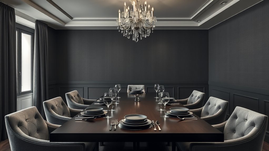
For an elegant dining room, consider classic neutrals like beige, ivory, or soft gray for a timeless look. Add depth with earthy tones such as warm browns and muted greens or go bold with rich jewel colors like emerald or sapphire. Incorporate metallic accents sparingly to add a touch of luxury and brightness. Soft pastels create a calming vibe, while monochromatic schemes bring sleek sophistication. Keep exploring for more ideas to refine your elegant space.
Key Takeaways
- Opt for neutral tones like beige, ivory, or soft gray for a timeless, sophisticated dining room backdrop.
- Incorporate bold jewel tones or contrasting colors sparingly for vibrant visual interest.
- Use soft pastels paired with natural materials to create a calming, elegant atmosphere.
- Enhance the space with metallic accents to add luxury and modern sophistication.
- Choose harmonious, earthy hues and textures for a cozy, natural-inspired aesthetic.
As an affiliate, we earn on qualifying purchases.
Classic Neutrals and Timeless Tones

Classic neutrals and timeless tones create an elegant foundation for any dining room. You’ll find that shades like beige, ivory, taupe, and soft gray bring a sense of calm and sophistication. These colors are versatile, making it easy to pair with various furniture styles and accent pieces. Neutral palettes also allow your tableware and décor to stand out without clashing. Using natural materials such as wood, marble, or stone enhances the understated elegance. You’ll appreciate how these colors create a warm, inviting atmosphere suitable for both casual meals and formal gatherings. Plus, they’re easy to update with accessories or artwork over time, keeping your dining space fresh and stylish without the need for a complete overhaul. Incorporating timeless tones like navy or charcoal can also add depth and modernity to the classic neutral foundation. Additionally, selecting colors with consistent undertones can help maintain harmony and balance in your overall design. Incorporating color schemes that complement your space can further enhance the overall aesthetic. Considering the use of layered textures can also deepen the sense of coziness in the space.
Bold and Vibrant Color Combinations

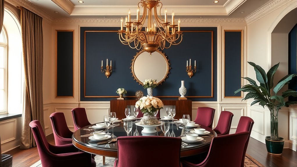
Moving beyond neutral tones, bold and vibrant color combinations can transform your dining room into a lively and energetic space. Think rich jewel tones like emerald green, sapphire blue, or ruby red paired with contrasting accents to create visual interest. You might combine a deep navy wall with bright yellow accessories or opt for a fiery orange tablecloth against cool teal walls. These vivid hues stimulate conversation and add a sense of excitement. Use bold colors sparingly on walls, choosing statement pieces or artwork to avoid overwhelming the room. Balance these intense shades with neutral elements like white or gray to keep the space feeling harmonious. Incorporating color schemes in interior design when choosing and applying these bold colors ensures a smooth transition between different design elements. Additionally, considering color psychology can help evoke specific moods and enhance the overall ambiance. Being mindful of environmental considerations helps ensure your decorating choices are sustainable and eco-friendly. Understanding how to combine contrasting hues effectively allows you to create a cohesive and striking look. By intentionally mixing vibrant colors, you inject personality and create an inviting, dynamic dining environment.
Soft Pastels for a Calm Atmosphere

Soft pastels effortlessly create a calm and inviting atmosphere in your dining room. These gentle colors, like blush pink, soft mint, or powder blue, bring a sense of serenity and sophistication. When you incorporate pastels, you soften the overall look, making the space feel more relaxed and comfortable. Use pastel-colored walls or accent pieces, such as tableware or decorative accessories, to enhance the tranquil vibe. Keep the furniture neutral to let the pastels stand out without overwhelming the room. Pairing pastels with natural materials like wood or linen adds warmth and texture. This color scheme works perfectly if you want a peaceful environment where conversation flows easily and everyone feels at ease. Soft pastels subtly elevate your dining space with understated elegance. Incorporating color schemes like these can also influence the overall mood and ambiance, creating a truly harmonious dining experience. Additionally, choosing lighting options that complement pastel tones can further enhance the calming effect of the space. Using color psychology principles, pastels can promote relaxation and social interaction during meals. Research shows that somatic therapy techniques can be beneficial in creating a calming environment, which can be especially effective in spaces designed for socializing. For added comfort, consider incorporating soft textiles like cushions or curtains to enhance the cozy feel.
Monochromatic Schemes for Sophistication
Monochromatic color schemes can elevate your dining room’s sophistication by creating a cohesive and polished look. By selecting varying shades, tints, and tones of a single color, you add depth while maintaining harmony. For example, pairing different shades of gray or navy offers a sleek, modern feel. You can incorporate this scheme through wall paint, furniture, and accessories, ensuring everything complements seamlessly. Keep contrast minimal to preserve elegance; subtle differences in hue make the space appear refined. Use textures and finishes—matte, gloss, or satin—to add visual interest without disrupting the monochromatic balance. This approach highlights sophistication and simplicity, making your dining area feel intentional and upscale. Monochromatic schemes are versatile and can suit contemporary, traditional, or minimalist styles effortlessly. Additionally, understanding color schemes for dining room elegance can help refine your choices for a truly sophisticated look, especially when considering how different colors and tones influence overall ambiance. Recognizing how color psychology impacts perception can further enhance the room’s refined atmosphere.
Earthy and Natural Hues

Earthy and natural hues bring warmth and grounding to your dining room, creating an inviting and relaxed atmosphere. Think warm browns, soft beiges, muted greens, and gentle terracotta tones. These colors evoke a sense of nature, making your space feel cozy and calming. You can incorporate these hues through wall paint, wooden furniture, or textiles like linen curtains and placemats. Pairing them with natural materials such as wood, stone, or wicker enhances their organic appeal. Earthy tones also serve as a versatile backdrop, allowing you to add accents with brighter colors or textured patterns without overwhelming the space. Incorporating natural elements promotes tranquility and enhances the overall ambiance. Overall, these hues promote a tranquil environment, perfect for intimate conversations and leisurely meals. They bring a timeless, effortless elegance to your dining area.
Metallic Accents and Luxe Finishes

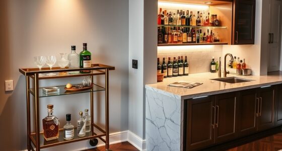
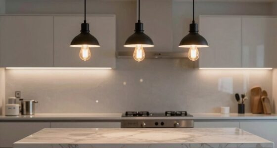
Adding metallic accents and luxe finishes instantly elevates your dining room’s elegance by introducing reflective surfaces and sophisticated textures. Incorporate metallics like gold, silver, or bronze through tableware, lighting fixtures, or decorative accessories to create a sense of opulence. Use finishes like high-gloss lacquer or polished marble to add depth and shine to furniture and surfaces. These touches catch the light, making your space feel brighter and more refined. Pair metallic elements with neutral or deep hues to enhance their impact without overwhelming the room. Keep the balance by limiting shiny finishes to strategic spots, so they serve as focal points rather than distractions. With thoughtful incorporation, metallic accents bring a modern, luxurious vibe that transforms your dining experience.
Frequently Asked Questions
How Can I Incorporate Seasonal Colors Into My Dining Room?
To incorporate seasonal colors into your dining room, start by updating your table linens and accessories with hues that reflect the time of year, like warm oranges and reds for fall or cool blues for winter. Add seasonal floral arrangements or artwork that echoes the colors. You can also swap out throw pillows or curtains periodically. These simple changes create a fresh, inviting atmosphere that celebrates each season’s unique palette.
What Lighting Options Best Complement Different Color Schemes?
Lighting lifts your dining room’s ambiance, so choose wisely. For warm hues like reds and oranges, opt for soft, warm lighting that creates a cozy, inviting atmosphere. Cool colors like blues and greens shine with bright, white light that highlights freshness and tranquility. Dimmable fixtures give you flexibility, allowing you to tailor your lighting to match your mood and meal, making every dining experience delightful and dynamic.
How Do Color Schemes Influence Dining Room Mood and Atmosphere?
Color schemes directly influence your dining room’s mood and atmosphere. Warm tones like reds and oranges create an inviting, energetic space perfect for lively gatherings. Cool shades such as blues and greens foster calmness and relaxation, ideal for intimate dinners. Bright colors add vibrancy, while neutral palettes offer sophistication and serenity. By choosing your colors carefully, you set the ambiance, making your dining experience more enjoyable and aligned with your desired vibe.
Which Color Schemes Are Most Suitable for Small Dining Spaces?
When choosing colors for a small dining space, you should opt for light, neutral shades like soft whites, beiges, or pastels. These colors make the room feel larger and more open. You can add pops of color through accessories or artwork to keep the space lively without overwhelming it. Stick to simple, cohesive schemes to create an inviting, airy atmosphere that maximizes the room’s sense of space.
How Can I Balance Bold Colors With Existing Furniture and Decor?
Think of bold colors as a statement necklace—powerful yet needing balance. To harmonize them with your furniture and decor, choose one bold hue and let it be the focal point. Use neutral shades for the walls or accessories to tone down the intensity. Incorporate textures and patterns that complement both. This approach creates a cohesive, stylish space where boldness enhances rather than overwhelms your existing setup.
Conclusion
Choosing the right color scheme can elevate your dining room’s elegance and set the perfect mood. Did you know that 78% of interior designers agree that color impacts mood and behavior? Whether you prefer classic neutrals, bold hues, or soothing pastels, selecting the right palette creates a welcoming, stylish space. So, experiment with different schemes, and watch your dining area transform into a sophisticated retreat that reflects your personal style.