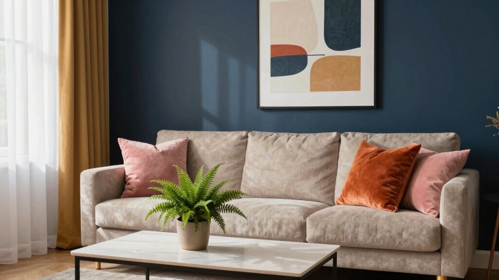
To make your room feel collected, master the art of color pairing by combining a monochromatic base with pops of complementary colors through accessories. Start with calming shades of one color, then add lively accents like cushions or artwork for contrast. This balance creates a space that feels both intentional and personalized, blending harmony with energy. Keep exploring, and you’ll discover more tips to craft a perfectly curated room that reflects your style.
Key Takeaways
- Use a monochromatic color base to create a cohesive and calming room atmosphere.
- Incorporate complementary accent colors through accessories for added visual interest.
- Balance vibrant contrasts with subtle shades to achieve a curated, intentional look.
- Combine harmony and contrast strategically for layered and well-balanced spaces.
- Focus on thoughtful color pairings to enhance personalization and overall room cohesion.
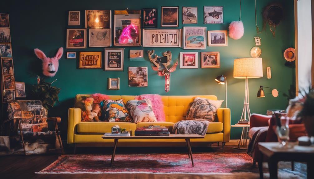
Choosing the right color combinations can transform a room from ordinary to extraordinary. When you’re designing a space, understanding how different color schemes work can make all the difference. Two effective strategies are complementary color schemes and monochromatic harmony. Complementary colors sit opposite each other on the color wheel, like blue and orange or red and green. Using these in a room creates a vibrant, dynamic feel that instantly grabs attention. When you pair such colors thoughtfully, you get a lively contrast that energizes the space without overwhelming it. For example, an accent wall painted in a bold orange paired with softer blue furnishings balances excitement with calm, making the room feel both lively and welcoming.
Complementary colors create vibrant, balanced spaces that feel lively yet welcoming.
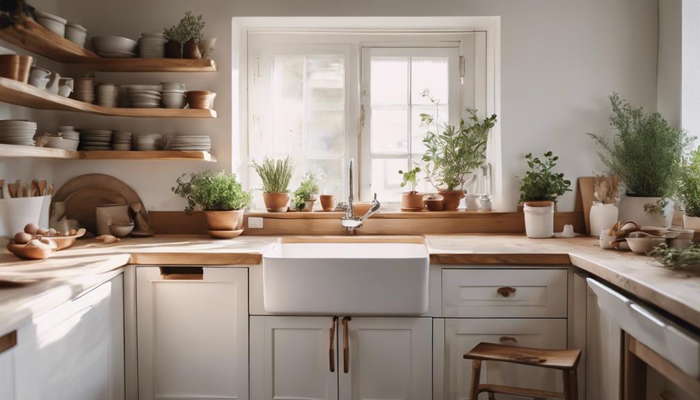
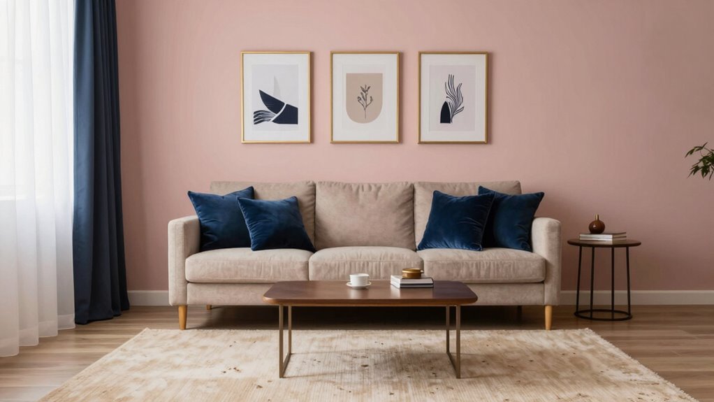
On the other hand, monochromatic harmony involves varying shades, tints, and tones of a single color. This approach creates a cohesive and sophisticated look that feels unified and refined. If you choose a pale blue wall and incorporate darker navy accents or light teal textiles, you establish a seamless flow that’s pleasing to the eye. Monochromatic schemes are especially useful if you want your room to feel tranquil and collected, as they avoid clashing colors and instead focus on subtle differences in hue. When you combine these shades thoughtfully, you craft a space that looks intentional and well-curated, giving it a collected, personalized vibe. Additionally, understanding color theory can deepen your ability to choose harmonious color combinations that enhance your space even further. Exploring color relationships helps in selecting effective pairings that balance contrast and harmony.
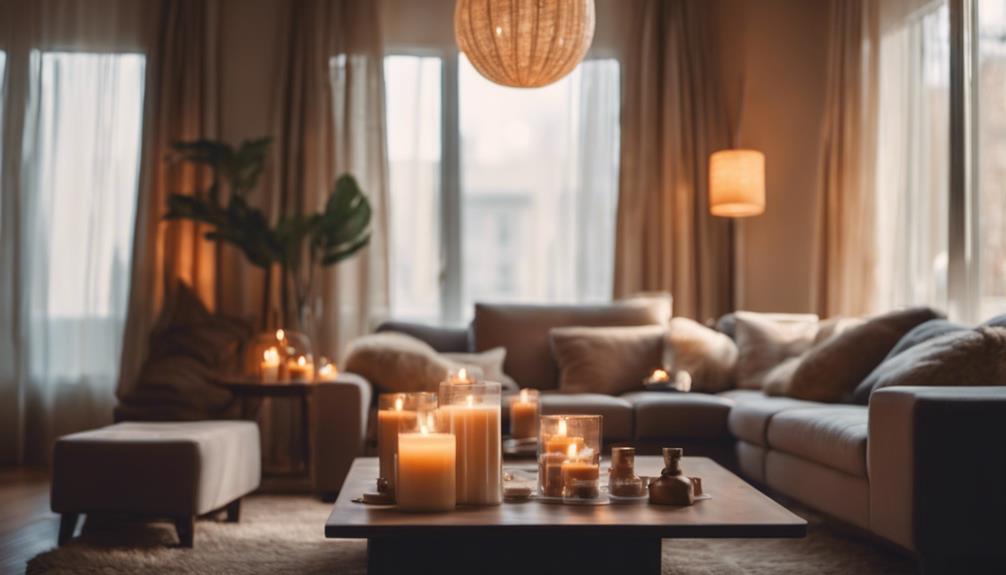
To make your room truly feel curated and put-together, consider blending these two strategies. Start with a monochromatic base to establish harmony and calmness. Then, add pops of complementary colors through accessories like cushions, artwork, or rugs to introduce energy and interest. Using color contrast effectively ensures your space remains dynamic without feeling chaotic. By balancing a monochromatic foundation with well-placed complementary accents, you create a room that feels layered and thoughtfully assembled rather than chaotic or disjointed. This color pairing trick plays with contrast and cohesion simultaneously. You get the comfort of a unified color story alongside the excitement of contrasting hues. When you understand how to balance complementary color schemes with monochromatic harmony, your room automatically feels more intentional and collected. It’s a simple, effective way to elevate your space without overcomplicating your design. Whether you’re aiming for a lively, energetic vibe or a calm, sophisticated atmosphere, mastering these color pairing tricks helps you craft a room that feels just right—personal, balanced, and visually engaging.
As an affiliate, we earn on qualifying purchases.
Frequently Asked Questions
How Do I Choose the Right Color Combinations for Small Spaces?
To choose the right color combinations for small spaces, stick to neutral palettes like soft beiges, grays, or whites, which make rooms feel open and airy. Incorporate monochrome schemes to add depth without overwhelming the space. Use subtle contrasts and cohesive tones to create a collected look. Keep accents minimal, and you’ll enhance the room’s size and style, making it feel inviting and well-designed.
Are There Color Pairing Tricks Suitable for Modern or Traditional Decor?
Yes, you can use color pairing tricks suited for both modern and traditional decor by focusing on color harmony and mood enhancement. For modern spaces, opt for bold, contrasting hues with clean lines, while traditional rooms benefit from soft, harmonious palettes like muted pastels or rich jewel tones. Balance warm and cool shades thoughtfully, creating a cohesive look that enhances the mood and style of your space.
Can This Color Pairing Trick Work With Bold or Bright Colors?
Yes, this color pairing trick works well with bold or bright colors. You can incorporate vibrant accents through color blocking, creating striking contrasts that feel intentional and balanced. Use the trick to unify these bold shades by pairing them with more subdued hues, or by balancing vibrant accents with neutral tones. This approach guarantees your space feels collected and cohesive, even with eye-catching, lively colors.
How Long Does It Take to See the Room Transformation?
You’ll notice the room transformation almost instantly, as the power of color psychology kicks in to create visual harmony. Within moments, your space feels more cohesive and inviting, thanks to the carefully paired hues. While some subtle changes might take a little longer to fully settle, the initial impact is immediate, and you’ll start experiencing a more balanced, collected atmosphere right away—making your room feel more put together than ever before.
Is This Trick Applicable to Outdoor or Patio Spaces?
Yes, this trick works perfectly for outdoor accents and enhances your patio ambiance. By carefully pairing colors in your outdoor space, you create a cohesive, inviting feel that makes your patio look thoughtfully curated. Use complementary or analogous colors in furniture, planters, and accessories to bring harmony. This approach helps your outdoor areas feel just as collected and stylish as indoor rooms, giving you a seamless shift between inside and outside.
Conclusion
Imagine walking into a room where every piece feels just right, like a perfectly curated playlist. That’s the power of smart color pairing—you create harmony effortlessly. When I first tried this trick, my living room transformed from chaotic to calming, like a symphony tuning itself. Just as a painter chooses colors to evoke emotion, you can use this trick to make your space feel deliberately collected, inviting, and truly yours.