TL;DR
Interior designer Yoko Kloeden has outlined five Japanese colors that can bring warmth to minimalist rooms: susutake-iro, shiracha, rikyū-nezu, kyō-sabi and tsuchikabe. Her guidance focuses on earthy undertones and matte, textured finishes; the paint matches named in the article are suggestions, not verified exact equivalents.
Interior designer Yoko Kloeden has recommended five Japanese-inspired wall colors for rooms that feel chilly or stark, arguing that earthy shades with yellow, red or green undertones can read warmer than many cool off-whites and greiges. The Livingetc article pairs the colors with modern paint suggestions and finish advice, but does not establish that those products are exact matches for traditional Japanese materials.

Get furniture and decor delivered free with Prime
- Fast, free delivery on millions of items
- Prime Video, Amazon Music and more included
- Member-only deals all year
The five colors are susutake-iro, a smoke-darkened brown-black; shiracha, a tea-tinted off-white; rikyū-nezu, a green-tinged gray; kyō-sabi, a muted red-brown clay color; and tsuchikabe, a settled mid-brown associated with traditional earthen walls. Kloeden describes them as grounded shades that can add warmth without abandoning a restrained, minimalist palette, including options like sage paint colors.
For contemporary paint choices, the article points to products including Little Greene Attic II for susutake-iro, Farrow & Ball Stirabout for shiracha, and Little Greene Ambleside for rikyū-nezu. It suggests Farrow & Ball Dead Salmon as a color that can evoke kyō-sabi, and Mouse’s Back or Farrow & Ball Duster in connection with tsuchikabe. These are presented as comparable colors or ways to emulate the look, rather than documented historical formulations.
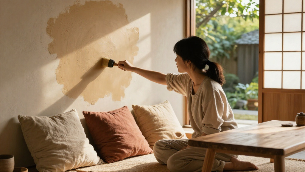
Kloeden also recommends considering matte paint, limewash or clay plaster. She says textured finishes let light shift across a wall, changing how its color appears through the day. The article does not give product specifications, application instructions or room-by-room test results.
Five Japanese wall colors for warmer rooms
Interior designer Yoko Kloeden recommends earthy shades and textured finishes to bring warmth to minimalist rooms.
The five shades
Each draws on an earthy material, tea shade or traditional color reference.
Susutake-iro
Smoke-darkened bamboo inspires this brown-black.
Shiracha
A tea-tinted off-white for a warmer take on cream.
Rikyū-nezu
A subdued gray with a green tinge.
Kyō-sabi
A red-brown clay shade associated with southern Kyoto.
Tsuchikabe
A mid-brown inspired by traditional clay, straw and sand walls.
Why undertones matter
Kloeden says yellow, red or green undertones can feel warmer than neutrals cooled with blue or black.
- Can add warmth while keeping a restrained palette.
- Range from soft off-white to deeper brown and clay.
- Blue- or black-cooled off-whites and greiges may feel chilly.
- Room light and surrounding materials affect the result.
Paint suggestions
The article offers contemporary colors to compare with the traditional references.
| Japanese color | Suggested paint |
|---|---|
| Susutake-iro | Little Greene Attic II |
| Shiracha | Farrow & Ball Stirabout |
| Rikyū-nezu | Little Greene Ambleside |
| Kyō-sabi | Farrow & Ball Dead Salmon |
| Tsuchikabe | Mouse’s Back or Farrow & Ball Duster |
Finish and test
Matte surfaces, limewash and clay plaster can add texture that shifts in changing light.
Try the suggested color on the intended wall with its existing floors and furnishings.
Check the sample in daylight and under evening lamps.
Ask the manufacturer or installer about limewash or clay plaster requirements.
How Undertones Change a Room
The advice gives readers a practical way to think about why a neutral room can feel cold: the key is not simply whether a color is light or dark, but what undertones sit beneath it. Kloeden contrasts warm earth-based shades with off-whites or greiges cooled by blue or black. For someone choosing paint, that distinction can help narrow options before buying samples or repainting.
The suggested palette also offers alternatives for different needs. Shiracha can serve as a warmer take on cream; rikyū-nezu offers a gray with green in it; and the deeper browns and clay shades can add visual weight. These are design judgments, not evidence that a particular shade will make every room feel warmer. Natural light, artificial lighting, surrounding materials and finish all affect the result.
Products Worth Considering

Levoit Vital 100S-P Air Purifier with Washable Pre-Filter

DREAME D20 Air Plus Robot Vacuum and Mop

Ring Alarm 14-Piece Kit
As an affiliate, we earn on qualifying purchases.
Five Shades and Their Origins
The names connect the palette to specific materials, places or associations described by Kloeden. Susutake-iro refers to bamboo darkened by hearth smoke over a long period. Shiracha means a white-tea-like shade, while rikyū-nezu is linked to tea master Sen no Rikyū and subdued color. Those descriptions explain the palette’s reference points; they do not mean the modern paint suggestions are made from the named materials.
Kloeden describes kyō-sabi as a muted clay color associated with Fukakusa in southern Kyoto and says a room at Shūsui-tei, a pavilion in the Imperial Palace gardens, is finished in it. Tsuchikabe refers to traditional walls made from local clay mixed with chopped straw and sand; the article identifies juraku clay as a well-known Kyoto variety. It says the material’s straw and grit can leave a surface that varies in appearance with changing light.
Kloeden is identified as the founder of a London-based architecture and interior design studio established in 2016. The studio works with Japanese aesthetics and natural elements. The article offers her recommendations as design guidance, not as a formal color standard or a report of controlled testing.
“The Japanese wall colors that warm a minimalist room are all earth colors, and none of them have blue in them.”
— Yoko Kloeden, interior designer
Paint Matches Are Approximate
The article does not specify exact paint formulas, measured undertones or a method for matching the traditional colors to current products. Its named paints are recommendations described as beautiful ways to add character or as colors that can come close to particular references. Readers should treat them as starting points for comparison, not guaranteed equivalents.
It is also unclear how each shade will look in a particular home. The article does not provide test results across different orientations, lighting conditions or wall surfaces. Kloeden’s account of warmth is an expert design opinion, and the published guidance does not quantify an effect on room temperature, comfort or mood.
Test Shades in Your Lighting
The next practical step for anyone using the recommendations is to compare samples on the intended wall and observe them in daylight and under evening lamps. That follows the article’s own descriptions: shiracha’s brown is said to emerge under lamplight, while tsuchikabe’s irregular surface can shift across the day. A sample can show whether a suggested color works with a room’s existing floors, furnishings and light.
Readers considering limewash or clay plaster can also check finish and installation requirements with the relevant manufacturer or installer. The article does not announce a new product, study or upcoming project; it remains a set of color and finish recommendations from Kloeden.
Key Questions
Which five Japanese-inspired wall colors does the article recommend?
It lists susutake-iro, shiracha, rikyū-nezu, kyō-sabi and tsuchikabe, described respectively through references to smoke-darkened bamboo, white tea, green-gray, muted clay and earthen walls.
Why does Yoko Kloeden say these colors feel warmer?
Kloeden says the shades are earth colors with yellow, red or green undertones, rather than blue. She argues that blue- or black-cooled off-whites and greiges can make a bare room feel chilly.
Are the paint products exact matches for the traditional colors?
No exact equivalence is established. The article presents named paints as suggestions or colors that can come close to the traditional references.
What finish does Kloeden recommend?
She recommends a matte finish, and says limewash or clay plaster can add texture that changes how color appears across a wall as light shifts.
Source: livingetc.com