Using color psychology in interiors helps you create spaces that influence mood and behavior positively. By choosing calming hues like soft blues and greens, you promote relaxation and tranquility. Bright colors such as yellows and reds energize and encourage social interaction. Neutral tones balance bold accents, making environments feel harmonious. Understanding cultural nuances and applying the right color combinations allows you to design intentionally. Keep exploring to discover how to craft perfectly balanced and emotionally resonant spaces.
Key Takeaways
- Select colors based on desired emotional effects, such as calming blues for bedrooms or energizing reds for social areas.
- Combine warm and cool tones thoughtfully to balance energy and relaxation within a space.
- Use neutral shades like beige or gray as bases to ground vibrant accents and create harmony.
- Consider cultural significance of colors to ensure respectful and meaningful interior design choices.
- Adjust color palettes according to room function, using calming hues for bedrooms and lively colors for social or activity spaces.

EVOLVE Paint & Primer: Environment-friendly, Low Sheen with One-coat Coverage for Interior & Exterior surfaces (Sky Blue, 1-Gallon)
- Paint and Primer in One: Provides coverage and surface sealing
- Multiple Sheens and Colors: Available in Flat, Eggshell, Satin, Semi-Gloss
- Various Sizes Available: Options in 1-Gallon and 5-Gallon containers
As an affiliate, we earn on qualifying purchases.
As an affiliate, we earn on qualifying purchases.
Understanding the Emotional Impact of Colors

Colors influence your emotions more than you might realize. When you choose a hue for your space, you’re not just picking a shade—you’re shaping how you feel. Bright reds can energize and excite you, perfect for areas where activity and stimulation are desired. Softer blues promote calm and focus, ideal for workspaces or bedrooms. Warm yellows can evoke happiness and optimism, while cool greens often bring balance and tranquility. Recognizing these effects helps you craft environments that align with your mood and purpose. Every color has an emotional resonance, so your choices can boost motivation, reduce stress, or foster comfort. By understanding how colors influence your feelings, you gain a powerful tool for designing spaces that support your mental and emotional well-being.
Choosing Calm and Soothing Hues for Restful Spaces

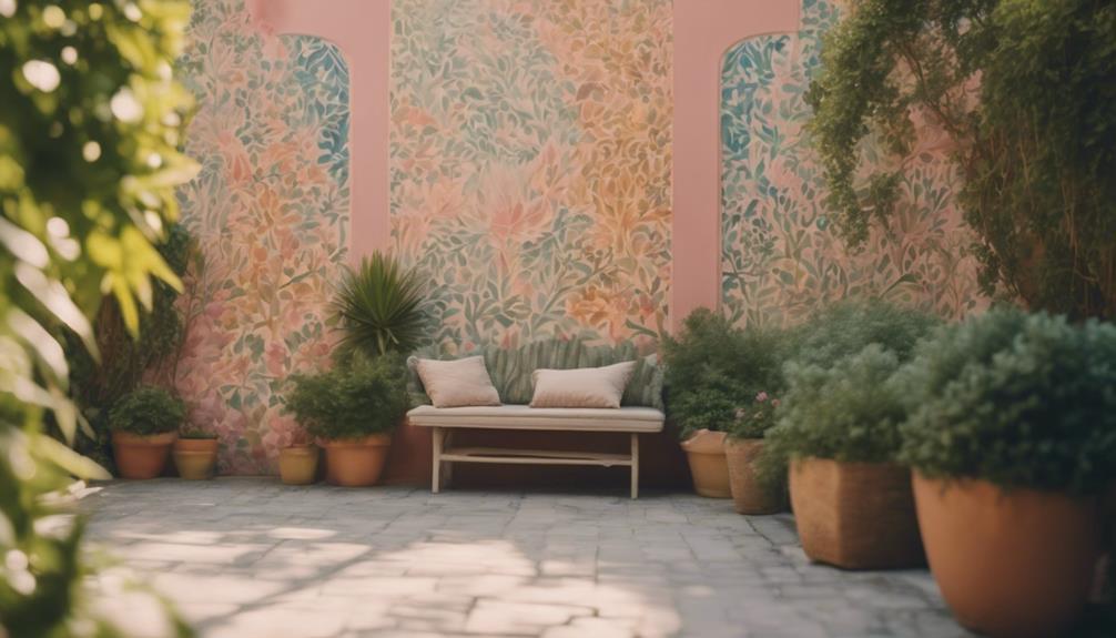
After understanding how different hues influence emotions, it becomes clear that selecting the right shades can profoundly enhance your rest and relaxation. Calm and soothing colors create a tranquil environment, helping you unwind after a busy day. Soft blues evoke serenity and promote peaceful sleep, while gentle greens bring a sense of balance and renewal. Light neutrals like beige, warm taupe, and soft grays add warmth without overstimulation. These hues reduce stress and foster a restful atmosphere, making your space inviting and comfortable. When choosing colors, prioritize shades that feel natural and understated. Keep the palette simple and cohesive to avoid visual clutter. Incorporating calming color palettes into your bedroom design can further enhance the peaceful ambiance. Recognizing how attention enhances creative practice, you can apply similar focus techniques to your interior design process to achieve more harmonious results. Paying careful attention to ambient lighting can also significantly influence the calming effect of your chosen colors. Additionally, understanding lifestyle factors can help tailor your color choices to suit your personal routines and preferences. By selecting calming hues, you set the stage for deeper relaxation and restorative sleep.
Energizing Colors for Dynamic and Inviting Areas

Energizing colors can transform your space into a lively, inviting area that encourages activity. Bright accents add essence, while warm hues help boost your energy levels. Combining bold shades thoughtfully can create dynamic environments that motivate and inspire. Incorporating wall organization principles can enhance the impact of your color choices to achieve the desired energetic atmosphere. Additionally, understanding personality traits can help you select colors that resonate with your emotional needs and promote positive interactions within your space. Recognizing the horsepower of electric dirt bikes can also serve as an inspiration for selecting vibrant, energetic colors that reflect power and agility. Selecting colors that align with well-being tips can further support a balanced and uplifting environment.
Bright Accents for Vitality
Bright accents can instantly transform a space into a lively and inviting environment, capturing attention and boosting energy. Incorporate vibrant colors like electric blue, fiery orange, or lively yellow through accessories such as pillows, artwork, or decorative objects. These pops of color create focal points that energize the room without overwhelming it. When used thoughtfully, bright accents encourage a sense of enthusiasm and positivity, making your space feel dynamic and welcoming. Keep in mind that balance is key; pair bold hues with neutral backgrounds to prevent visual overload. Research supports 16PF that the strategic use of color can influence mood and behavior, enhancing the overall ambiance of your space. By strategically placing bright accents, you invite vitality into your environment, inspiring activity and conversation. The right touches of color can turn an ordinary space into an energizing haven that reflects your lively personality. Additionally, choosing energizing colors based on their psychological effects can enhance the desired atmosphere in your space. Embracing color psychology can help you select hues that foster motivation and positivity, elevating your interior design to support your lifestyle goals.
Warm Hues Boost Energy
Warm hues like reds, oranges, and yellows naturally stimulate the senses and infuse your space with energy. These colors are perfect when you want to create a lively, inviting atmosphere that encourages activity and engagement. Reds can boost adrenaline, making them ideal for areas where you need motivation or focus. Oranges evoke warmth and enthusiasm, perfect for social spaces like kitchens or living rooms. Yellows brighten a room and promote positivity, helping you feel more alert and cheerful. Incorporating these hues through walls, furnishings, or accents energizes your environment without overwhelming it. When used thoughtfully, warm colors can transform a dull space into a vibrant hub that energizes anyone who enters. Color psychology helps us understand how different hues influence mood and behavior, making it easier to choose the right palette for your space. Additionally, understanding the sound vibrations associated with certain tones can enhance the energetic effect of your color choices. This knowledge can also influence your decision to incorporate tuning modifications, which can optimize the overall ambiance and functionality of a space. For example, selecting colors with specific visual effects can further amplify the energizing impact. Just remember to balance them with neutral tones to avoid overstimulation, especially considering safety precautions related to heating devices in your home.
Dynamic Combinations Inspire Activity
Combining vibrant colors can create a lively and inviting space that encourages activity and interaction. Bright hues like fiery reds, energetic oranges, and lively yellows stimulate your senses and foster a dynamic atmosphere. Use bold color pairings to energize areas where you want movement, such as kitchens, home gyms, or playrooms. Contrasting colors add excitement and keep the space feeling fresh and engaging. Don’t shy away from mixing shades; instead, experiment with combinations that evoke enthusiasm and motivation. Remember, balanced use of these colors prevents overwhelm. Incorporate them through accent walls, furniture, or accessories to spark energy without overwhelming the senses. Additionally, understanding color psychology can enhance the effectiveness of your color choices in creating the desired energetic environment. Ultimately, dynamic color combinations inspire movement, making your space more vibrant and inviting for daily activity and lively interactions.
Using Neutral Tones to Balance and Ground Your Design

Neutral tones serve as the foundation of a balanced interior design, providing a calming backdrop that grounds other colors and elements. By incorporating shades like beige, gray, taupe, or soft whites, you create a versatile base that enhances your space’s harmony. These tones help reduce visual clutter and make your environment feel more spacious and organized. Neutral colors also allow you to introduce bold or vibrant accents without overwhelming the room. When used thoughtfully, they evoke a sense of tranquility and stability, making your space more inviting. Keep in mind that neutral doesn’t mean boring; it’s a strategic choice that provides flexibility for future updates and personal touches. Ground your design with neutral tones to foster a peaceful, cohesive atmosphere.
Color Combinations and Their Psychological Effects

Your choice of color combinations can considerably impact the mood of a space. Warm tones create energy and comfort, while cool tones promote calmness and relaxation. Pairing complementary colors or selecting bright versus muted hues can further influence how you feel in your environment.
Warm vs. Cool Tones
Warm and cool tones evoke distinct psychological responses that can dramatically influence the mood of a space. Warm colors like reds, oranges, and yellows tend to energize and create feelings of comfort, intimacy, and excitement. They can make a room feel inviting and lively, perfect for social areas. Cool tones such as blues, greens, and purples promote calmness, relaxation, and focus. These colors are ideal for bedrooms or workspaces where tranquility is desired. When choosing between warm and cool tones, consider the atmosphere you want to foster. Warm hues stimulate activity and conversation, while cool shades help you unwind and feel at ease. Combining these tones thoughtfully can balance energy and relaxation within a single space.
Complementary Color Pairings
Complementary color pairings involve combining hues that are opposite each other on the color wheel, creating striking visual contrasts. These combinations evoke strong emotions and draw attention. For example, pairing blue and orange can energize a space, while red and green balance excitement with harmony. Think about how these colors influence mood and perception. To help visualize, consider this table:
| Color 1 | Color 2 | Psychological Effect |
|---|---|---|
| Blue | Orange | Energizing, dynamic |
| Red | Green | Balanced, invigorating |
| Yellow | Purple | Creative, stimulating |
| Aqua | Coral | Fresh, lively |
Use complementary pairings to create focal points or highlight specific areas, making your space more vibrant and engaging.
Bright vs. Muted Hues
Choosing between bright and muted hues can dramatically alter the mood and perception of a space. Bright colors, like vivid reds or lively yellows, energize and create a sense of excitement or alertness. They grab attention and can make a room feel more dynamic. In contrast, muted hues, such as soft blues or gentle grays, promote calmness and relaxation, making spaces feel cozy and inviting. When selecting colors, consider how you want to feel in the room—whether motivated or relaxed. Bright hues work well in active areas like kitchens or gyms, while muted tones suit bedrooms or meditation spaces. Balancing these choices can help you craft an environment that aligns with your desired psychological effect and enhances your overall mood.
Cultural Significance of Colors in Interior Design

Colors in interior design carry deep cultural meanings that can influence how a space feels and how it’s perceived. For example, white symbolizes purity and peace in Western cultures but can signify mourning in some Asian traditions. Red often represents luck and celebration in Chinese culture but can signal danger elsewhere. Green might evoke nature and growth in many societies, yet in some regions, it’s associated with jealousy. Understanding these cultural associations helps you create spaces that resonate and communicate the intended message. If you’re designing for a multicultural audience, incorporating colors thoughtfully can show respect and awareness of different backgrounds. Recognizing these cultural nuances ensures your interior choices evoke positive emotions and avoid misunderstandings. Colors aren’t just aesthetic—they carry stories that shape perceptions.
Practical Tips for Applying Color Psychology in Different Rooms

To create functional and emotionally supportive spaces, it’s vital to tailor your color choices to each room’s purpose. In bedrooms, opt for calming hues like soft blues or gentle greens to promote relaxation and restful sleep. For living rooms, choose warm tones such as earthy yellows or inviting reds to foster social interaction and comfort. Kitchens benefit from energizing colors like bright yellows or lively oranges, which can stimulate appetite and activity. Bathrooms may be enhanced with cool shades like light blues or crisp whites to evoke cleanliness and tranquility. Keep in mind that lighting influences how colors appear—test swatches in different settings. Ultimately, balance bold colors with neutral accents to prevent overstimulation and create harmony. Adjust your palette thoughtfully to support each room’s unique function and mood.
Creating a Cohesive Color Scheme That Reflects Your Mood

Creating a cohesive color scheme that reflects your mood involves understanding how different hues influence your feelings and selecting those that resonate with your emotional state. Start by identifying the emotions you want your space to evoke—calm, energy, warmth, or inspiration. Choose colors that align with these feelings, like soft blues for tranquility or vibrant reds for excitement. Aim for harmony by balancing bold accents with neutral tones, ensuring your space feels unified and intentional. Consider the proportions of each color to maintain consistency. Test your chosen palette in small areas before committing fully. Remember, your environment should support your mood and lifestyle, so trust your intuition and select shades that make you feel good every time you walk into your space.
Frequently Asked Questions
How Can I Incorporate Color Psychology on a Budget?
You can incorporate color psychology on a budget by choosing affordable paint options in colors that evoke the feelings you want, like calming blues or energizing reds. Use accessories such as cushions, rugs, or artwork to add pops of meaningful colors without repainting. Rearrange furniture to change the mood, and add plants for a natural touch that influences your space’s atmosphere. Small changes can make a big impact without breaking the bank.
Are There Colors That Work Universally Across All Cultures?
Did you know that red is often associated with passion and energy worldwide? When choosing colors, you’ll find some, like blue and white, tend to evoke positive feelings across many cultures. While no color is universally perfect, sticking with these tends to be safe. You should consider cultural contexts, but generally, blues and whites create a calming, inclusive atmosphere. This approach helps you design spaces that resonate broadly.
How Does Lighting Affect the Perception of Colors in a Room?
Lighting plays a vital role in how you perceive colors in a room. When you change the lighting, colors can appear warmer, cooler, brighter, or duller. Natural light enhances true colors, while artificial light, such as incandescent or LED, shifts their appearance. You should consider the type and intensity of lighting to create the desired mood and guarantee colors look appealing in different times of day and settings.
Can Color Psychology Influence Mood Over Long Periods?
Think of color psychology as a gentle gardener tending your mood garden over time. It influences your feelings subtly, planting seeds that grow into lasting impressions. When you surround yourself with calming blues or energizing reds, these hues shape your emotional landscape long-term. Yes, color can be a quiet but powerful force, gradually nurturing your mood and creating a sanctuary that reflects your inner world every day.
What Are Common Mistakes to Avoid When Choosing Colors?
When choosing colors, you might overlook how they impact your space’s mood. Avoid common mistakes like selecting colors without considering lighting, which can change their appearance and effect. Don’t just pick trendy shades; consider your personal preferences and the room’s purpose. Also, avoid overusing bold colors, as they can be overwhelming. Instead, balance vibrant hues with neutral tones to create a harmonious, inviting environment.
Conclusion
As you explore the power of color psychology, you’ll notice how the right shades can transform your space and mood. Sometimes, a calming blue or energizing red appears just when you need it most, almost like a whisper from your surroundings. By thoughtfully choosing colors, you create an environment that genuinely reflects who you are and supports your well-being. After all, your home should be a reflection of your inner harmony and subtle coincidences that make life more vibrant.