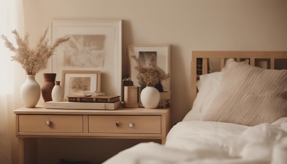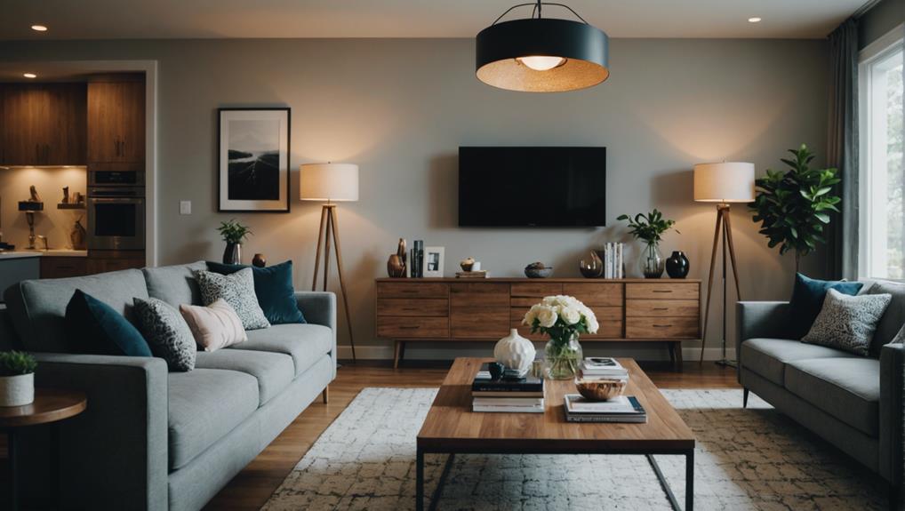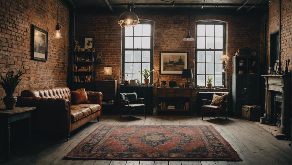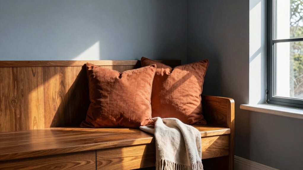

To mix warm and cool tones successfully, start with a dominant color, typically in a larger area, and then add accents of the opposite for contrast. Balance their visual weight by placing warm hues as focal points or accessories, while using cooler shades for walls and larger surfaces. Consider lighting, as natural light boosts warm tones and artificial light enhances cool ones. Keep proportions harmonious to create a space that feels inviting and balanced—exploring this further can help you perfect your color scheme.
Key Takeaways
- Balance large areas with cooler shades to create a calming foundation, using warm tones as accents for energy.
- Distribute warm and cool colors evenly to guide the eye naturally around the space.
- Use warm tones in small doses or as focal points to prevent overwhelming the space.
- Incorporate lighting considerations: natural light enhances warm hues, artificial light emphasizes cool tones.
- Ensure color interactions complement rather than clash, maintaining visual harmony and cohesion.

When it comes to mixing warm and cool tones in your design or decor, understanding the fundamental rule can make all the difference. This rule hinges on the principles of color theory, which guides how different hues interact and influence the overall feel of a space. By grasping the basics, you can create a harmonious environment that feels intentional rather than chaotic. The key is achieving visual balance, so neither warm nor cool tones overwhelm the other. You want your space to have a cohesive look where colors complement each other, rather than clash or compete for attention.
Color theory teaches that warm colors—like reds, oranges, and yellows—evoke energy, warmth, and comfort. Cool colors—such as blues, greens, and purples—bring calmness, serenity, and a sense of distance. When mixing these tones, you need to consider how their psychological impacts and visual weight balance out. A common mistake is to place too many warm tones in a small space, making it feel overwhelming, or to drown a room in cool hues and create a sense of coldness or detachment. The rule for success is to use warm and cool tones thoughtfully, balancing their proportions and placements.
Balance warm and cool tones thoughtfully to create inviting, harmonious spaces with psychological impact and visual harmony.
Visual balance is essential. Think of your space as a visual canvas where each color has a role. To create harmony, you might use warm tones as accents or focal points, while larger areas are painted in cooler shades. For example, a cool-toned wall with warm-colored accessories or artwork can anchor the room without making it feel jarring. Conversely, if you want a lively, energetic vibe, you can amplify warm tones in furniture or textiles, offset with cooler walls or flooring. The idea is to distribute the tones evenly, so the eye naturally moves around the space without feeling pulled in one direction. Additionally, understanding color interaction helps you predict how different tones will appear in your space and avoid unintended clashes. Recognizing color nuance can also help you create subtle transitions and layered effects that add depth to your design.
In practical terms, start by choosing a dominant tone—whether warm or cool—and then introduce the opposite as accents. This approach ensures you maintain visual balance while still embracing a dynamic mix of colors. Also, consider how lighting influences color perception. Natural light can enhance warm tones, making them glow, while artificial lighting might emphasize cool hues. Adjust your color placement accordingly to keep the harmony intact. Moreover, paying attention to subtle color nuances can elevate your design, adding depth and interest to the overall look. Ultimately, the rule for mixing warm and cool tones successfully is about understanding the interaction of colors through color theory and applying it to achieve visual balance. When you pay attention to proportions, placement, and lighting, you’ll craft a space that feels both lively and cohesive—an environment that’s as inviting as it is visually pleasing.
As an affiliate, we earn on qualifying purchases.
Frequently Asked Questions
How Do I Identify Warm and Cool Tones in My Existing Decor?
To identify warm and cool tones in your decor, look at the color temperature. Warm tones include reds, oranges, and yellows, creating a cozy, inviting mood. Cool tones feature blues, greens, and purples, offering a calm, invigorating feel. Observe how these colors influence your space’s mood, and notice the undertones in your furniture and accessories. This awareness helps you balance your decor for a harmonious, mood-enhancing environment.
Can Mixing Warm and Cool Tones Create Visual Imbalance?
Believe it or not, mixing warm and cool tones can cause visual imbalance, but only if you ignore color harmony. Think of it like a dance—if the partners don’t coordinate, they stumble. When you skillfully balance warm and cool tones, you create striking visual contrast that adds depth without chaos. So, yes, it’s possible to throw things off, but with intent, you can master a harmonious, enchanting space.
Are There Specific Color Combinations to Avoid?
You should avoid pairing overly saturated warm tones with equally intense cool tones, as it can disrupt color psychology and negatively affect mood enhancement. For instance, avoid combining bright reds with icy blues, which may feel jarring. Instead, opt for more subdued or balanced combinations. This helps create harmony, maintains positive mood enhancement, and leverages color psychology to evoke the desired emotional response in your space.
How Do Lighting Conditions Affect Warm and Cool Tone Mixing?
Ironically, lighting conditions love to complicate your efforts at color temperature contrast, making warm and cool tones clash or blend unpredictably. You might think natural light creates harmony, but it can distort mood harmony, turning a cozy scene into cold discomfort or vice versa. To succeed, consider how different lighting enhances or diminishes your chosen tones. Adjust your palette or lighting setup accordingly, ensuring your mood remains balanced and intentionally expressive.
What Accessories Work Best to Bridge Warm and Cool Tones?
You should choose accessories that incorporate complementary color schemes, like deep blues with warm oranges, to bridge warm and cool tones seamlessly. Incorporate textured accessories—such as woven scarves or leather bags—to add visual interest and balance the overall look. These elements help create harmony, making the shift between warm and cool tones smoother and more cohesive, ensuring your outfit or decor feels unified and thoughtfully styled.
Conclusion
Think of your color palette as a symphony, where warm and cool tones are the instruments. When played thoughtfully, they create harmony instead of chaos. By balancing these tones with intention, you’re conducting a masterpiece that feels both vibrant and serene. Remember, just as a conductor guides each instrument to blend seamlessly, your mindful pairing of warm and cool hues will lead to a beautifully cohesive space—an artful symphony you can truly call your own.