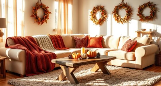
To mix patterns in home decor successfully, start with a cohesive color palette and choose a dominant pattern that anchors the space. Balance large, bold designs with smaller, subtle ones, and play with different scales for visual interest. Incorporate textures and neutral accessories to bridge patterns smoothly. Keep patterns limited to two or three types to avoid overload. If you want to master this art, exploring the details will help you craft a stylish, harmonious look.
Key Takeaways
- Limit patterns to two or three to maintain visual balance and prevent overwhelm.
- Vary pattern scales—combine large, medium, and small designs for depth and interest.
- Use a cohesive color palette to unify different patterns and avoid clashes.
- Mix textures like smooth and textured fabrics to add dimension and richness.
- Balance bold patterns with neutral accessories or solids to create a harmonious space.
As an affiliate, we earn on qualifying purchases.
Understanding the Basics of Pattern Mixing

Understanding the basics of pattern mixing is essential if you want to create a balanced and visually appealing home decor. Start by recognizing that mixing patterns involves combining different designs without overwhelming the space. Use a variety of scales—pair large, bold patterns with smaller, subtle ones—to create contrast and harmony. Stick to a cohesive color palette to ensure the patterns complement each other rather than clash. Keep the number of patterns limited—two or three works best—so your space doesn’t feel chaotic. Textures also play a role; mixing smooth and textured fabrics adds depth. Incorporating pattern categories can further guide you in selecting compatible designs for your space. Additionally, considering the overall design style helps ensure your pattern choices feel unified and intentional. When selecting patterns, pay attention to the scale of patterns to maintain visual balance and avoid clutter. A good understanding of design principles can help you achieve a harmonious look in your decor. Remember that the regional decor trends can influence your choices and inspire fresh ideas.
Choosing a Dominant Pattern for Balance

Choosing a dominant pattern is key to creating a cohesive and balanced look when mixing patterns. It serves as the foundation for your decor, guiding the selection of complementary patterns. To pick the right one, consider these steps:
- Focus on the pattern with the largest scale or boldest design to anchor the space.
- Use it in a central area, like a sofa or a statement wall, to draw attention.
- Keep other patterns smaller or more subtle to prevent visual overload.
- Guarantee the dominant pattern’s color palette ties in with the accents and secondary patterns.
- Recognizing that understanding vetted patterns in grobal world can enhance your ability to create meaningful and harmonious decor choices.
Incorporating Different Scales of Patterns

Mixing patterns of different sizes creates visual interest and prevents your space from feeling cluttered. You should balance larger, bold patterns with smaller, subtle ones to avoid overwhelming the room. By varying pattern sizes thoughtfully, you’ll achieve a cohesive and dynamic look. Incorporating design principles such as balance and harmony can further enhance the overall aesthetic. Paying attention to visual hierarchy helps guide the eye and create a well-organized appearance. Additionally, understanding entertainment and parks hours can inspire playful and lively decor themes that resonate with your personal style. Considering dog names that reflect different personalities can also add a unique touch to your decor, especially if you incorporate personalized accessories or artwork. When mixing patterns, it’s also helpful to consider self watering plant pots as a practical decor element that adds both beauty and functionality to your space.
Varying Pattern Sizes
Incorporating different scales of patterns in your home decor adds visual interest and depth to a space. To effectively vary pattern sizes, consider these tips:
- Mix large, bold patterns with smaller, subtle ones to create contrast.
- Use oversized patterns on statement pieces like rugs or accent walls, and smaller patterns on accessories.
- Balance scale by pairing a large floral print with tiny geometric details.
- Keep a focal point with a dominant pattern, then support it with smaller, complementary patterns.
- Considering contrast ratios can help ensure that the patterns stand out appropriately and contribute to a cohesive look.
This approach keeps your decor lively without overwhelming the eye. Varying pattern sizes helps guide visual flow and emphasizes specific areas. Experiment with scale to create a layered, dynamic look that feels cohesive and engaging.
Balancing Visual Weight
To achieve a harmonious look in your home decor, maintaining the visual weight of different pattern scales is essential. You want your space to feel balanced, not chaotic. Mix large, bold patterns with smaller, subtle ones to create contrast without overwhelming. Use the table below as a guide:
| Pattern Size | Visual Effect | Placement Tips |
|---|---|---|
| Large Patterns | Anchor focal points, add drama | Use on statement pieces like rugs or curtains |
| Medium Patterns | Support overall balance | Incorporate in upholstery or accent pillows |
| Small Patterns | Lighten busy areas, add detail | Use in accessories or throw blankets |
Additionally, understanding pattern scale helps in selecting the right combinations for a cohesive aesthetic. Considering furniture proportions can also enhance the overall harmony of your decor. Recognizing how visual weight distribution influences the balance in a room is crucial for a polished look.
Combining Patterns With Similar Color Palettes

When combining patterns with similar color palettes, focus on harmonizing shades to create a cohesive look. Balance the scale of different patterns to prevent any one element from overwhelming the space. By carefully matching colors and adjusting pattern sizes, you can achieve a stylish and unified decor. Paying attention to color consistency ensures a more polished and intentional design. Incorporating pattern scale considerations helps maintain visual interest without clutter. Developing attention in creative practice can enhance your ability to select and pair patterns thoughtfully.
Harmonizing Color Shades
Harmonizing color shades is an effective way to create a cohesive and calming home decor look. When you choose patterns with similar color palettes, everything feels unified and intentional. To achieve this, consider these steps:
- Select a dominant color and build your patterns around it.
- Use shades within the same color family for variety without chaos.
- Mix lighter and darker tones to add depth and interest.
- Keep the color palette limited to 2-3 hues to avoid visual clutter.
Balancing Pattern Scale
Balancing pattern scale is essential for creating visual harmony when combining patterns with similar color palettes. If you mix large and small patterns, it keeps the look dynamic without feeling overwhelming. Use larger patterns as focal points, like a bold rug or statement curtains, and balance them with smaller patterns in pillows or throws. This contrast helps your space feel cohesive and well-proportioned. Avoid clustering too many large patterns together, which can dominate the room, or too many tiny patterns, which may seem busy. Instead, distribute different scales thoughtfully across your space. By doing so, you create a balanced visual flow that draws attention without causing chaos. The key is to vary pattern sizes while sticking to your chosen color palette for a unified, stylish look.
Using Neutrals to Tie Patterns Together

Using neutrals is an effective way to unify diverse patterns in your home decor. They create a calm backdrop that allows your patterns to stand out without clashing. To do this effectively:
- Choose a neutral base color, like beige, gray, or taupe, for large items such as walls or furniture.
- Incorporate neutral accessories—pillows, throws, or rugs—to anchor your patterned pieces.
- Use neutral art or decor pieces to balance busy patterns elsewhere in the room.
- Limit the number of bold patterns and let neutrals fill the gaps, creating harmony.
Mixing Geometric and Organic Prints

Mixing geometric and organic prints can add visual interest and depth to your home decor, but it requires careful consideration to avoid chaos. Start by choosing a cohesive color palette to unify the different patterns. For example, if your geometric print features navy and white, incorporate organic prints with similar shades to create harmony. Balance the look by pairing bold, structured geometric patterns with softer, flowing organic designs. Keep the scale in mind—mix large geometric shapes with smaller organic motifs so they don’t compete. Use accessories or accents to tie the patterns together, like cushions or artwork. Remember, the key is contrast without clutter. With thoughtful placement and attention to color and scale, you’ll create a lively yet harmonious space.
Playing With Textures and Patterns

Playing with textures and patterns adds depth to your decor, making your space more inviting. You can balance visual interest by mixing smooth and rough fabrics or combining bold and subtle patterns. Experimenting with textured fabrics helps create a layered look that feels both dynamic and cohesive.
Balancing Visual Interest
Balancing visual interest in your home decor involves thoughtfully combining textures and patterns so they complement rather than compete with each other. To achieve this, start by:
- Vary the scale of patterns—mix large and small designs to create depth.
- Limit the color palette so patterns don’t clash and maintain harmony.
- Mix solid colors with patterned pieces to give the eye a resting point.
- Balance busy patterns with calmer textures to prevent visual overload.
Combining Textured Fabrics
Incorporating textured fabrics into your home decor adds depth and richness, elevating the overall aesthetic. When you combine different textures, such as velvet, linen, and knits, you create visual interest and tactile contrast. Don’t be afraid to mix smooth, shiny fabrics with rougher, matte ones—this contrast energizes the space. Use textured pillows, throws, or rugs to layer your decor effortlessly. To keep the look cohesive, stick to a consistent color palette so the textures stand out without overwhelming the room. Play with scale as well; pairing large, chunky knit blankets with smaller patterned cushions adds variety. Ultimately, blending textured fabrics allows you to craft a cozy, inviting environment that feels both curated and personal.
Tips for Using Patterned Upholstery and Accessories

When using patterned upholstery and accessories, it’s important to establish a cohesive look by choosing a unifying color palette. This keeps different patterns from clashing and creates harmony. To effectively incorporate patterns, consider these tips:
- Start with a neutral base to anchor your space and give your patterns room to shine.
- Mix large and small patterns to add visual interest without overwhelming the room.
- Balance bold patterns with subtler accessories to prevent the space from feeling chaotic.
- Repeat key colors across different items to tie everything together seamlessly.
Common Mistakes to Avoid When Mixing Patterns

While mixing patterns can add personality and depth to your home decor, it’s easy to make mistakes that disrupt the harmony you’ve worked to create. One common error is using patterns that are too similar, which can make the space feel cluttered or confusing. Avoid pairing patterns with the same color but different scales; instead, aim for contrast in size or tone. Overdoing it with multiple busy patterns can overwhelm the room, so balance bold designs with calmer, solid tones. Also, don’t ignore the importance of color coordination—clashing hues can clash visually. Ultimately, neglecting the overall style or theme can result in a chaotic look. Be intentional with your pattern choices, and remember, moderation is key to achieving a cohesive and stylish space.
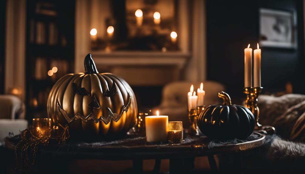
Creative Ideas for Patterned Wall and Floor Treatments

Creative patterned wall and floor treatments can instantly transform any room into a stylish statement. To make the most of this, consider these ideas:
- Use bold wallpaper on one accent wall to create a focal point and add visual interest.
- Incorporate patterned floor tiles in entryways or kitchens for a striking look.
- Combine subtle wallpaper patterns with textured paint for layered depth.
- Mix large-scale and small-scale patterns in adjacent areas to balance energy and harmony.
Keep colors cohesive to avoid overwhelm, and don’t be afraid to experiment. Patterned walls and floors are your chance to add personality and flair, so choose designs that reflect your style. With these ideas, your space will feel fresh, dynamic, and uniquely yours.
Frequently Asked Questions
How Do I Prevent Patterns From Clashing in Small Spaces?
To prevent patterns from clashing in small spaces, start by choosing a cohesive color palette. Limit your patterns to two or three, and vary their scale—mix small, medium, and large prints for visual interest. Use solid colors to break up busy patterns, creating balance. Keep furniture and accessories simple, letting the patterns shine without overwhelming the room. This approach helps your space feel unified and stylish.
What Are the Best Pattern Combinations for a Minimalist Style?
Mastering minimalist magic means maintaining simplicity. You want subtle stripes, soft solids, and sparse spots of pattern, so your space stays sleek and serene. Opt for monochrome motifs or muted hues that harmonize without overwhelming. Limit the number of patterns, and pair them with plenty of whitespace. This balance breathes life into your minimal masterpiece, making your home feel fresh, focused, and fabulous without fuss or clutter.
How Can I Incorporate Patterns Into a Rental Home?
To incorporate patterns into your rental home, start small with removable items like throw pillows, rugs, or wall decals. You can also add patterned curtains or art that’s easy to swap out later. Mix patterns carefully by balancing bold and subtle designs, ensuring they complement each other. Use neutral backgrounds to help patterns stand out without overwhelming the space. This approach keeps your decor lively and personalized without permanent changes.
Are There Pattern-Mixing Rules for Different Room Functions?
Did you know that 78% of interior designers recommend pattern mixing for a lively space? When choosing patterns for different rooms, consider their function: in bedrooms, keep patterns subtle and calming, while in living rooms, feel free to be bolder and more playful. You should blend patterns of varying scales to create visual interest, but avoid overwhelming the space. Trust your instincts, and you’ll create a beautifully balanced, functional room.
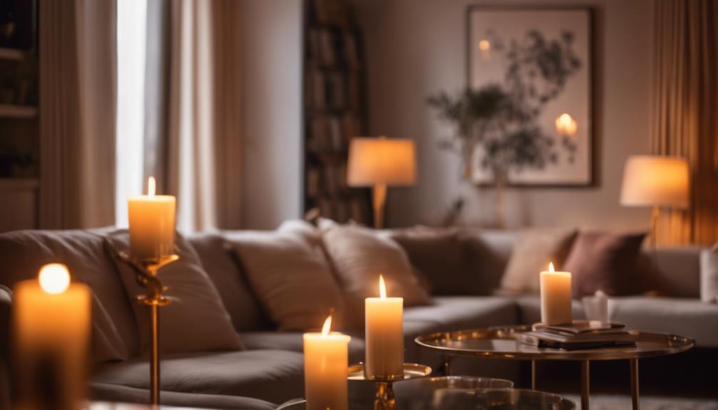
How Do Lighting Conditions Affect Pattern Perception and Pairing?
Lighting conditions profoundly impact how you perceive and pair patterns in your home. Bright, natural light makes colors pop and reveals details, helping you see how patterns work together. Dim or warm lighting softens contrasts, so you might want bolder patterns to stand out. Experiment with different lighting setups to find the best balance, ensuring your pattern combinations look appealing in various conditions and create the atmosphere you desire.
Conclusion
Mastering pattern mixing can transform your home into a stylish sanctuary. Remember, homes with well-balanced patterns tend to feel 30% more inviting and vibrant. Don’t be afraid to experiment—start with a dominant pattern and add smaller, complementing designs. With a little practice, you’ll create a dynamic, cohesive space that reflects your personality. Trust your instincts, and soon you’ll be effortlessly blending patterns like a pro!