
TL;DR

Get furniture and decor delivered free with Prime
- Fast, free delivery on millions of items
- Prime Video, Amazon Music and more included
- Member-only deals all year
A Veranda report on paint-industry forecasts identifies 10 color directions experts expect to shape interiors in 2027, including mossy greens, grounded roses, neutral browns and complex blues. The forecast reflects industry opinion, not a guarantee that these shades will become widespread; individual color choices remain personal.
A Veranda report on paint and color-industry forecasts identifies 10 palettes expected to influence interiors in 2027, from mossy greens and grounded roses to warm pastels and periwinkle. The projections point toward colors with deeper, more complex undertones and natural or nostalgic associations, but they are expert forecasts—not evidence that every shade will become widely used.
The trends named in the report are mossy greens, grounded roses, neutral browns, stone-based neutrals, complex blues, warm pastels, earthen oranges, mature yellows, periwinkle and wine. Across the list, the emphasis is less on bright primary colors and more on nuanced hues influenced by plants, minerals, natural pigments and familiar objects or places.
Several paint brands have named colors for 2027. Benjamin Moore selected Webster Green, a mid-tone green with olive undertones, as its Color of the Year. Behr chose Grounded, a rich olive shade. C2 Paint’s Pueblo combines mauve, brown and pink notes, while U.K.-based Graham & Brown named Rose Earth, a dusty pink that the report says can read as light terracotta in evening light.
The brown category is also shifting in the forecast. Dunn-Edwards named French Coffee Press as its 2027 Color of the Year, describing a brown with a subtle plum undertone. The report’s broader palette includes neutral browns alongside stone-based neutrals and more saturated options, suggesting that the forecast is not a move away from color but toward shades with varied depth and character.
Color Forecasts Favor Deeper, Personal Palettes
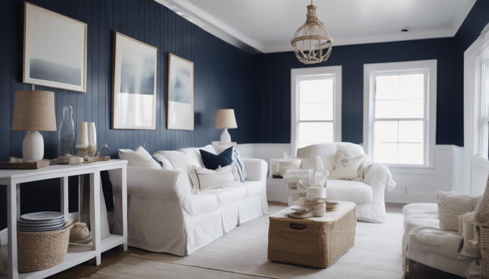
The forecast matters to readers planning a renovation or choosing paint because it offers an early view of the shades brands and design professionals are promoting for 2027. The range—from earthy greens and browns to warm pastels and periwinkle—also gives homeowners alternatives to the light, airy neutrals that have recently defined many interiors, according to the experts quoted in the report.
These projections may shape product launches and design coverage, but they do not establish what consumers will choose. The practical takeaway is that a trend list can provide ideas, not a rulebook: the report describes color as personal and ties interest in particular hues to memories, travel and objects such as antique textiles.
As an affiliate, we earn on qualifying purchases.
Nostalgia Meets Nature in 2027
Veranda says the forecasts draw on two recurring influences: nature and nostalgia. The report describes colors inspired by flora, minerals and natural pigments, as well as shades that recall childhood homes, favorite trips or vintage textiles. Those references help explain why some predicted colors combine familiar associations with less conventional undertones.
Emily Kantz, color marketing manager at Sherwin-Williams, says some people are looking beyond rooms designed only to feel calm. She described interest in spaces that feel more energetic and personal. Behr’s head of color, Kayla Kratz, similarly said definitions of comfort are shifting toward warmer, deeper and more earthen colors, rather than relying solely on airy beiges.
Brand selections provide examples of the wider forecast, but each company’s Color of the Year is its own designation. The list should not be read as a single industry-wide vote or as proof that all 10 directions will appear equally often in homes.
“If you had to conjure in your mind the perfect mid-tone green, we really felt that this hits the mark.”
— Andrea Magno, vice president of brand, color, and integrated marketing at Benjamin Moore
Forecasts Are Not Consumer Results
The report presents industry predictions, not measured sales data or a survey showing which colors homeowners will use. It does not establish how widespread each trend will be, how long it may last or whether predicted shades will be adopted across different regions and styles. The phrase “everywhere” in the source headline is promotional framing; the material supports describing these as colors experts expect to gain attention, not as a guaranteed outcome.
It is also unclear how the full group of 10 trends was selected or ranked. The source provides examples and comments from brand representatives, but does not supply a common forecasting method or comparable data for all the shades.
Watch for Brand and Design Launches
As 2027 approaches, paint companies and design brands may introduce more products and combinations tied to these palettes. Readers can watch for additional color releases, retailer offerings and design coverage to see which forecasts gain traction. The available report does not give a schedule for further announcements or identify a single next milestone.
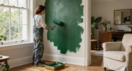
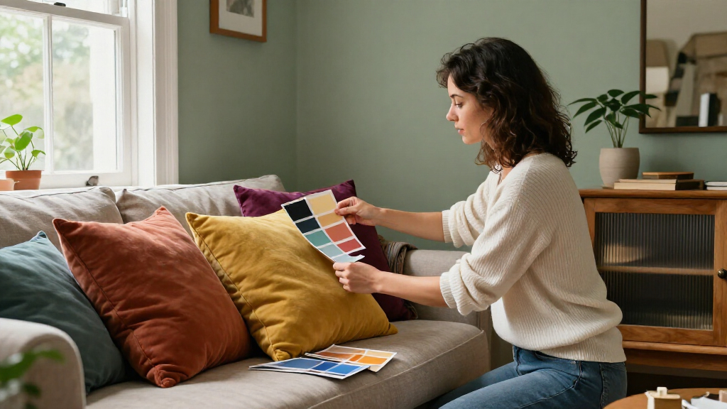
For anyone considering a repaint, the forecasts are best treated as starting points. Testing a color in the intended room can show how daylight and artificial lighting affect its appearance; the source notes that shades such as Pueblo and Rose Earth can shift noticeably through the day.
Key Questions
What are the 10 color trends forecast for 2027?
The report lists mossy greens, grounded roses, neutral browns, stone-based neutrals, complex blues, warm pastels, earthen oranges, mature yellows, periwinkle and wine.
Which paint colors were named Colors of the Year?
Among the examples in the report, Benjamin Moore chose Webster Green, Behr chose Grounded, Dunn-Edwards selected French Coffee Press, and Graham & Brown named Rose Earth. C2 Paint’s Pueblo is also highlighted as a shade in the grounded-rose direction.
Are these trends certain to be popular in 2027?
No. They are expert and brand forecasts, not confirmed consumer trends or sales results. The report does not establish how commonly people will use each color.
What influences the predicted palette?
The report points to natural pigments, flora, minerals and nostalgia, including memories of homes, trips and vintage textiles. It also quotes experts describing demand for warmer, more personal and energetic spaces.
Source: rss
Halloween Picks
halloween
As an affiliate, we earn on qualifying purchases.