TL;DR

Get furniture and decor delivered free with Prime
- Fast, free delivery on millions of items
- Prime Video, Amazon Music and more included
- Member-only deals all year
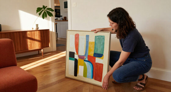
Toronto framing expert Tara Gavin says a gallery wall works best when its frames, mats and images follow a deliberate design direction. Her approach uses unexpected mat colors, negative space and, in some projects, black-and-white family photographs to create a more unified display.
Toronto framing expert Tara Gavin recommends planning a gallery wall around a clear design direction, rather than treating it as a collection of frames to hang together. In advice published by House Beautiful, the founder of On the Wall Framing describes using contrasting frame finishes, colored mats, varied image placement and, in one family-photo project, black-and-white prints to make a display feel cohesive without relying on matching frames.
Gavin’s approach was illustrated by a gallery wall she curated for a Toronto family of five, working with design studio Kessler Levitan. The wall offered just 31 inches of width, which she treated as a design opportunity rather than a limitation. The finished arrangement combined oak and black frames with burgundy-toned frames and mats. Gavin said the burgundy added warmth, the oak kept the grouping from feeling too formal, and the black frames supplied contrast.
Color can also connect a wall display to the rest of a room. Gavin suggested choosing a mat or frame color that picks up a shade already present in nearby furnishings. White remains a familiar option, she said, but alternatives such as soft blue, olive green, burgundy or warm neutrals can change the appearance of a photograph and give the wall more character.
Gavin also treats the mat—the border between an image and its frame—as part of the composition. Wider or more noticeable negative space can draw attention to a small photograph. Her team may place multiple images in one frame or position a photograph off-center instead of using a single centered image. For the Toronto project, the photographs were printed in black and white, a choice Gavin recommends when images have different lighting and color palettes and a more uniform overall look is wanted.
Design Choices That Unify a Wall
The advice matters for readers who want to display personal photographs without buying a matching set of frames or a collection of fine art. Gavin’s example shows how a limited wall area can still support a planned composition, while mat colors, frame finishes and image spacing provide structure. The methods are options rather than rules: the report does not suggest that every gallery wall needs burgundy accents, monochrome photographs or asymmetrical placement.
Her emphasis on consistency also addresses a common practical challenge with family pictures: photographs may have been taken years apart, in different light and with different cameras. Printing them in black and white can reduce visible differences across a collection. Alternatively, a repeated color in the frames or mats can supply a visual link while leaving the photographs in color. The right choice depends on the images, the room and the look the homeowner wants.
Using photographs with personal meaning also makes a gallery wall accessible to people who do not own an art collection. Gavin told House Beautiful that pictures saved on phones or stored in boxes can become meaningful pieces for the home. That is her perspective as a framing professional, not a claim that one arrangement will suit every space.
Products Worth Considering

Philips Hue Large Smart Light Tube, Black – White and Color Ambiance LED Color-Changing Light – 1 Pack

Sonos Era 100 SL Compact Microphone-Free Speaker, Black

Philips Hue Secure Wired Video Doorbell, 2K, Black
As an affiliate, we earn on qualifying purchases.
A Narrow Toronto Wall as an Example
The source article presents Gavin’s recommendations through one commissioned project, not a formal study or a universal set of design standards. Kessler Levitan asked her to curate a display for a family in Toronto, and the available wall measured 31 inches across. The project included familiar oak and black frames, then added burgundy to introduce another color and vary the finishes.
Gavin’s broader framing work, as described in the report, includes experimenting with scale, mat colors, frame finishes and the positioning of photographs. The article develops that approach into three main ideas: choose a palette beyond default white, make intentional use of mat space and image placement, and consider black-and-white printing when a set of photographs feels visually inconsistent. These are reported recommendations from Gavin; the source does not provide prices, measurements for spacing, or a step-by-step hanging plan.
““The secret to doing a gallery wall right is to make sure it has a ‘design direction.’””
— Tara Gavin, founder of On the Wall Framing, quoted by House Beautiful
Choices Depend on the Room
The source does not establish one layout, spacing measurement or color scheme as the right choice for every home. Gavin’s recommendations are based on her framing practice and a specific project; the report gives no independent assessment of how the techniques perform across different wall sizes, lighting or interior styles.
It is also unclear whether the Toronto family project’s exact arrangement can be replicated from the text alone. The supplied report does not include a full hanging template, frame dimensions or the precise spacing between pieces. Readers would need to adapt the principles to their own photographs and available space.
Plan the Display Before Hanging
For readers applying the advice, the next step is to decide what should tie the collection together: a recurring frame finish, a deliberate mat color, a consistent treatment of the photographs, or some combination. Lay out the intended images and frames before hanging them, and test whether the balance of color, scale and negative space works within the available wall area. This is practical guidance based on Gavin’s reported approach, not a specific installation method provided by the article.
House Beautiful’s report does not announce a follow-up project or further guidance from Gavin. Any additional details about her process, including exact frame specifications or a measured layout for the narrow Toronto wall, remain unavailable in the supplied source.
Key Questions
What does Tara Gavin say is the key to a gallery wall?
Gavin says to give the display a clear design direction. She recommends coordinating choices such as frame finishes, mat colors, image scale and photograph placement rather than relying on a set of identical frames.
Do gallery wall frames all need to match?
No. In the Toronto project described by House Beautiful, Gavin combined oak, black and burgundy-toned frames and mats. Her example uses variation while keeping the arrangement connected through a planned palette.
Why use black-and-white family photographs?
Gavin says converting photographs to black and white can create more visual consistency when the originals were taken in different lighting conditions and color palettes. The report presents this as an option, not a requirement.
How can mats change a gallery wall?
Mats create negative space around an image and can make a small photograph feel more prominent. Gavin also recommends considering multiple openings in one frame or placing an image off-center to vary the composition.
Source: housebeautiful.com