To make neutral rooms more interesting, use contrast through color, texture, and materials. Add bold accents like vibrant pillows, artwork, or vases against muted backgrounds to draw attention. Layer soft and sleek textures, such as velvet with leather, to create visual depth. Incorporate matte and glossy finishes to add variety, highlighting architectural features and furnishings. If you explore these techniques further, you’ll discover how contrast can truly transform your space into something enthralling.

Get furniture and decor delivered free with Prime
- Fast, free delivery on millions of items
- Prime Video, Amazon Music and more included
- Member-only deals all year
Key Takeaways
- Incorporate bright, bold accents like pillows or artwork against muted backgrounds to create visual pops.
- Layer different textures, such as plush rugs with sleek furniture, to add depth and tactile interest.
- Use contrasting materials and finishes, like matte walls with glossy decor, to highlight architectural features.
- Maintain a cohesive color palette while adding pops of color to prevent clashes and keep harmony.
- Combine varied textures and materials to introduce richness and visual complexity without overwhelming the space.
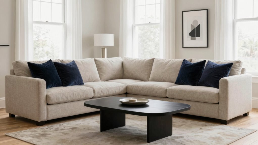
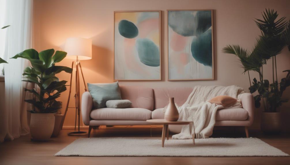
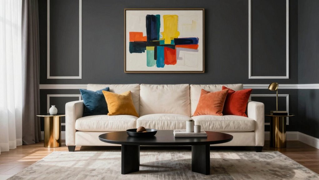
Have you ever wondered how to make a neutral room feel more lively and interesting? The secret lies in using contrast to create visual interest without overwhelming the space. One effective way to do this is by adding color pops—bright, bold accents that stand out against the muted background. Think of a vibrant throw pillow, a striking piece of artwork, or a colorful vase. These small touches instantly draw the eye and break up the monotony of neutral tones, giving your room personality and energy. Just be sure to keep the overall palette cohesive so the pops of color enhance rather than clash with the room’s calm serenity.
Add bold color pops to neutral rooms for instant personality and energy.
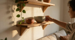
Another powerful technique is texture layering. Incorporate a variety of textures to add depth and tactile interest. For instance, pair a plush velvet sofa with sleek leather accent chairs, or combine a shaggy rug with smooth ceramic accessories. This contrast in textures creates a rich, inviting atmosphere that keeps the space from feeling flat. When you layer different materials—such as matte and glossy finishes, soft and hard surfaces—you introduce subtle variations that catch the light and add complexity to the room’s appearance. Texture layering works especially well in neutral rooms because it compensates for the lack of color variety, making the space feel more dynamic and engaging. Additionally, exploring different materials and finishes can significantly enhance the overall contrast and depth of your design, providing a more visually interesting environment. Incorporating material contrasts can also emphasize architectural features or furnishings, further elevating your room’s aesthetic. To maximize impact, consider how biodiversity principles, like varied textures and materials, can be used to create harmonious yet contrasting elements within your space.
As an affiliate, we earn on qualifying purchases.
Frequently Asked Questions
Can Contrast Be Used in Small Neutral Rooms Effectively?
Yes, contrast works well in small neutral rooms. You can use lighting accents to highlight specific areas or features, creating visual interest without overwhelming the space. Incorporate art focal points with bold colors or textures to draw the eye and add depth. These contrasting elements make the room feel more dynamic and inviting, proving that even small spaces benefit from strategic contrast to enhance their overall design.
What Are the Best Contrast Colors for Minimalist Neutral Spaces?
Think of your space as a symphony—every note matters. For minimalist neutrals, bold color pairing like black and white creates striking contrast, emphasizing clean lines. Soft gray with navy adds depth without overwhelming. These choices enhance visual balance, making your room lively yet serene. Just like tuning an instrument, carefully selecting contrast colors transforms a simple space into a harmonious retreat that feels both dynamic and peaceful.
How Do I Avoid Overwhelming a Neutral Room With Contrast?
To avoid overwhelming a neutral room with contrast, you should use color psychology to pick subtle, calming shades and balance them with strategic lighting. Incorporate soft lighting techniques like dimmers or warm-toned bulbs to create depth without harsh contrasts. Keep bold contrasts limited to accent pieces, ensuring they don’t dominate the space. This approach maintains visual interest while preserving a serene, cohesive atmosphere.
Is Contrast Suitable for All Interior Design Styles?
They say “variety is the spice of life,” and juxtaposition can enhance many design styles. While contrast works well with modern, eclectic, and transitional styles, it might clash with minimalist or traditional aesthetics. Color psychology and lighting techniques help you tailor contrast to suit your style. If used thoughtfully, contrast adds depth and interest; if overdone, it can feel out of place. Always aim for harmony to create a balanced space.
How Can I Incorporate Contrast With Textures Instead of Colors?
You can incorporate contrast with textures through textural layering and material pairing. Mix smooth surfaces like glass or polished wood with rougher textures such as woven fabrics or matte finishes. Pair soft textiles with hard materials to create visual interest and depth. By combining different textures thoughtfully, you add dimension to your neutral room, making it more dynamic without relying on color contrast.
Conclusion
So, next time you’re designing a neutral room, remember that contrast isn’t just a stylistic choice—it’s a subtle story waiting to unfold. Sometimes, it’s funny how the smallest accents can unexpectedly bring your space to life, making it more than just a room but a reflection of your unique taste. After all, the magic of contrast might just be the coincidence your space needs to surprise and delight every time you step inside.
Halloween Picks
halloween
As an affiliate, we earn on qualifying purchases.