To pick a color palette you’ll trust, start by understanding color relationships like complementary and analogous schemes for harmony and contrast. Use natural and everyday life inspiration to find authentic combinations, and employ simple tools like Coolors or Adobe Color to experiment quickly. Balance bold hues with neutrals to create calm, versatile designs that evoke the right emotions. When you grasp how colors influence feelings and context, you’ll craft lasting, appealing palettes—keep exploring to master these skills.
Key Takeaways
- Use complementary or analogous color schemes for vibrant or harmonious palettes suited to your message.
- Incorporate neutral tones to balance bold colors and create a timeless, adaptable look.
- Consider emotional and cultural meanings behind colors to ensure lasting appeal and clarity.
- Use online tools like Coolors or Adobe Color to experiment and refine your palette easily.
- Choose colors that evoke positive feelings and suit your long-term design goals to prevent future regret.
Understanding the Basics of Color Relationships

Understanding the basics of color relationships is essential for creating visually appealing combinations. Two key concepts are complementary contrast and analogous harmony. Complementary contrast involves pairing colors opposite each other on the color wheel, like blue and orange, to create vibrant, striking effects. This contrast draws attention and adds energy to your designs. On the other hand, analogous harmony uses colors next to each other, such as yellow, yellow-orange, and orange, producing a more cohesive, soothing look. Recognizing these relationships helps you select colors that work well together and achieve your desired mood. Additionally, understanding color harmony can help you avoid clashing colors and ensure a balanced palette. Whether aiming for bold or subtle effects, understanding how colors relate guarantees your palette is balanced, engaging, and visually harmonious.
The Power of Color Schemes and How to Use Them

Color schemes are powerful tools that help you create cohesive and impactful designs. They guide your choices, ensuring your colors work well together. For example, complementary contrasts pair colors opposite each other on the color wheel, making your design pop. Analogous harmony uses nearby colors for a smooth, unified look. To use color schemes effectively, consider these tips:
- Use complementary contrasts to create eye-catching highlights.
- Choose analogous harmony for a calming, harmonious feel.
- Balance bold and subtle colors to avoid overwhelming your audience.
- Limit your palette to three or four colors for simplicity.
- Experiment with shades and tints to add depth without complexity.
- Understanding color horsepower can help you select vibrant and energetic palettes that energize your design.
Mastering these schemes allows you to craft designs that are visually appealing and emotionally resonant.
How to Choose Colors That Match Your Mood or Message

Choosing the right colors is essential because they can instantly communicate your mood or message without words. Using color psychology, you can evoke specific emotional impacts that align with your intentions. For example, warm colors like red and orange energize and excite, while cool colors like blue and green promote calmness and trust. To visualize, consider this table:
| Mood/Message | Color Choices | Emotional Impact |
|---|---|---|
| Excitement | Red, bright yellow | Passion, energy |
| Calmness | Blue, soft green | Relaxation, trust |
| Creativity | Purple, vibrant orange | Inspiration, innovation |
Choose colors that reinforce your message, whether you want to inspire, soothe, or energize your audience.
The Role of Neutral Colors and How to Balance Brights

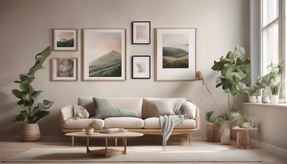
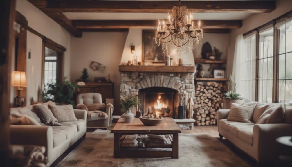
Neutral colors like beige, gray, and white play a crucial role in balancing bold hues, preventing a design from feeling overwhelming or cluttered. They act as visual rest points, making your space feel calm and cohesive. To achieve neutral balancing with bright moderation, consider these tips:
- Use neutrals as a backdrop for your brighter accents.
- Limit the number of bold colors in a single space.
- Incorporate neutrals in furniture or walls to ground the palette.
- Add pops of bright color sparingly, like in accessories or artwork.
- Maintain contrast between neutrals and brights for visual interest.
- Understanding the importance of emotional intelligence can also help in selecting colors that evoke the desired mood.
Tips for Picking a Harmonious Color Palette Quickly

Ever wonder how to quickly create a harmonious color palette that looks intentional and balanced? Start by considering color psychology—think about how different colors evoke emotions and reactions. For example, blue often conveys trust and calm, while red signals energy and passion. Next, explore cultural color meanings, as colors can carry different significance worldwide. Knowing these associations helps you choose colors that resonate universally or intentionally contrast. Stick to a color scheme—such as complementary or analogous—to ensure harmony. Use online tools like color pickers or palettes for quick inspiration. Trust your instincts, but also balance bold shades with neutrals. Incorporating spiritual symbolism can add deeper meaning and resonance to your palette. By combining awareness of color psychology and cultural meanings, you can assemble appealing palettes swiftly and confidently.
Common Mistakes to Avoid When Selecting Colors

When choosing colors, it’s easy to overlook basic principles like harmony, which can make your palette look chaotic. You might also overuse bright colors, creating visual strain instead of appeal. Additionally, ignoring the context or mood you want to convey can result in mismatched or confusing color choices. To improve your selections, consider how color accuracy influences the overall aesthetic and emotional impact of your palette.
Ignoring Color Harmony Rules
Ignoring color harmony rules can lead to designs that feel jarring or unbalanced, even if the individual colors are appealing. When you overlook these principles, you risk creating visuals with bold contrasts or unexpected pairings that clash instead of complement. This can make your work seem chaotic or confusing. To avoid this, consider these common mistakes:
- Combining colors with no thought for their relationships
- Relying solely on vibrant, contrasting hues without balance
- Using unexpected pairings that don’t harmonize
- Ignoring the mood or emotion certain colors evoke together
- Neglecting to test how colors look side by side
- Failing to understand personality traits that influence how people perceive color combinations.
Focusing on harmony helps your palette feel intentional and pleasing. Even bold contrasts can work when thoughtfully applied, but ignoring these rules often results in a disjointed look.
Overusing Bright Colors
Overusing bright colors can overwhelm your design and make it difficult for viewers to focus on the main message. Bright color pitfalls often occur when you rely too heavily on bold hues, creating clutter rather than clarity. Overuse color schemes with too many vivid shades can confuse the eye, distract from key elements, and diminish overall impact. Instead, limit your palette to a few carefully chosen bright colors, and balance them with neutral tones or muted shades. This contrast helps highlight important parts without overwhelming your audience. Remember, restraint is key. Using bright colors sparingly and intentionally guarantees your design remains engaging, clear, and visually appealing. Incorporating cohesive color schemes and balancing vibrant hues with softer tones ensures a harmonious and effective visual presentation. Avoid the temptation to flood your work with all the brightest hues—less truly is more.
Neglecting Context and Mood
Choosing colors without considering the context and mood can lead to mismatched designs that confuse or alienate your audience. Without proper contextual awareness, your color choices might clash with the message or setting you aim to convey. To avoid this, think about the emotional tone you want to evoke. For example, calming blues suit healthcare, while energetic reds work for sales. Keep these in mind:
- Match colors to the target audience’s expectations
- Consider the setting or environment where your design appears
- Use warm tones for intimacy, cool tones for professionalism
- Reflect the emotional tone you want viewers to feel
- Avoid bright, playful colors in serious contexts
- Regularly assess and rotate items to prevent clutter buildup and ensure your color palette remains relevant and effective.
Using Color Inspiration From Nature and Everyday Life

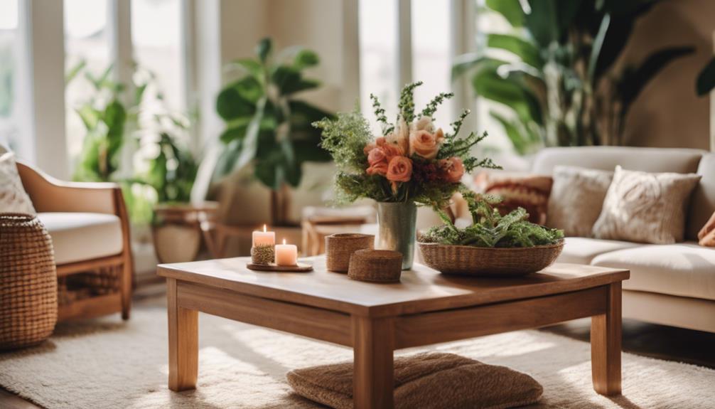
You can find inspiring color combinations all around you in nature and daily life. From the vibrant hues of a sunrise to the subtle shades in your morning coffee, these colors can add authenticity to your projects. Pay attention to your surroundings, and you’ll discover a natural palette to draw from. Exploring outdoor environments like parks and beaches can also reveal a wide range of color inspiration for your palette.
Nature’s Color Combinations
Nature offers an endless palette of colors that can inspire your own creations, whether you’re designing, decorating, or simply exploring new combinations. By observing flower combinations and seasonal palettes, you can discover striking harmonies and contrasts. For example, spring blooms blend soft pastels, while autumn leaves showcase warm, earthy tones. Incorporating these natural patterns helps create balanced and vibrant color schemes. Understanding AI bifurcation can also inspire innovative approaches to color theory by analyzing how human perception and AI-generated designs diverge and converge. Consider these ideas: – Bright yellow sunflowers with deep green foliage – Soft pink cherry blossoms against a blue sky – Rich orange pumpkins for fall-inspired palettes – Vibrant red berries with muted browns – Cool blues and whites of winter snow scenes Using nature’s color combinations offers authentic, timeless inspiration to enhance your projects.
Everyday Color Finds
Sometimes, everyday life offers surprising sources of color inspiration that can enhance your projects. Look around—your morning coffee, a vibrant fruit, or even a city street scene. These objects often feature a monochrome contrast, where shades of a single color create depth and interest. Pay attention to color saturation; a bright, highly saturated hue can energize your design, while muted tones provide calmness. Using simple, familiar colors from daily life makes your palette more relatable and easier to work with. You don’t have to seek exotic palettes; everyday objects can teach you how to balance contrast and harmony. Embracing these natural, accessible sources helps you develop a confident, cohesive color scheme that feels authentic and pleasing.
Inspired by Surroundings
Drawing inspiration from your surroundings can open a world of appealing color schemes that feel both natural and authentic. Pay attention to the colors around you—nature, cityscapes, or everyday objects—and notice how they evoke emotion through color psychology. These hues often carry cultural influences, shaping how you interpret and connect with them. For example, a deep green might symbolize growth, while a warm orange can evoke energy. Use these insights to build palettes that resonate personally. To get started, try:
- Observing the colors of leaves, sky, or flowers
- Noticing the tones in your favorite cafes or shops
- Reflecting on colors that evoke specific feelings
- Considering cultural meanings behind certain shades
- Experimenting with combining these natural hues into your projects
How Different Colors Evoke Different Emotions

Colors have a powerful ability to influence your emotions and perceptions instantly. The psychology of hues reveals that different colors can evoke specific feelings—blue often promotes calmness, while red can increase excitement or urgency. Understanding cultural color meanings is also essential, as interpretations vary across societies; for example, white symbolizes purity in some cultures but mourning in others. By recognizing how these associations work, you can choose colors that evoke the desired emotional response in your projects or environment. Whether you want to energize, soothe, or inspire, selecting the right colors based on their emotional impact helps you communicate more effectively. Remember, colors are more than visuals—they’re emotional signals that shape how others perceive your message.
Practical Tools and Resources for Color Selection

You don’t need to be a designer to choose great colors; there are many practical tools to help. Color palette generators, mobile design apps, and online color tools make selecting harmonious schemes quick and easy. These resources empower you to create appealing color combinations without prior experience.
Color Palette Generators
Have you ever struggled to choose a cohesive color scheme? Color palette generators are practical tools that simplify this process. They help you create harmonious combinations quickly and effortlessly. Many of these tools incorporate mood matching, allowing you to select palettes that evoke specific feelings or atmospheres. Here are some popular options:
- Coolors: Instantly generate palettes and explore trending schemes
- Adobe Color: Use mood-based sliders or upload images to extract colors
- Paletton: Experiment with color theory principles for custom schemes
- Colormind: Leverage AI to produce modern, stylish palettes
- Canva Color Palette Generator: Generate palettes from photos or predefined themes
These tools make it easier to discover color combinations that fit your project and ensure your chosen palette resonates emotionally.
Mobile Design Apps
Ever wondered how to choose the perfect color scheme on the go? Mobile design apps make it easy to explore color psychology and cultural color meanings anytime, anywhere. These apps often include features like real-time color matching, palettes inspired by trends, and adjustable sliders to tweak shades instantly. By understanding cultural color meanings, you can select colors that resonate appropriately with your audience. Many apps also offer accessibility tools, ensuring your palette works for everyone. With intuitive interfaces and instant feedback, you can experiment confidently without needing advanced design skills. Whether you’re creating a quick social media post or refining your brand colors, these apps help you make informed choices, ensuring your color palette aligns with your message and avoids unintentional cultural missteps.
Online Color Tools
Online color tools provide a convenient way to select and experiment with color schemes without needing advanced design software. They allow you to explore digital color blending, helping you create harmonious palettes effortlessly. Plus, many tools include insights into cultural color meanings, so you can choose colors that convey the right message or emotion. Using these tools, you can quickly test different combinations, see how colors look together, and adjust tones in real-time. They’re perfect for non-artists who want to make informed color choices without hassle. Here are some popular online options:
- Adobe Color Wheel
- Coolors
- Paletton
- Canva Color Palette Generator
- Colormind
Making Your Color Choices Last and Avoiding Regret

Choosing colors thoughtfully can save you from regret later on, especially if you want your selections to stay appealing over time. To guarantee your palette remains timeless and emotionally impactful, focus on versatile shades that complement various settings. Think about colors that evoke positive feelings and adapt well as trends change. Avoid overly trendy hues that may fade quickly. Consider pairing neutral tones with accent colors to create balance and longevity. Here’s a simple guide:
| Color Type | Example | Emotional Impact |
|---|---|---|
| Neutral | Beige, gray | Calm, sophisticated |
| Bold | Navy, forest green | Stability, confidence |
| Accent | Coral, mustard | Energy, optimism |
| Soft Pastels | Mint, blush | Comfort, serenity |
| Deep Jewel Tones | Emerald, burgundy | Luxury, richness |
Choose wisely—your palette should reflect your style and stand the test of time.
Frequently Asked Questions
How Do I Incorporate Trendy Colors Without Sacrificing Timelessness?
To incorporate trendy colors without sacrificing timelessness, focus on color harmony by balancing bold, trendy shades with classic neutrals. Use trendy colors in accents or small details, allowing them to stand out without overwhelming. Consider color psychology to choose hues that evoke the right feelings and remain relevant over time. This approach keeps your palette fresh and stylish while maintaining a timeless foundation, ensuring your choices stay appealing for years.
Can Color Theory Improve My Branding and Marketing Strategies?
Color theory is like a compass guiding your branding and marketing strategies. It helps you choose colors rooted in color psychology that evoke emotions and influence perceptions. By understanding how different hues impact consumer behavior, you boost brand recognition and foster loyalty. When you strategically use colors, your message becomes clearer and more memorable, giving you an edge in competitive markets. So, yes, mastering color theory can considerably elevate your branding efforts.
What Are the Best Ways to Test Color Combinations Before Committing?
You should use the color wheel to test your combinations, focusing on complementary contrast for striking results. Try creating digital mockups or use design tools like Canva or Adobe Color to see how colors work together. Swap out options and view them in different lights or on various backgrounds. Gathering feedback from others also helps guarantee your chosen palette resonates and effectively communicates your brand’s message before you commit.
How Does Lighting Affect the Appearance of Chosen Colors?
Lighting is like a chameleon, transforming your colors with every change. When you consider color temperature, warm light makes reds and yellows pop, while cool light enhances blues and greens. Brightness impacts color contrast, making shades appear more vivid or subdued. Keep in mind how different lighting conditions can shift your palette’s vibe, so test your colors in various settings to guarantee they look just right, no matter the environment.
Are There Cultural Considerations When Selecting Colors?
Yes, cultural considerations matter when choosing colors. You should be aware of cultural symbolism, as colors can carry different meanings across regions. For example, white symbolizes purity in some cultures but mourning in others. Regional preferences also influence color choices, so research local customs to guarantee your palette resonates positively. By understanding these aspects, you avoid unintended misinterpretations, creating a more thoughtful and respectful color selection.
Conclusion
By mastering the art of color, you hold the brush to paint your world with intention. Think of your palette as a symphony, each hue a note that can evoke emotion or set a mood. Trust your instincts, draw inspiration from nature’s endless canvas, and let your choices flow effortlessly. With this knowledge, your colors will harmonize like a well-tuned orchestra, leaving behind a masterpiece you’ll cherish without a trace of regret.