Revamping your home this August? Consider using bold color palettes that reflect the season's spirit! Try burnt reds, coral, and soft yellows to capture summer vibes while hinting at autumn. Earthy tones add warmth, making your space feel cozy and inviting. Don't forget to incorporate accent colors through throw pillows or art to create depth. You can personalize your space by analyzing your favorite wardrobe colors or drawing inspiration from nature. Small changes can have a big impact. Explore seasonal trends and smart tips for your home to discover the perfect palette tailored just for you!
Key Takeaways
- Incorporate warm color palettes like burnt reds and oranges to embrace late summer vibes and signal autumn's approach.
- Refresh your space effortlessly with vibrant throw pillows in hues like coral and pale orange for a lively atmosphere.
- Utilize earthy tones and bright accents to create a cozy retreat that reflects your personal style and mood.
- Analyze your wardrobe colors for inspiration, and create a cohesive aesthetic throughout your home using your favorite tones.
As an affiliate, we earn on qualifying purchases.
The Power of Color Palettes
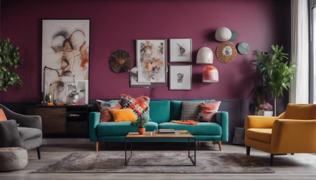
Color palettes hold the power to transform your space, making decorating decisions easier and creating a cohesive look throughout your home. By selecting a defined color palette, you can effortlessly combine colors together, ensuring that every room complements one another. Aim for 4-5 paint colors that harmonize well; this creates an inviting atmosphere and enhances the overall aesthetic appeal of your living spaces.
Your personal color preferences play a significant role in shaping the mood of a room. Whether you gravitate towards bold hues or soft pastels, the right colors can reflect your unique style. Consider incorporating an accent color to add depth and interest, bringing your vision to life.
Don't forget about seasonal adjustments! Revitalizing your color palette according to the time of year can keep your home feeling lively and current. Utilize a mood board to visualize various color combinations and find what resonates with you.
Seasonal Trends for August
As August rolls in, it's time to refresh your home with trending colors that capture the essence of the season.
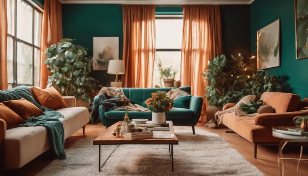
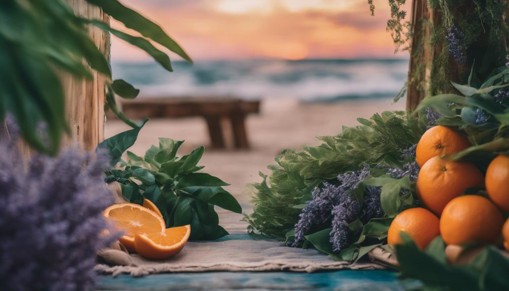
You can embrace burnt reds and oranges for a warm shift to autumn or incorporate coral and yellow hues to keep that summer energy alive.
Small decor changes, like adding earthy tones and vibrant accents, can transform your space into a cozy retreat.
Trending August Colors
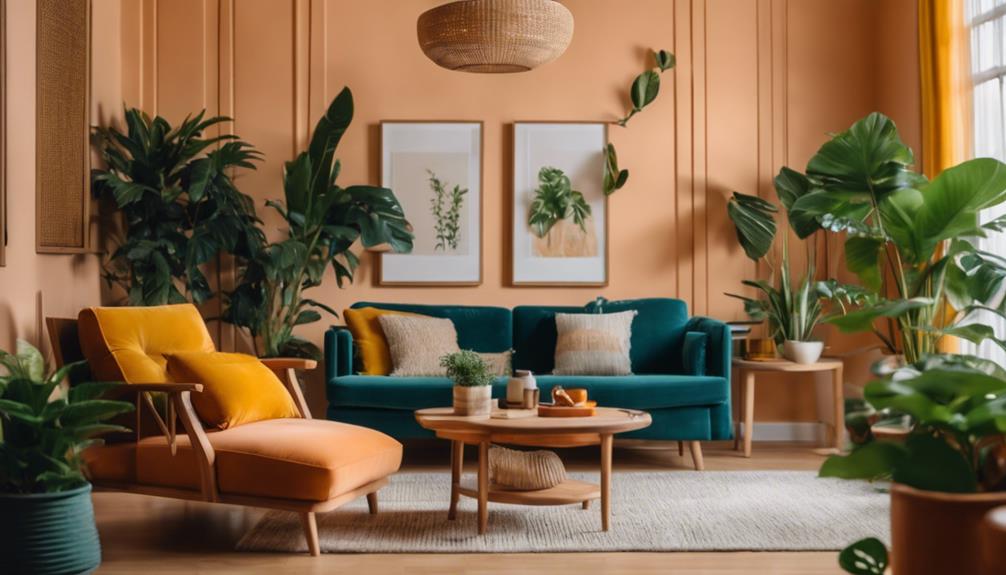
August brings a vibrant palette of warm tones and earthy hues, perfect for capturing the essence of summer's end and autumn's approach. This month, you'll find popular colors like burnt red and orange, which reflect the dynamic energy of summer while hinting at the changes ahead. Earthy hues such as rust and bright blue are trending, symbolizing the shifting leaves and clear skies.
To create a cozy atmosphere in your home, consider incorporating colors like coral and pale orange. These shades evoke warmth and nostalgia, making them ideal for summer gatherings. Accent colors like pearl and yellow can also add a cheerful touch to your seasonal decor.
A simple way to refresh your space is by rotating throw pillows and linens in these trending colors. Not only do these warm tones provide a soft, inviting ambiance, but they also enhance the overall vibe of your home. By embracing these colors, you can easily shift your decor from the height of summer to the welcoming embrace of autumn, ensuring your space remains stylish and inviting throughout the changing seasons.
Seasonal Decor Inspirations
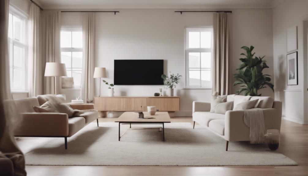
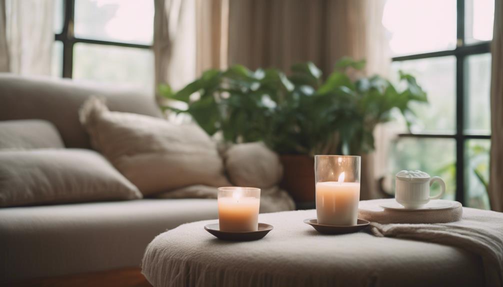
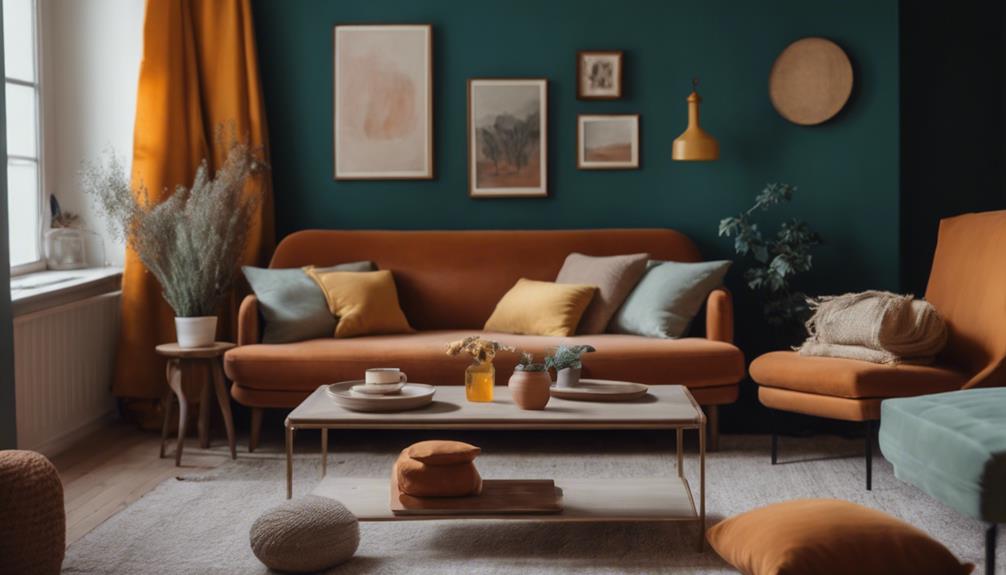
Shifting your decor this month can be a delightful way to embrace the warmth of late summer while subtly hinting at the upcoming fall. To create a cozy home feel, consider incorporating a warm color palette with seasonal colors like burnt red and orange. These hues not only reflect the change to autumn but also enhance the carefree summer vibe.
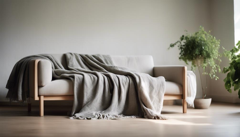
You can easily refresh your space by adding vibrant throw pillows and linens in shades of pale orange or coral. These small updates breathe new life into your environment without breaking the bank. Don't forget to rotate decorative elements throughout your home to align with August's color trends; even minor changes can greatly enhance the ambiance of your living areas.
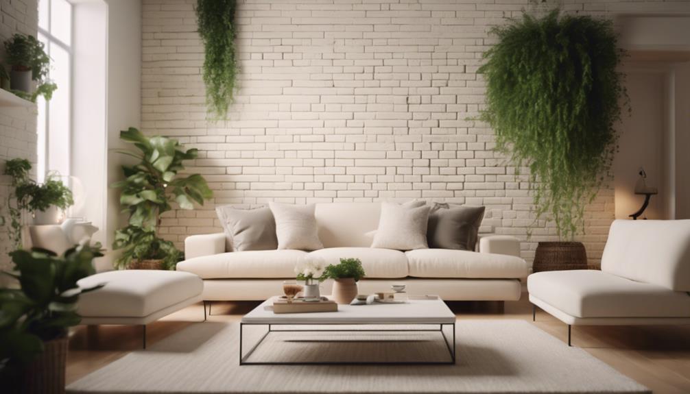
Embrace natural materials, such as jute or wicker, to foster a connection to your surroundings. These elements complement the warm color palette beautifully while adding texture and depth to your decor.
Personalizing Your Space
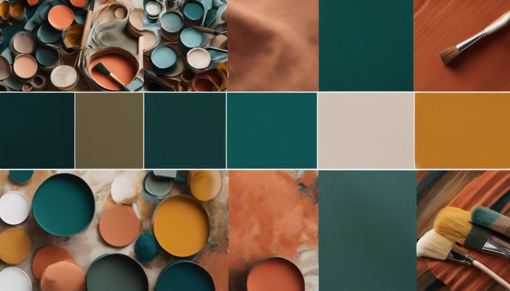
Personalizing your space starts with analyzing your wardrobe colors to identify your favorite tones that can seamlessly translate into your home decor. This approach creates a cohesive aesthetic that reflects your unique style. For instance, if you love shades of blue, consider how to incorporate those tones into your living room and throughout your home.
Here's a simple table to visualize your color choices:
| Color Family | Paint Options | Accent Colors |
|---|---|---|
| Shades of Blue | Soft Sky Blue | Bright Coral |
| Warm Neutrals | Creamy Beige | Deep Teal |
| Earthy Greens | Olive Green | Warm Mustard |
| Bold Reds | Rich Cherry Red | Soft Gray |
| Cool Grays | Light Charcoal | Vibrant Yellow |
Using a mood board can help clarify your design vision. Also, consider seasonal color adjustments to refresh your decor, making it easy to express individuality. Remember to use accent colors strategically—playful hues in children's spaces or calming tones in bedrooms help maintain a harmonious overall look while personalizing your space.
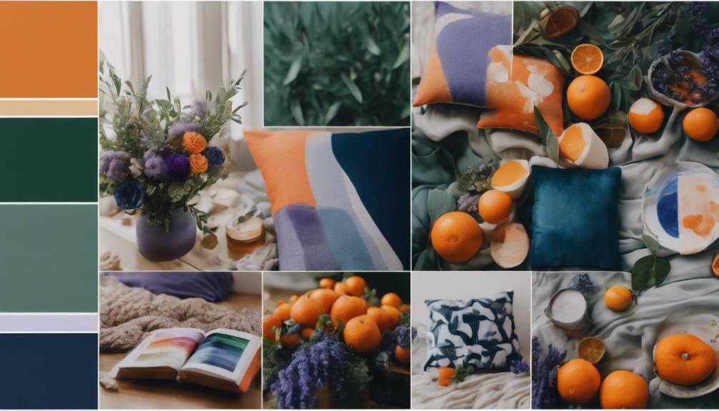
Sources of Color Inspiration
Often, you can find color inspiration in everyday life, from the vibrant hues of nature to the latest fashion trends. Start by analyzing wardrobe colors; those favorite tones can easily translate into your home decor. Look at the bold colors you gravitate towards in your clothes—they might inspire the perfect paint color for different rooms in your home.
Seasonal changes also play a significant role in color inspiration. As the seasons shift, so do the colors around you. Embrace the bright outdoor hues in spring to refresh your whole house color scheme, or opt for warm, cozy tones in the fall. Creating mood boards by collecting images and samples can help clarify your personal style and facilitate the exploration of potential palettes.
Don't shy away from daring combinations. Pairing unexpected colors from eclectic sources can lead to a unique home aesthetic that reflects your personality. When you choose a paint, consider how each color works together to create an inviting atmosphere.
With these sources of inspiration, revamping your space becomes an exciting journey that transforms your home into a beautiful reflection of you.
Common Color Mistakes
Choosing colors for your home can be exciting, but making spontaneous decisions without a cohesive plan can lead to common mistakes that disrupt your overall aesthetic. Here are some common pitfalls to avoid:
| Mistake | Solution |
|---|---|
| Ignoring lighting conditions | Test colors in different lighting |
| Mismatched wall and trim color | Choose colors that work well together |
| Overlooking seasonal colors | Adapt your palette to reflect the season |
| Clashing different styles | Stick to a unifying theme |
| Skipping paint samples | Always sample before you commit |
To create a harmonious space, consider how your white trim color interacts with the wall color in your living rooms. Different colors can evoke various emotions, so reflect your personality through your choices. Remember, colors can look drastically different based on lighting conditions; what seems perfect during the day may feel off at night. Finally, embrace seasonal color changes—they can breathe new life into your home and match your mood. By avoiding these common mistakes, you'll create a beautiful, cohesive environment that truly feels like home.
Room-Specific Color Recommendations
When selecting colors for specific rooms, it's essential to contemplate how each hue can enhance the function and mood of the space.
For your main living spaces, consider using Benjamin Moore Ballet White. This creamy warm white serves as a versatile backdrop, allowing your decor to shine.
In the guest bath, try Sherwin Williams Clary Sage; it pairs beautifully with creamy shower tiles and brass fixtures, creating a fresh and inviting atmosphere.
Your main bedroom can greatly benefit from Benjamin Moore Boothbay Gray, which features calming blues and greens with warm undertones, fostering a serene vibe.
For children's rooms, Valspar Warm Fog offers a lovely blush hue that can be accentuated with custom chair rails and molding, making it playful yet sophisticated.
If you're revamping a home office, opt for a deep navy accent wall using Valspar Chimney Smoke. This striking contrast against Ballet White adds elegance and focus to your workspace.
Engaging With Color Communities
Engaging with color communities opens up a treasure trove of shared experiences and insights that can elevate your design journey. By participating in these vibrant groups, you can discover how your favorite colors look different in various contexts and gain inspiration for that fun color palette you've been dreaming of.
Through feedback sessions, you'll be able to refine your choices, ensuring you select the right color for your space. Plus, many communities provide handy resources like color palette generators and mood board tools, which are essential for visualizing color concepts before you immerse yourself.
Here's a quick look at some community benefits:
| Benefit | Description |
|---|---|
| Shared Experiences | Learn from others' design journeys and choices |
| Resource Access | Utilize tools for color palette generation |
| Accountability | Share projects to motivate and inspire each other |
| Trend Discussions | Stay updated on the latest color trends |
| Polls & Feedback | Get opinions on your color selections and ideas |
Engaging with color communities not only enriches your palette but also makes the design process more enjoyable and collaborative throughout every step!
Frequently Asked Questions
What Is the Color Scheme for August?
August's color scheme features warm burnt reds, oranges, and cheerful yellows. You can balance these vibrant tones with deep blues and greens, creating an inviting atmosphere that reflects the shift from summer to autumn.
What Color Goes Best With August?
For August, deep blues pair beautifully with burnt reds and oranges, creating a cozy yet vibrant atmosphere. Soft neutrals balance these colors, ensuring your space feels inviting and harmonious as you move into autumn.
What Is Joanna Gaines' Favorite Grey Color?
Joanna Gaines' favorite gray color is Sherwin Williams Repose Gray. It adapts beautifully to different lighting, creating a calming atmosphere while complementing both modern and traditional designs, making it perfect for any living space you choose.
What Color Paint Does Joanna Gaines Use on Fixer Upper?
Imagine stepping into a serene haven—Joanna Gaines often paints with soft hues like Sherwin Williams Sea Salt and Mindful Gray, blending dusty blues and creamy whites to create inviting, calming spaces that feel effortlessly cozy.
Conclusion
As August unfolds like a vibrant canvas, it's the perfect time to breathe new life into your home.
Embrace the warmth of rich hues and cool tones, weaving together a tapestry of comfort and style.
Remember, each splash of color tells your story, so don't shy away from personal touches.
Immerse yourself in the world of color, and let your imagination dance.
After all, your home should reflect the beautiful symphony of who you are.